The network for creativity
Join 1.25M professional creatives like you
Connect with clients, get discovered, and run your business 100% commission-free
Creatives on Contra have earned over $150M and we are just getting started
Back to feedPost

The first figma-makeathon challenge I was most excited about, it was fun, exploring and daring..
Figma team just showed they haven't been sleeping cause the updates has been massive, this screen was from my first prompt crazy but super excited.
Aura is a SAAS event command center center for event planners, basically pinterest moodboards, calenders, deadlines, venues, spreadsheets in one app helping event planners to be in one app instead of shuffling around multiple app.
We are just starting and we have alot to ship for this Saas
The network for creativity
Join 1.25M professional creatives like you
Connect with clients, get discovered, and run your business 100% commission-free
Creatives on Contra have earned over $150M and we are just getting started





Related posts

Figma to lovable by connecting MCP
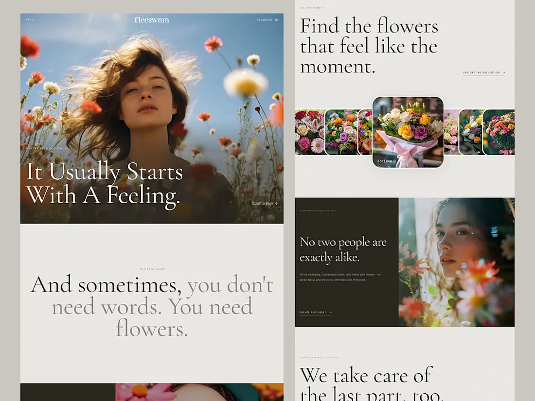
One prompt. One Figma file. A working website. 👀
So, what did I actually do here?
I analyzed how AI interprets UI designs, how it understands layer names, and how naming conventions affect the generated output.
Then I structured my Figma file accordingly and gave Lovable a single prompt.
And honestly? It nailed it.
No complicated back-and-forth. Just a better-structured design and a smarter workflow.
Live preview: https://fleeswora.lovable.app/
This experiment reminded me that AI-assisted design isn’t just about writing better prompts. It’s also about preparing our designs so AI can understand them.
Designers, are you optimizing your Figma files for AI yet?




@contralabs Creative Intelligence Report shows AI adoption, workflows, and earnings, and the page itself is a masterpiece
The storytelling is unmatched.
Huge congrats to the big talent behind, @Mark Vassilevskiy, @Alex Karpodinis, @Stacy · Heed Collective, @Heed Collective , @Erin Horner, @Ben Huffman and the entire @Contra Labs team 👏


Folding the entire post-purchase flow into Kajabi — confirmations, order forms, the whole sequence — is where the brand actually earns trust, not just the landing page. Worth checking whether the confirmation and post-purchase pages read consistently when a customer hits them on a small phone after a sweaty match.

Most SaaS products don’t need more features.
They need clearer priorities. 🎯
As products grow, it’s easy to keep adding dashboards, filters, settings, and new flows.
But for users, more options often mean more friction.
The best product experiences usually do a few things really well:
✅ Make the next step obvious
✅ Show the right information at the right time
✅ Keep complex workflows feeling simple
✅ Remove decisions users shouldn’t have to make
Good SaaS design is not about making everything minimal.
It’s about reducing the effort required to get value from the product. ✨
That’s the kind of product experience I enjoy designing: clear, scalable, and built around real user workflows.