The network for creativity
Join 1.25M professional creatives like you
Connect with clients, get discovered, and run your business 100% commission-free
Creatives on Contra have earned over $150M and we are just getting started
Back to feedPost

I build conversion-focused websites and automation systems that help brands grow faster online.
The network for creativity
Join 1.25M professional creatives like you
Connect with clients, get discovered, and run your business 100% commission-free
Creatives on Contra have earned over $150M and we are just getting started

Challenges
View all


Related posts

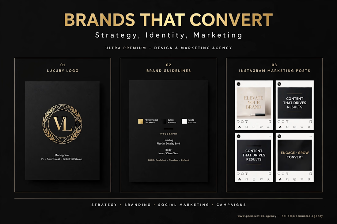
I build BRANDS THAT CONVERT. Strategy, Identity, Marketing. What you get: Luxury Logo, Brand Guidelines, Social Marketing that drives results. Stop looking cheap. Start looking premium. DM me for branding. #BrandDesign #Marketing #LogoDesign #Branding


Great work 👍

A beautiful e-commerce website is not enough. It needs to help people discover, trust, and buy.
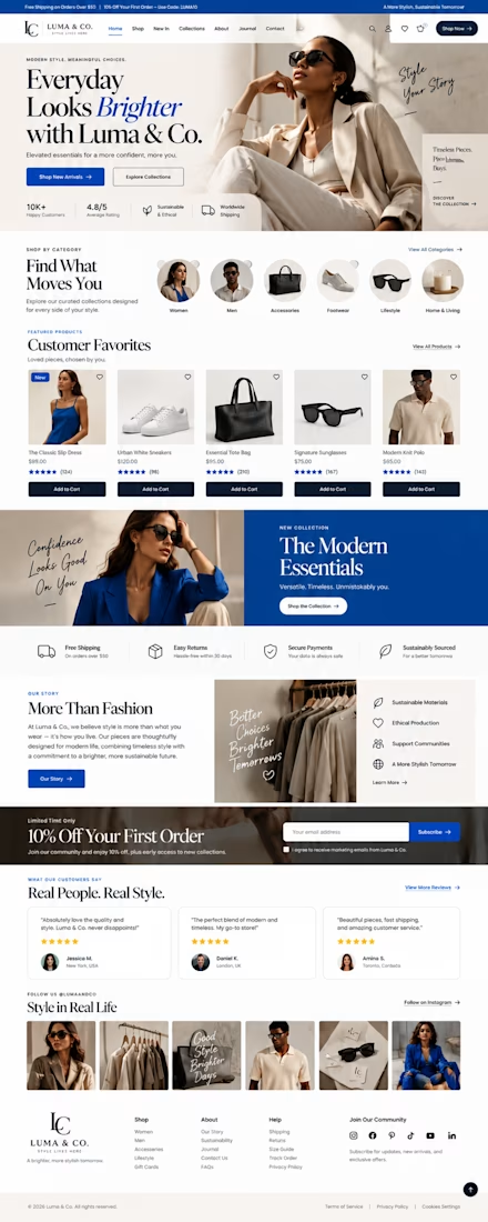
For Luma & Co., I designed a premium e-commerce website concept where visual storytelling and conversion-focused UX work together.
The objective was simple: create an online shopping experience that feels like a fashion editorial while still making the customer journey clear, intuitive, and effortless.
What makes an e-commerce website convert?
A strong e-commerce experience should answer three questions quickly:
What do you sell?
The hero section immediately establishes the brand, product category, positioning, and primary shopping actions.
Why should I trust you?
Customer ratings, product reviews, secure payment messaging, easy returns, shipping information, and sustainability messaging are positioned throughout the experience to reduce hesitation.
Where do I go next?
Clear navigation, curated categories, featured products, strong calls-to-action, and strategically placed product discovery sections guide visitors naturally toward shopping.
The Luma & Co. approach
I created an editorial-inspired fashion e-commerce interface using a bold cobalt blue and warm neutral palette to balance energy with premium sophistication.
The homepage includes:
• High-impact fashion hero section
• Clear primary and secondary CTAs
• Category-based product discovery
• Featured products with ratings and pricing
• Add-to-cart interactions
• New collection promotion
• Brand story and sustainability section
• Shipping, returns and payment trust signals
• Customer testimonials
• Social proof and Instagram-style content
• Newsletter and first-order offer
• Structured e-commerce footer and navigation
• Responsive-first layout considerations
The goal wasn't to fill the page with design elements.
It was to create visual hierarchy so customers know what matters, where to look, and what action to take next.
The bigger lesson
Your website is often the first salesperson your customer meets.
If the design looks beautiful but the navigation is confusing, the product information is buried, the CTA is weak, or trust signals are missing, you're creating friction between interest and purchase.
Great e-commerce web design connects:
Brand → UX → Product Discovery → Trust → Conversion
That's the thinking I bring into every website project.
Project: Luma & Co.
Industry: Fashion / E-commerce
Design direction: Editorial · Premium · Conversion-focused
Services: E-commerce Web Design · Brand Identity · Responsive Web Design

I’ve been exploring how the same design principles can adapt across very different brands — from barbershops and architectural materials to SaaS and creator portfolios.
The goal with each concept was the same:
→ strong first impression
→ clear visual hierarchy
→ responsive layouts
→ focused calls to action
→ a design that actually fits the brand
These projects helped me push my Framer workflow further while experimenting with typography, art direction and conversion-focused layouts.
I’m currently available for Framer website design & development for startups, personal brands and businesses.
If you need a site that feels premium and doesn’t look like another generic template, feel free to reach out.
#Framer #WebDesign #FramerDeveloper #LandingPage #WebsiteDesign