The network for creativity
Join 1.25M professional creatives like you
Connect with clients, get discovered, and run your business 100% commission-free
Creatives on Contra have earned over $150M and we are just getting started
Back to feedPost

I’m currently working on a UI/UX review and audit of a product.
The goal isn’t to simply make the UI “look better.”
I’m looking at it from a user + business perspective:
→ Is the user journey smooth?
→ Is the information easy to understand?
→ Are important actions clear?
→ Is the interface doing too much?
→ Where might users lose interest or drop off?
→ What can be simplified to improve conversion?
The approach is simple:
Keep the UI simple → make the experience smoother → remove friction → improve conversion.
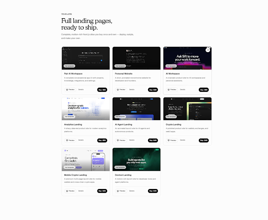
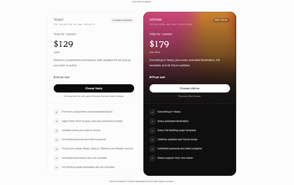
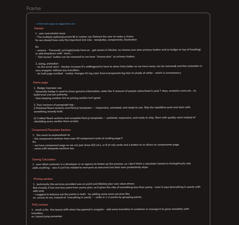
I’ve already gone through the interface and documented the key issues, opportunities, and improvements.
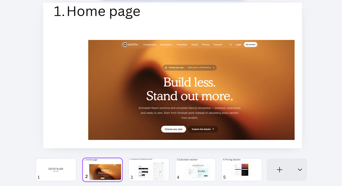
Now I’m turning the findings into a structured presentation PDF — so every recommendation has a clear reason behind it, rather than being just a subjective design opinion.
The network for creativity
Join 1.25M professional creatives like you
Connect with clients, get discovered, and run your business 100% commission-free
Creatives on Contra have earned over $150M and we are just getting started

Challenges
View all


Related posts

Working on the homepage for Still Blooming, a wedding and floral studio, I explored two different layout directions for the hero section. Same brand, same copy, just a different structure and visual rhythm.
Option 1 : Left Aligned. Text sits on the left with supporting content beside it, giving an editorial, asymmetrical feel.
Option 2 : Centered. Everything is stacked and centered, giving a clean, balanced, more classic hero layout.
Would love your honest UX/UI take which direction feels more elegant, functional, and true to a wedding/floral brand, and why?
22 voted
41%
32 voted
59%
54 votes
Closed

Great Design :)




Day 10/30 of my hero section challenge.
Today: Ofelia, a spa in Bali.
→ The wordmark sits at eye level, spanning the full width, cutting across the middle of the space. Here the type claims the room, and because the interior is symmetrical and calm, it can take the weight.
→ A high-contrast serif against soft plaster. The architecture is all curves and matte texture, so the type brings the only sharp edges in the frame. Contrast without adding a single element.
10 down, 20 to go. A third of the way.
Template by Hariom, adapted and customized by me. Interior imagery generated with AI.


Contrast without adding a single element is such a clean way to put it. With 20 more of these to go, are you locking the typographic approach per venue type, or is Ofelia's centered serif going to be the constant across the whole 30?