The network for creativity
Join 1.25M professional creatives like you
Connect with clients, get discovered, and run your business 100% commission-free
Creatives on Contra have earned over $150M and we are just getting started
Back to feedPost

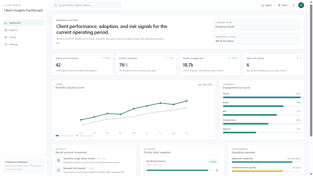
Client Insights Dashboard — Analytics & Portal Demo
Client Insights Dashboard is a modern analytics and portal concept designed to demonstrate dashboard structure, reporting flows, KPI visibility, and polished client-facing product design.
The project includes a responsive dashboard home, reporting views, client/project records, and a lightweight account/settings experience. It was built as a portfolio piece for SaaS products, analytics platforms, and client portal interfaces.


The network for creativity
Join 1.25M professional creatives like you
Connect with clients, get discovered, and run your business 100% commission-free
Creatives on Contra have earned over $150M and we are just getting started

Challenges
View all


Related posts

Designed a dashboard concept for tracking net worth across every asset type — stocks, crypto, property, pensions, funds, cash, and liabilities — all in one place.
Instead of the usual pie chart or bar graph, the centerpiece is a dial: a single, glanceable gauge showing where your wealth actually sits. Behind it, a quiet grid of every asset category fades in and out of visibility, reinforcing that everything's accounted for even when it's not the focus.
Dark UI, a single confident green accent, and a lot of negative space — built to make a genuinely overwhelming task (seeing your entire financial picture at once) feel calm instead of cluttered.


wow the animation feels super smooth, what is this animation for?

Working on the homepage for Still Blooming, a wedding and floral studio, I explored two different layout directions for the hero section. Same brand, same copy, just a different structure and visual rhythm.
Option 1 : Left Aligned. Text sits on the left with supporting content beside it, giving an editorial, asymmetrical feel.
Option 2 : Centered. Everything is stacked and centered, giving a clean, balanced, more classic hero layout.
Would love your honest UX/UI take which direction feels more elegant, functional, and true to a wedding/floral brand, and why?
22 voted
41%
32 voted
59%
54 votes
Closed

Great Design :)


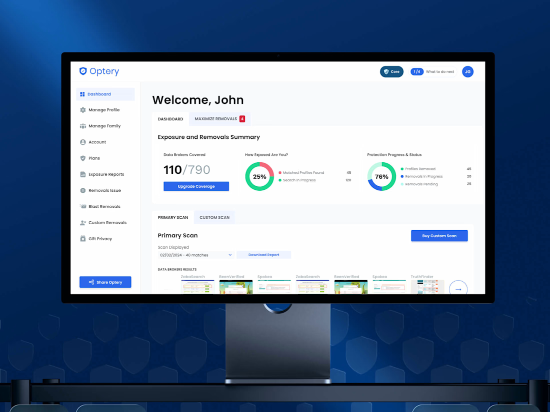
Nobody churns because a dashboard is ugly, they churn because they can't tell whether anything is happening.
Optery was quietly pulling users' data off hundreds of broker sites and almost none of that work was visible to the person paying for it, so the biggest win in this redesign wasn't a new screen; it was making invisible work visible. Free-to-paid hit 30%
Check it out

Making the invisible work visible is such a sharp way to frame it, that 30% lift proves people will pay once they can actually see the value happening in the background. How did you decide which data points were worth surfacing without overwhelming someone who just wants reassurance?