The network for creativity
Join 1.25M professional creatives like you
Connect with clients, get discovered, and run your business 100% commission-free
Creatives on Contra have earned over $150M and we are just getting started
Back to feedPost

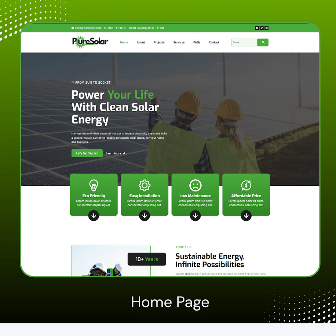
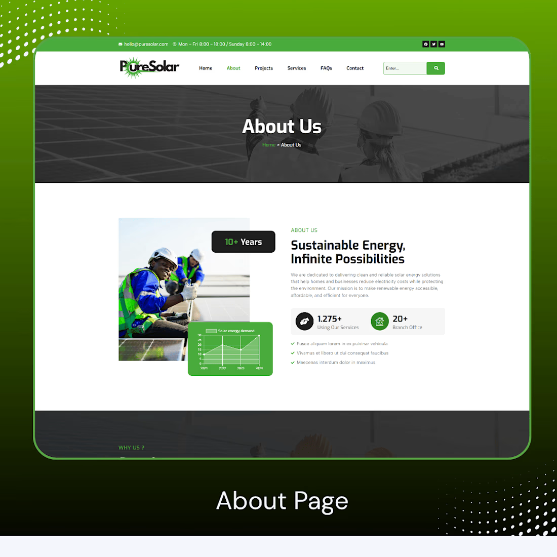
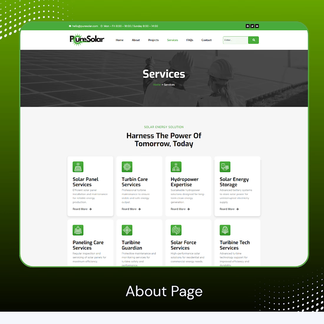
Solar Energy Website Project Completed
We are excited to announce the successful completion of a modern Solar Energy Website Design & Development Project.
This project is built with a clean UI, responsive layout, and SEO-optimized structure focused on renewable energy solutions.
Our goal was to create a professional solar company website that highlights services like solar panel installation, energy storage, turbine care, and sustainable power solutions.
Key Features:
Modern and responsive design
SEO-friendly structure
Fast loading performance
Clean solar energy branding
Mobile-friendly layout
This project is a step toward promoting green energy and sustainable future solutions through digital innovation.
Live Preview: https://puresolar.wuaze.com/
#SolarEnergy #ProjectManagement #RenewableResources #Sustainability #SolarTechnology #EnergyEfficiency #ProjectCompletion #CleanEnergySolutions #StakeholderEngagement #EnvironmentalImpact

The network for creativity
Join 1.25M professional creatives like you
Connect with clients, get discovered, and run your business 100% commission-free
Creatives on Contra have earned over $150M and we are just getting started





Related posts

A few things we’ve been working on this month.
Different industries, different problems, but the same goal: making complex products feel simple, clear, and trustworthy.
Fintech → Investment Banking → Geospatial AI
More projects are still in progress.
Full case studies coming soon.






This is the kind of work I enjoy seeing — simple, focused, and actually thought through.

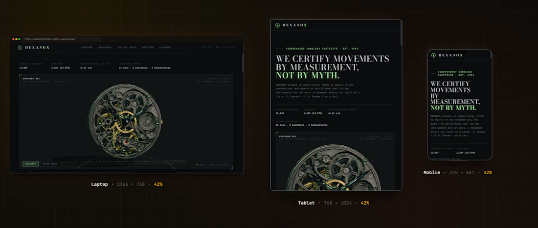
A watch movement lifted from one photograph into 3D. HEXANOX is an independent horology institute. We certify mechanical movements by measurement, amplitude, beat error, positional variance, to tolerances your eye cannot see.
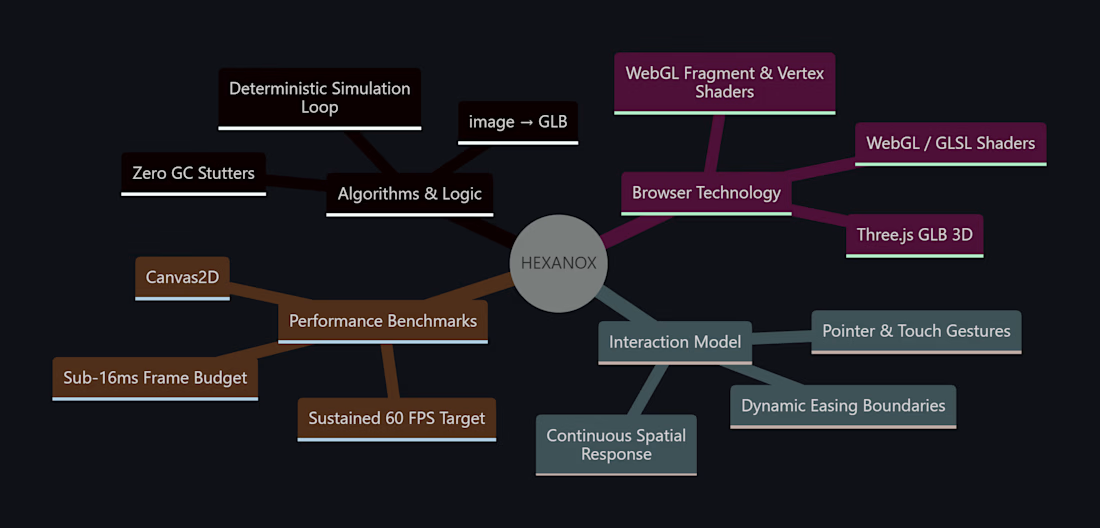
I built this project to test A watch movement lifted from one photograph into 3D. HEXANOX is an independent horology institute. We certify mechanical movements by measurement, amplitude, beat error, positional variance, to tolerances your eye cannot see. The core engineering challenge was sustaining uncompromised 60 FPS rendering using Three.js (GLB 3D) while handling continuous user interaction without framework overhead.
WHAT I WAS TESTING:
I focused on two core engineering benchmarks:
Precision implementation of image → GLB under continuous interactive user input
Sustained 60 FPS render performance and zero-dependency browser execution
THE TECHNICAL SIDE:
Engineered directly in the browser with Three.js (GLB 3D), WebGL / GLSL Shaders, Canvas2D, Image → GLB. The application runs without third-party frameworks or build-step dependencies, using hardware-accelerated rendering and custom event loops to achieve zero-latency response.
Everything executes in the browser using Three.js (GLB 3D), WebGL / GLSL Shaders, Canvas2D, Image → GLB. No third-party frameworks, no heavy runtime bundles, and zero external tracking.
WHAT I LEARNED:
Balancing the mathematical rigors of image → GLB with tactile browser interaction required tuning event throttling and memory allocation to eliminate all garbage collection stutters.
Finding the sweet spot between mathematical precision and frame budget took careful profiling, but the result runs at a steady 60 FPS even on modest hardware.
TRY IT YOURSELF:
The live build is deployed on Netlify. Open it in your browser, test the controls, and observe the render response times.
If you are building high-performance 3D, physics, or creative web systems and want to collaborate, reach out here on Contra.




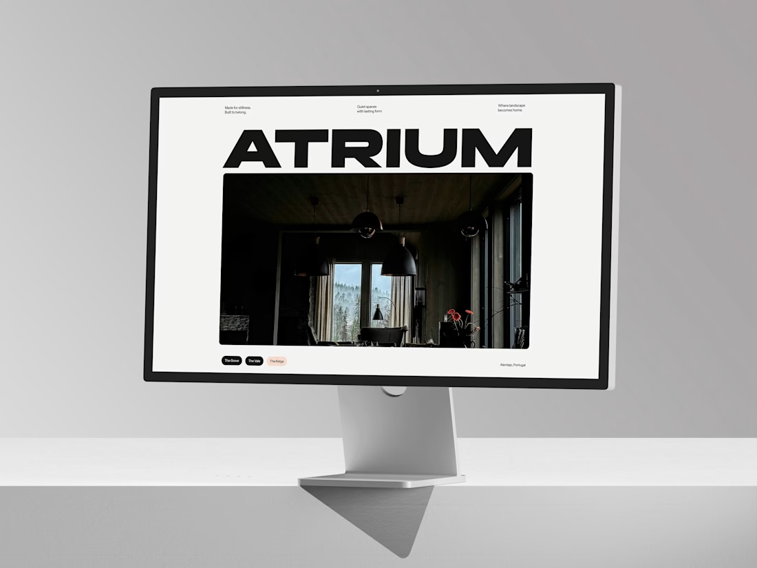
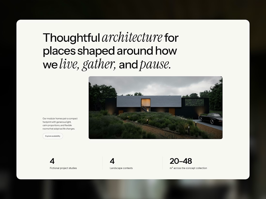
Meet Atrium Studio, my latest Framer template for architects, interior designers, and modular home studios.
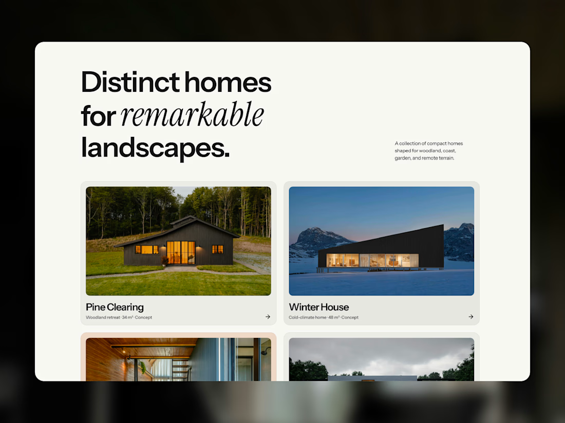
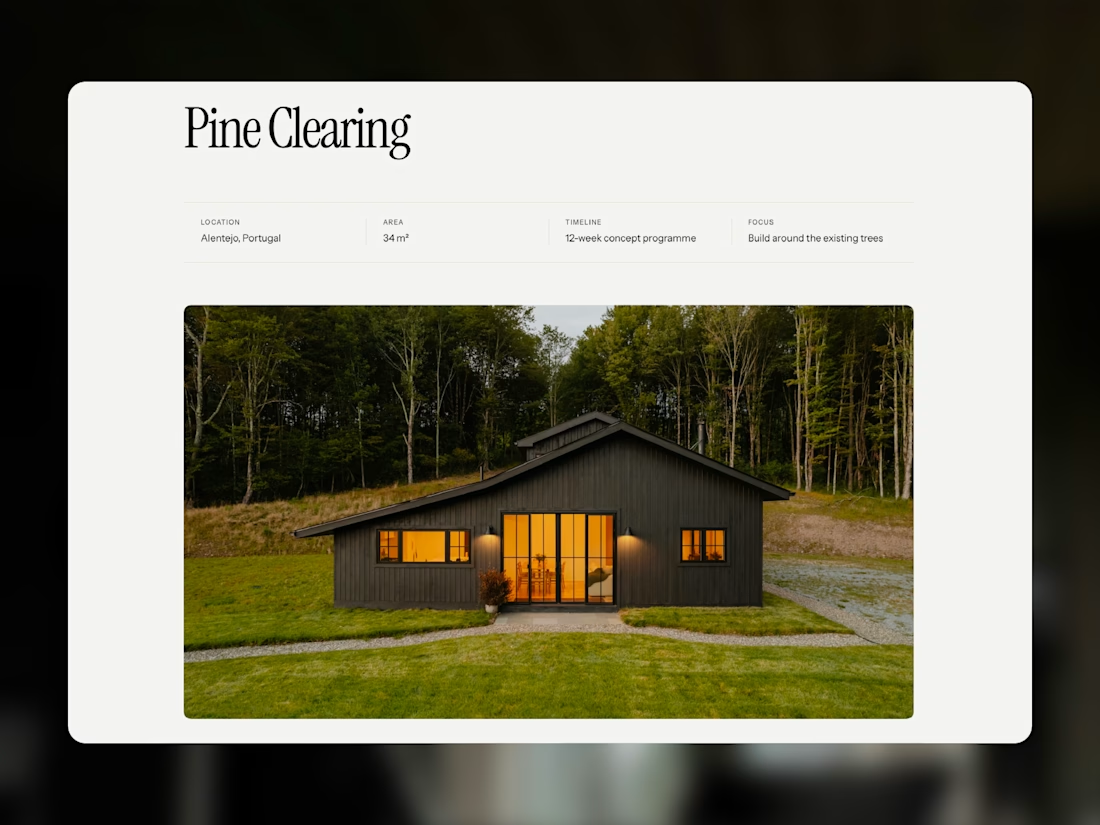
Bold typography, generous whitespace, and immersive photography create an editorial feel that gives each project room to stand out. Dedicated garden room pages and a CMS project portfolio let you share the spaces you create and the thinking behind them.
Designed for desktop, tablet, and mobile, with reusable components and customizable colors and typography.
Take a closer look at Atrium, or make it your own.



But this feels too premium 🙄