The network for creativity
Join 1.25M professional creatives like you
Connect with clients, get discovered, and run your business 100% commission-free
Creatives on Contra have earned over $150M and we are just getting started
Back to feedPost

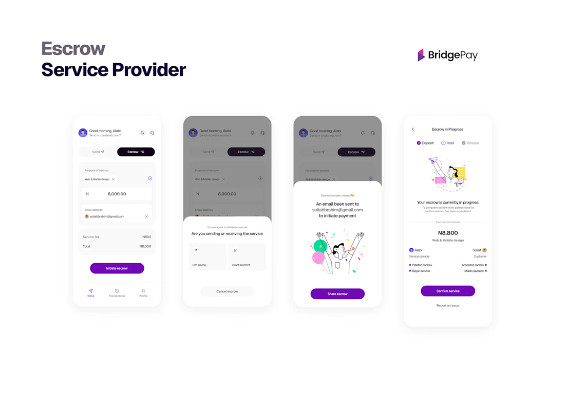
Product design for BridgePay, a fintech product for international payments and school-fee transfers, live since launch. I designed the core flows for sending money across borders and paying institutional fees, focused on making a high-trust, high-stakes transaction feel clear and safe.
Fintech and payments work calls for careful handling of trust, error states, and money-movement clarity, which is the kind of detail I design for. Available for fintech, payments, and B2B product design.


The network for creativity
Join 1.25M professional creatives like you
Connect with clients, get discovered, and run your business 100% commission-free
Creatives on Contra have earned over $150M and we are just getting started









Related posts

15 seconds of smooth UI, editorial layouts, and micro-interactions.
Kept the micro-interactions snappy, typography expressive, and transitions buttery smooth.
Rate this UI animation from 1 to 10 in the comments, or tell me what you’d improve! 😉


Solid 10/10 bro! 🔥 Micro-interactions are super snappy and transitions are buttery smooth indeed. Editorial layout game is strong. Keep it up!

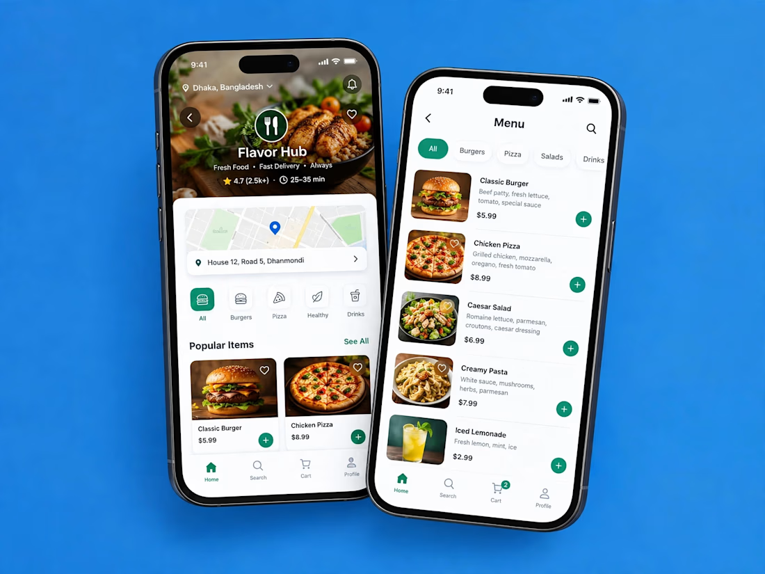
A clean and modern food delivery app concept designed with a focus on simple navigation, clear layouts, and a smooth user experience.
Designed in Figma.

Love how clean and intuitive this feels, the navigation looks super smooth and the layout is really well balanced


Lovely cohesive work, Alex. The motion is spot on!