The network for creativity
Join 1.25M professional creatives like you
Connect with clients, get discovered, and run your business 100% commission-free
Creatives on Contra have earned over $150M and we are just getting started
Back to feedPost
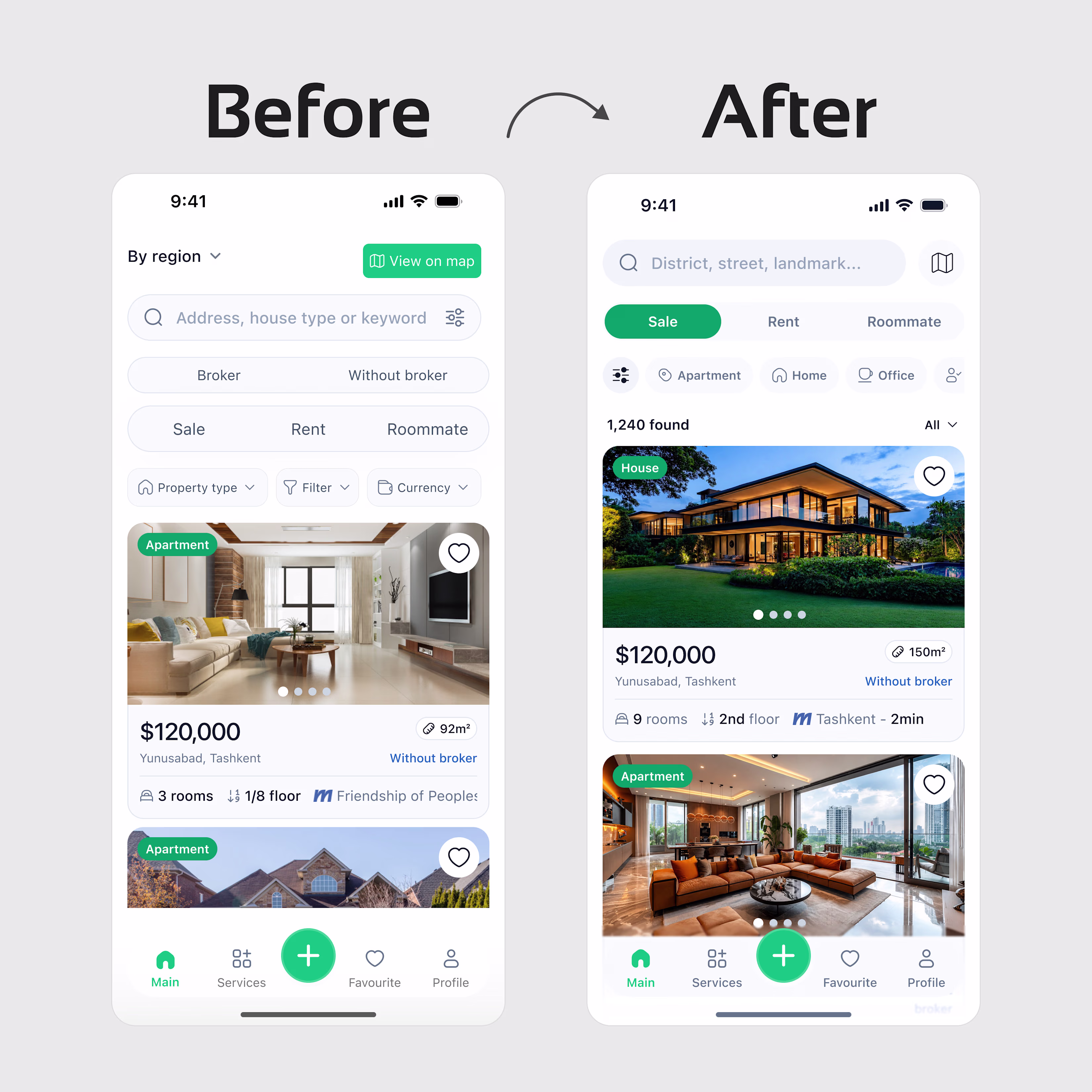
Redesigning a Real Estate App Homepage
The original had 6+ filter elements competing for attention before the user even saw a listing. Every screen inch was occupied, but nothing was clear.
So I asked one question: what does the user actually do in the first 3 seconds?
They search. That's it.
Key decisions:
1. Search bar moved to top. Placeholder text changed from "Search" to "District, street, landmark" — users now know exactly what to type
2. Sale / Rent / Roommate became tabs, not equal-weight buttons. Intent comes first, filters follow
3. Currency dropdown removed from header entirely. It's a one-time preference, not a per-session choice
4. "View on map" demoted from primary green CTA to a compact secondary icon — because 90% of users scroll the list first
5. Listing cards restructured: price at 24px/500 weight, area pill next to it, metro distance readable at a glance
Good UX isn't about adding features.
It's about removing the decisions users shouldn't have to make.
#UXDesign #ProductDesign #MobileDesign #RealEstate #UIDesign
The network for creativity
Join 1.25M professional creatives like you
Connect with clients, get discovered, and run your business 100% commission-free
Creatives on Contra have earned over $150M and we are just getting started
Related posts
2020 designer starter pack:
→ freepik illustrations
→ dribbble gradients
→ random icons
→ inter font
2026 designer starter pack:
→ ai-generated photography
→ brand-first experiences
→ custom typography
→ premium motion
→ ai everywhere
time changes fast.
drop your 2020 vs 2026 below 👇
i'm happy to see your progress 😭
41 voted
79%
11 voted
21%
52 votes
Closed
2026
Kombucha Y2K – Interactive Flavor Experience with a walkthrough video
project live demo link :
Link of figma project
Figma X contra challenge
Kombucha Y2K is a bold, interactive product experience that showcases a new generation of kombucha through a high-energy digital interface. Built with a striking neon aesthetic, the app blends product discovery, brand storytelling, and exploration into one immersive platform.
Users can browse unique flavors like Neon Lime Surge, view detailed product information, and explore ingredients, energy levels, and nutritional highlights in a visually engaging way. Each product is presented with a futuristic, electric style that reflects the brand’s identity.
Beyond shopping, the app introduces a strong brand narrative through its manifesto—positioning Kombucha Y2K as more than just a drink, but a movement focused on energy, flavor, and individuality.
With interactive sections like product exploration, lab-style discovery, and location features, the experience feels dynamic and modern rather than static.
Kombucha Y2K is designed for a new generation of consumers who want bold flavors, strong identity, and an engaging digital experience—all in one place.
I didn’t want to make something normal.
Everything I see online feels the same—clean, safe, predictable. So I decided to build something that actually feels different… something with energy.
I started with a simple idea: what if a drink brand felt alive? Not just a product, but an experience. Something bold, electric, almost futuristic.
So I designed Kombucha Y2K.
I played with neon colors, sharp contrasts, and a dark interface to give it that high-energy vibe. Every screen, every detail—it’s meant to feel intense, like you’re not just looking at a product, but stepping into a world.
This wasn’t just about design. It was about creating a feeling.
Something loud. Something different. Something that stands out.
And honestly… this is just the beginning.
Some walking through video
For this contra Makeathon, I wanted to merge creative tech . So I designed and built a tool where you can pick any MP4 or WebM from your device, and it plays directly in your browser as live, colored ASCII.
#FigmaMakeathon #Figma #DesignWithPurpose #ASCIIArt #PrivacyFirst #WebDesign
This is COOL!
Challenges
View allTrending
Claude
Claude has entered the design space. How are you using Claude Design?
Contra University
Learn from expert creatives how to earn more using next-gen AI tools.
MagicPath
The canvas is infinite, and exploration is becoming the workflow. How are you using MagicPath?
creativeaiflow
Creative AI workflows are evolving. What tools do you use, and what are their strengths and weaknesses?
freelancerlife
Freelancer life is wins, pivots, and everything in between. What’s yours right now?