The network for creativity
Join 1.25M professional creatives like you
Connect with clients, get discovered, and run your business 100% commission-free
Creatives on Contra have earned over $150M and we are just getting started
Back to feedPost



The network for creativity
Join 1.25M professional creatives like you
Connect with clients, get discovered, and run your business 100% commission-free
Creatives on Contra have earned over $150M and we are just getting started



Related posts

Building Hanif's brand identity packaging, mobile, and apparel, unified by one flower and one flavor story.
.
.
.
More conversion tests, UI breakdowns, and real builds: x.com/rightnextstep
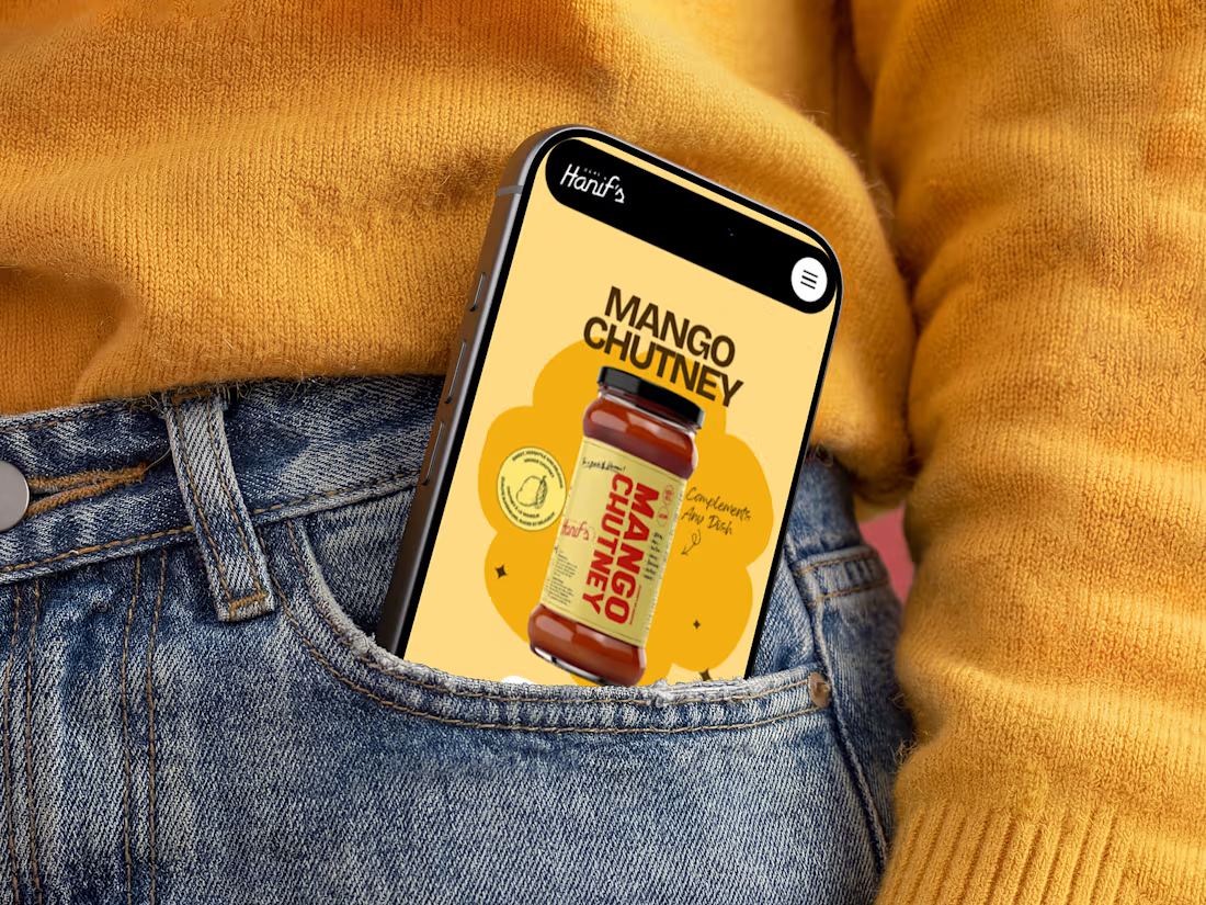
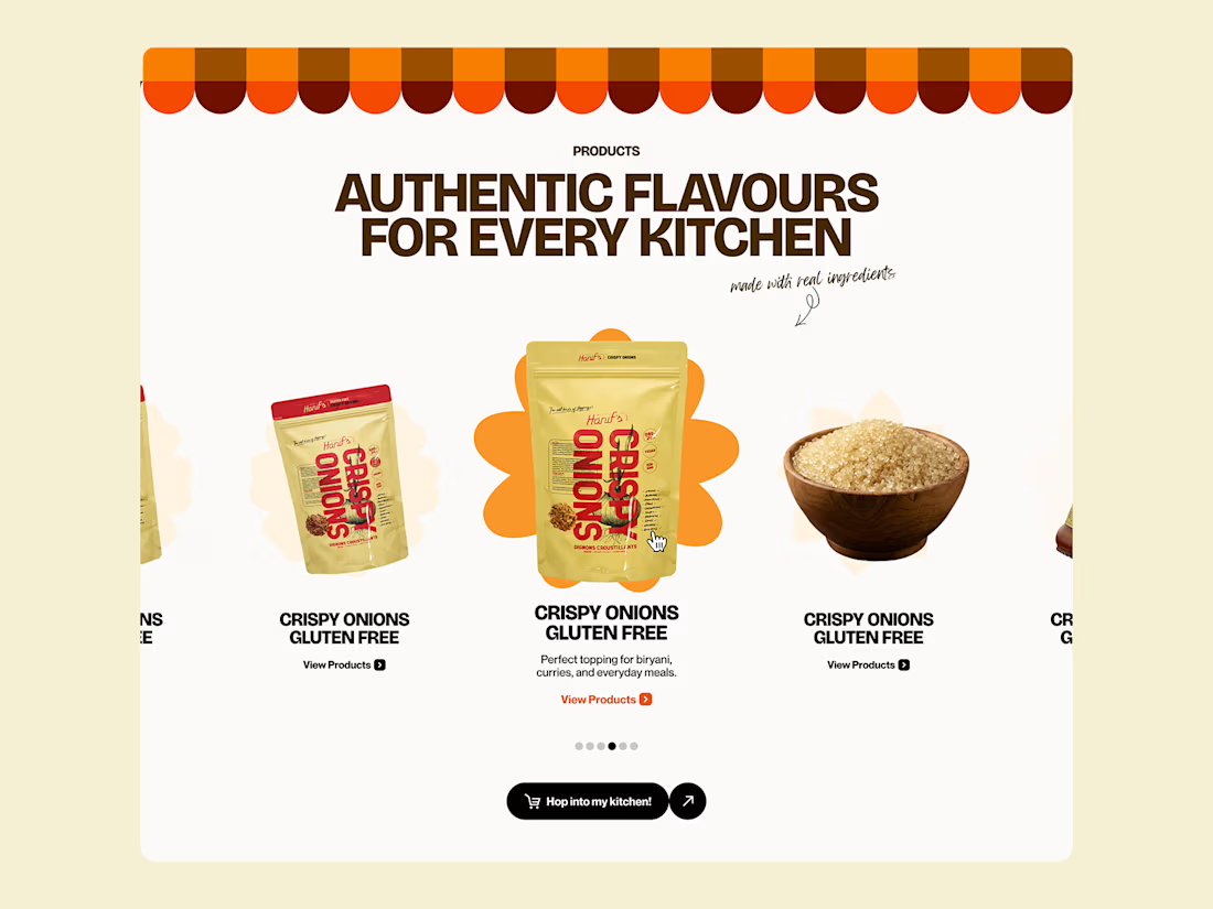
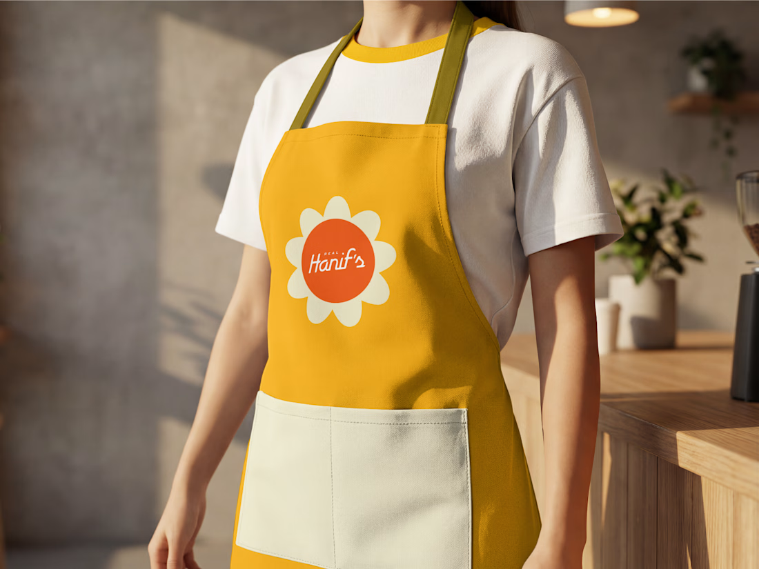
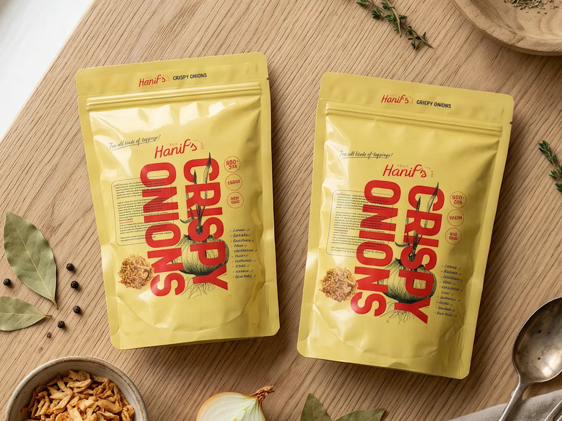

Great work, Anush! Loving the vibrant color palette and how smoothly the identity scales from packaging to apparel. The packaging designs look clean and high-end.


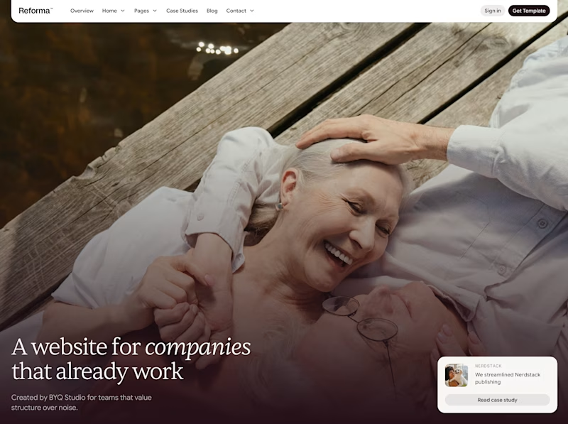


Added a new case study that I'm so excited to share!
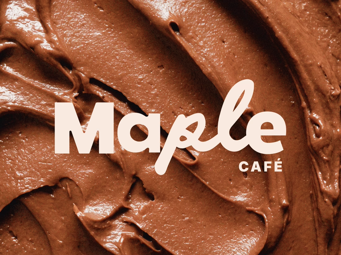
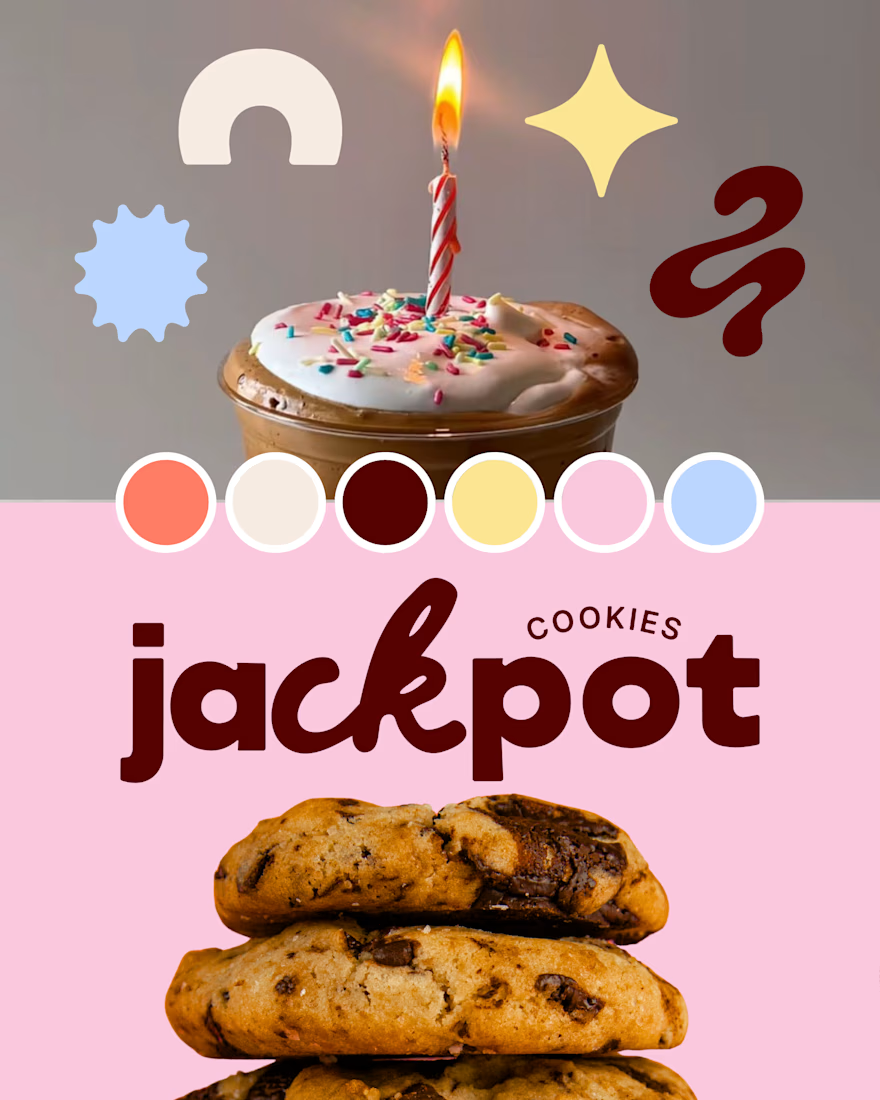
This one started as an unused creative direction from a previous branding project that I still really loved, so I decided to give it a new life as Maple Café.
Swipe to see where it started → and how I adapted the original direction into a playful, nostalgia-inspired café brand with bold typography, warm colors, and celebratory details throughout.