The network for creativity
Join 1.25M professional creatives like you
Connect with clients, get discovered, and run your business 100% commission-free
Creatives on Contra have earned over $150M and we are just getting started
Back to feedPost


The network for creativity
Join 1.25M professional creatives like you
Connect with clients, get discovered, and run your business 100% commission-free
Creatives on Contra have earned over $150M and we are just getting started











Related posts

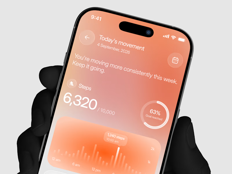
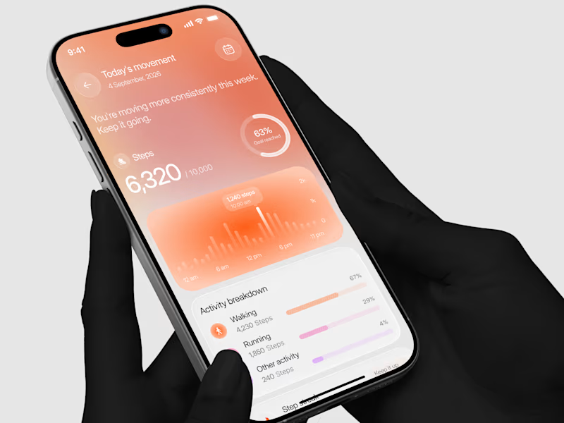
Designed a step tracking screen where you can see your daily progress and weekly trend in one glance.
Same screen, two shots. Which one would stop your scroll? 👀

11 voted
73%
4 voted
27%
15 votes
Closed


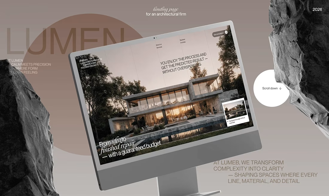
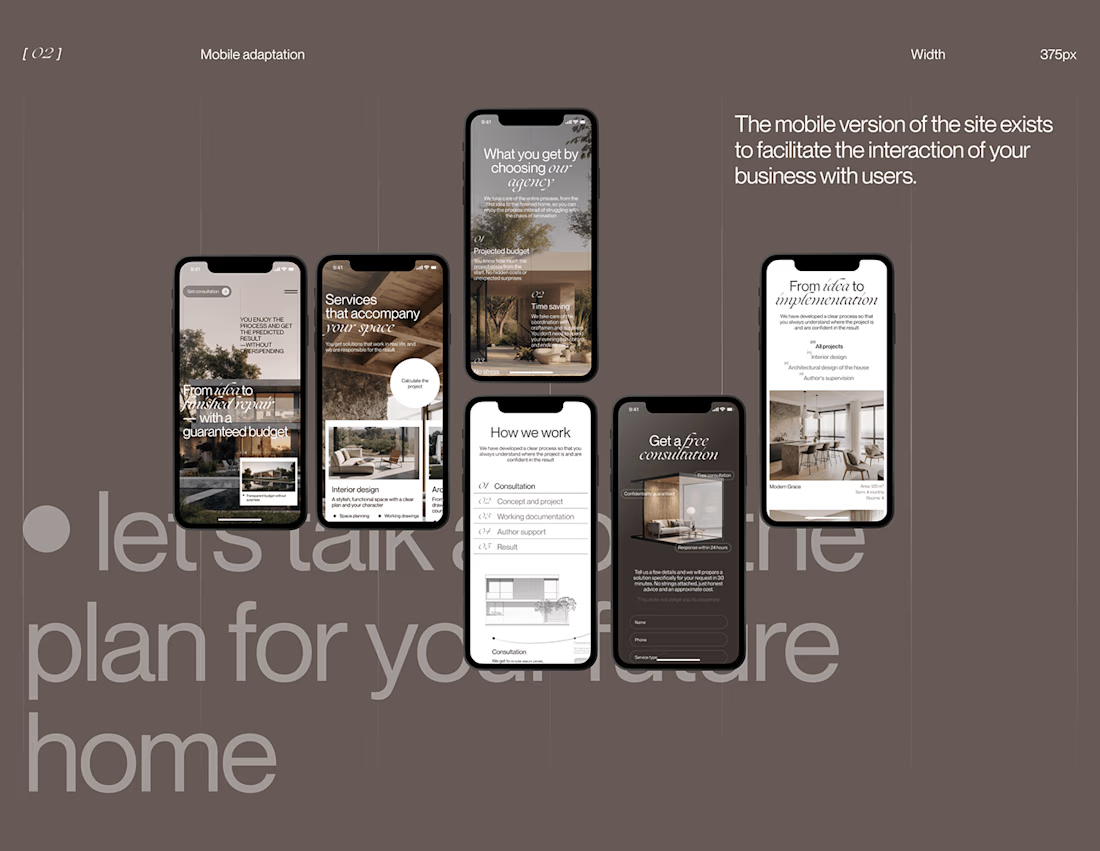
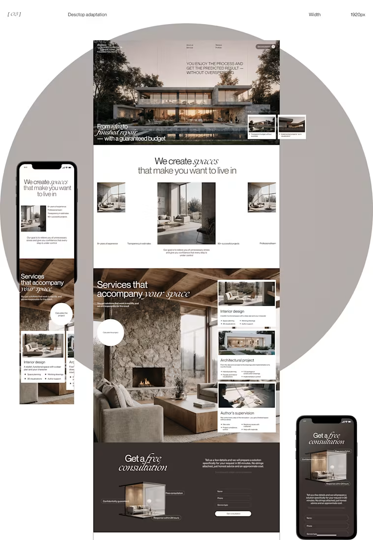
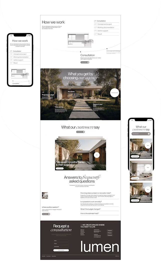
Lumen — UX/UI Design for a Premium Architecture Studio
Sometimes, the smallest details are what give a design its personality.
For Lumen, I found myself exploring how typography, architectural photography, colour, and layout could work together to tell a story before someone even starts reading.
I played with oversized text, warm brown tones, editorial layouts, and a mobile experience that carries the same visual character as the desktop design.
I especially enjoyed putting the mobile screens together. Seeing the different sections come to life on a smaller screen made the whole concept feel more complete.
It's always interesting to see how different creative decisions can change the way people experience a brand.
What's one design detail that can make you appreciate a website even before you've explored everything?
#WebDesign #CreativeDesign #UIUXDesign #Architecture


i love this soooo wellllll, i just said welll with 4 l's thats how good this is

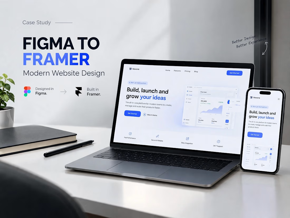
A modern SaaS website concept designed in Figma, featuring clean layouts, intuitive navigation, consistent visuals, and a user-friendly experience across different screen sizes.