The network for creativity
Join 1.25M professional creatives like you
Connect with clients, get discovered, and run your business 100% commission-free
Creatives on Contra have earned over $150M and we are just getting started
Back to feedPost

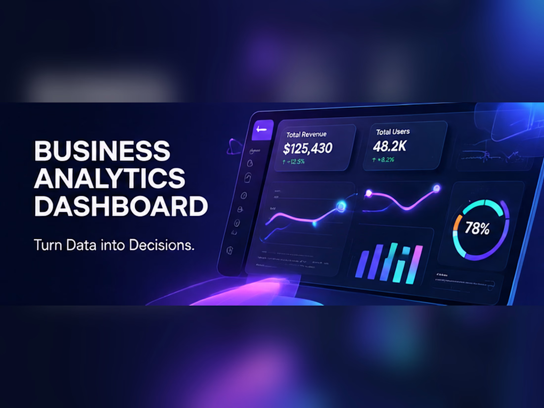
A business intelligence dashboard concept designed to present key performance indicators through clear data visualisations and an organised interface. The project focuses on readability, information hierarchy and actionable insights, making complex business information easier to understand.
Deliverables: KPI cards, sales charts, performance trends, filter concepts and dashboard layout.


The network for creativity
Join 1.25M professional creatives like you
Connect with clients, get discovered, and run your business 100% commission-free
Creatives on Contra have earned over $150M and we are just getting started






Related posts

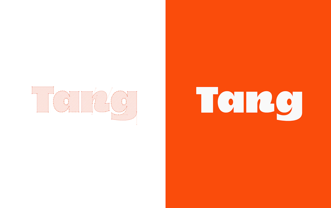
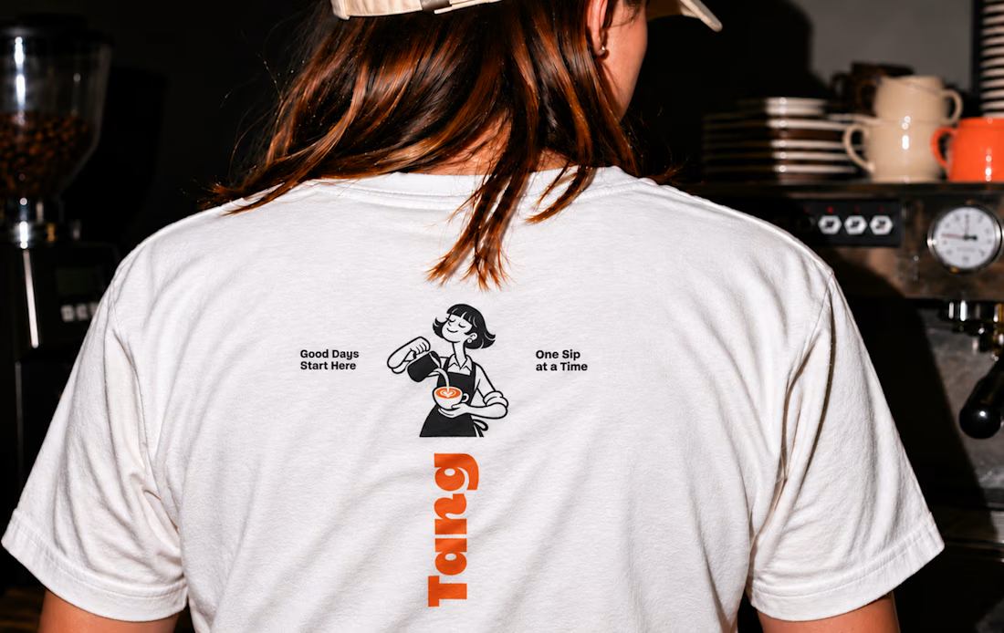
Tang - Café Brand Identity
A warm, playful café identity built around the idea “Good Days Start Here.”
Bold typography, illustrated café characters, and an orange-and-cream palette connect the brand across takeaway cups, packaging, menus, and apparel. The art direction captures the atmosphere of coffee shared over conversation.
Scope includes visual identity, packaging, menu design, apparel graphics, and art direction.




T O P!!

Dashboard design for AllWays Holiday.
Clarity is what makes a good dashboard.
Every section, metric and action should help users understand what's happening and what needs their attention.
Designed to make managing travel operations easier.
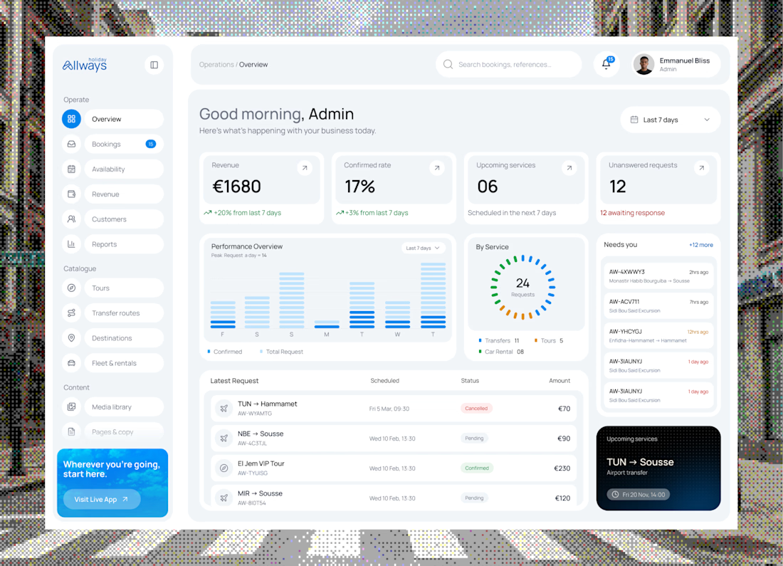

"What needs their attention" is the part most dashboards miss. Clean KPI cards up top, then the list below makes it easy to act. Did you consider pulling urgent bookings or issues into their own highlighted block, so ops teams see problems before they scroll?


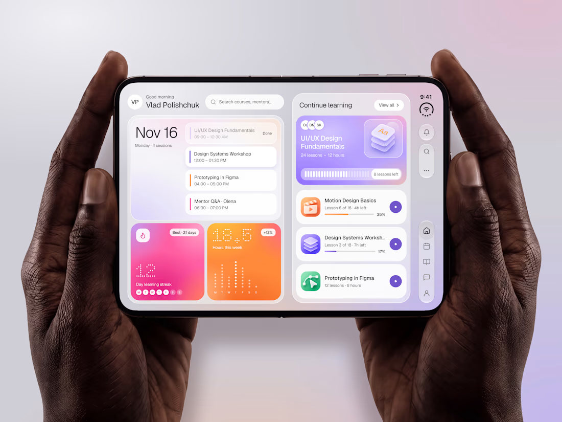

The purple gradients keep learning lively and fun.