The network for creativity
Join 1.25M professional creatives like you
Connect with clients, get discovered, and run your business 100% commission-free
Creatives on Contra have earned over $150M and we are just getting started
Back to feedPost

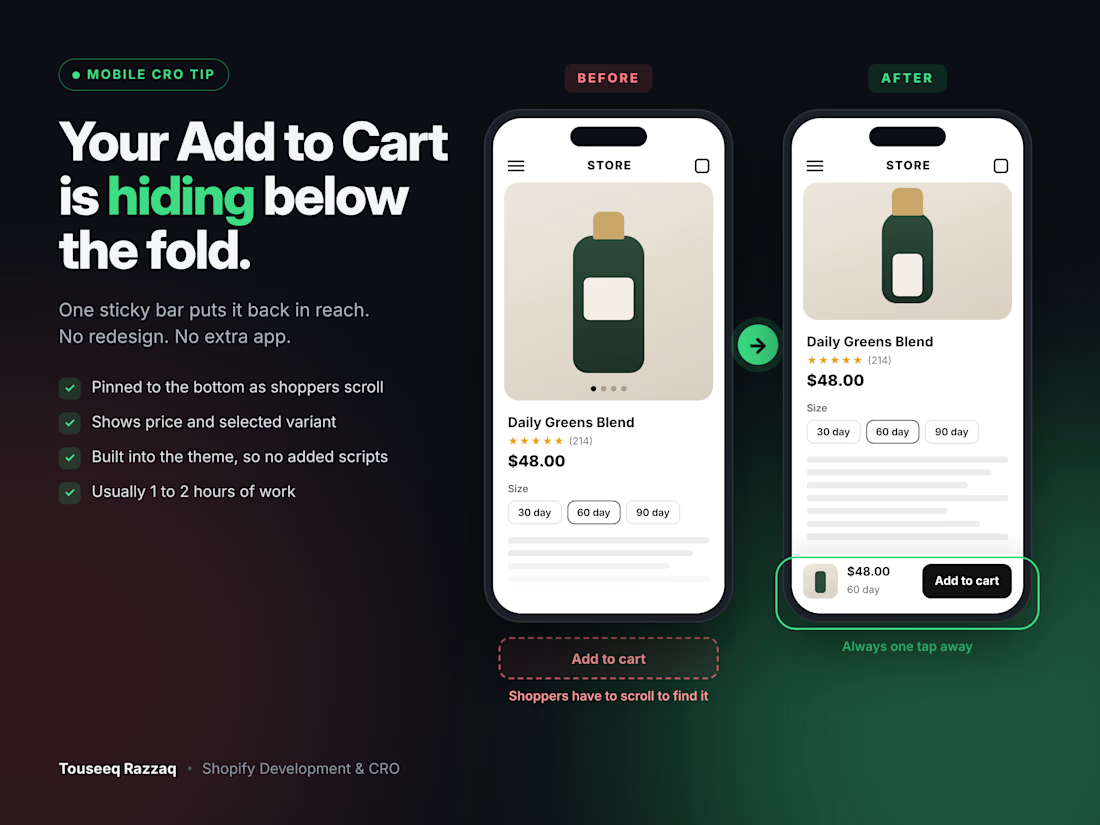
Your Add to Cart button might be the reason mobile sales feel flat.
On most Shopify product pages I audit, it sits under a tall image gallery, variant pickers and a wall of description. On a phone, shoppers have to scroll before they can even buy.
The fix is small: a sticky Add to Cart bar.
→ Stays pinned to the bottom of the screen as shoppers scroll
→ Shows price and the selected variant, so there's no guessing
→ Only appears once the main button scrolls out of view
→ Built into the theme, so no extra app slowing the page down
It's usually an hour or two of work, and it's one of the quickest wins I find in audits.
Quick test: open your best-selling product on your phone. Can you tap Add to Cart without scrolling? Tell me in the comments.
Still doing free mini-audits this week. Drop your store URL below and I'll send a short video with the first 3 fixes I'd make.
The network for creativity
Join 1.25M professional creatives like you
Connect with clients, get discovered, and run your business 100% commission-free
Creatives on Contra have earned over $150M and we are just getting started



Related posts

LUXE Furnish Studio is ready!!
I designed & built LUXE - a premium furniture brand on Shopify.
The goal was simple: Make it feel like a luxury showroom, not just an online shop.
What I did:
Clean, premium homepage with luxury branding
Curated collections: Sofas, Chairs, Tables & Decor
High-converting product pages with clear pricing & Add to Cart
Fully mobile-responsive - looks perfect on phone & desktop
Fast, clean navigation for easy shopping
Built on Shopify with a premium, minimal aesthetic focused on conversions.
If you need a luxury Shopify store that actually sells - let's build yours.
Live Demo: luxe-furnish-studio.myshopify.com
Password: 00
Services: Shopify Store Design, Shopify Development, E-commerce UI/UX

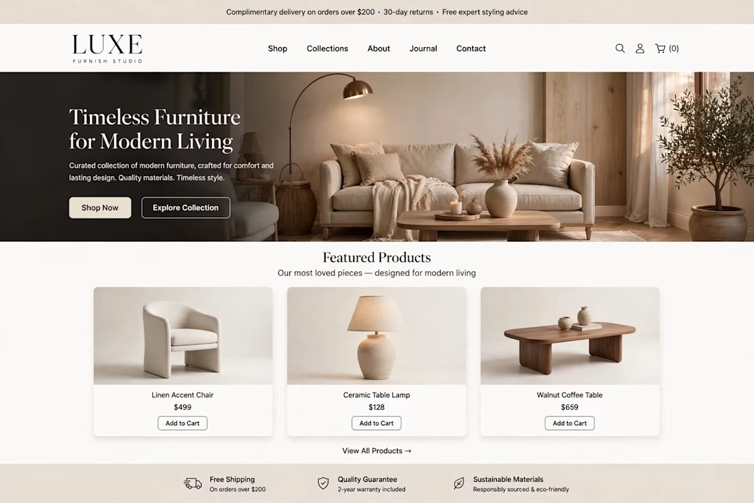
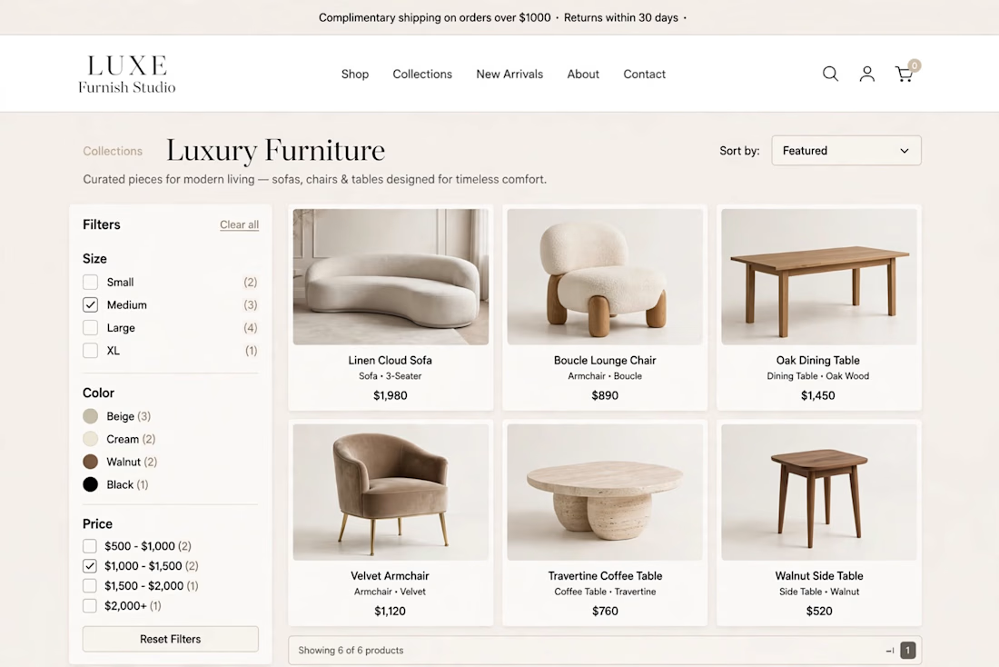
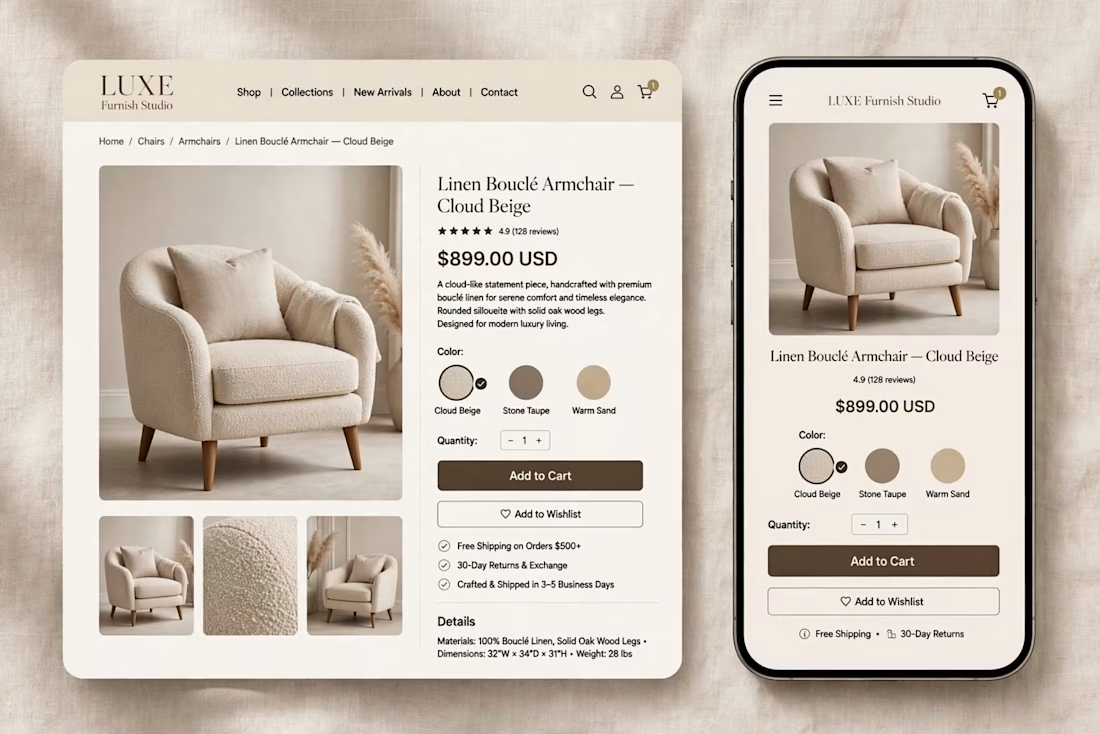

The warm beige palette and the sofa hero with the arc lamp feel like a real showroom, and the mobile product page keeps the same calm look. Which part took longer, the homepage or the product page?

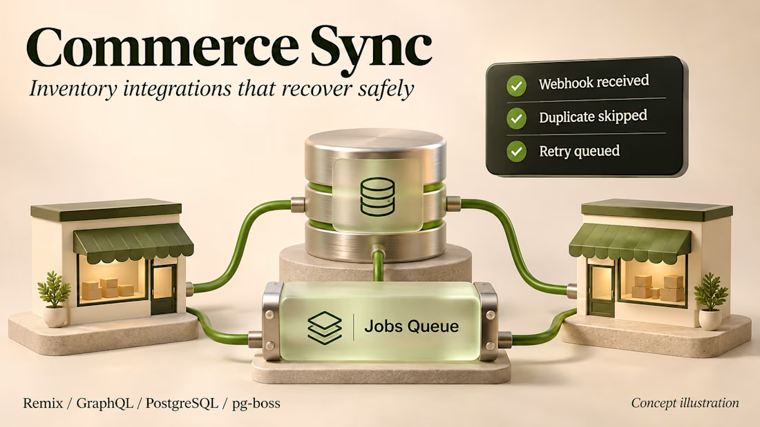
A duplicate webhook should not change inventory twice.
Commerce Sync is my multi-store Shopify integration example. Product changes move between storefronts, and inventory updates make their way back to the parent store.
The part I care about is what happens when something fails. PostgreSQL catches duplicate deliveries, pg-boss keeps jobs durable, and separate workers handle throttling and retries. Partial syncs have a rollback path.
I put the architecture and implementation decisions in the case study below. Client details are removed, and the render is a concept illustration.
I am taking on Shopify app integrations and backend maintenance, remotely from India, up to 20 hours a week.


I designed and built the Shopify store for Youegos ✨
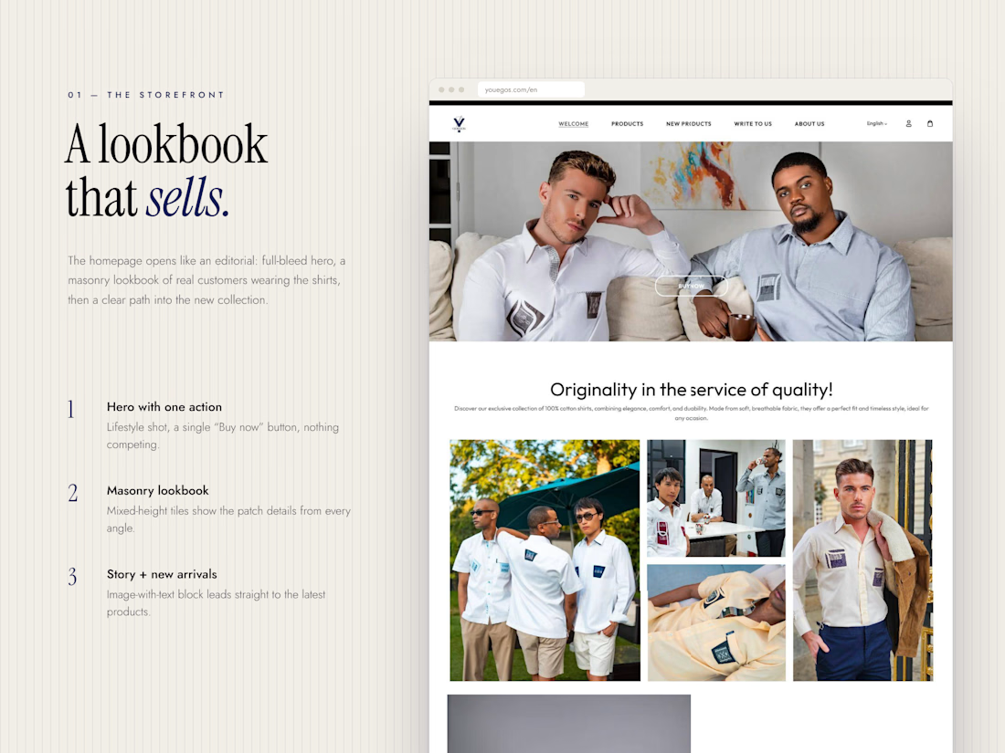
Youegos makes premium 100% cotton shirts in France, and each style carries its own woven patch details on the pocket, the chest or the collar. Those details are what make the brand, so the website had to put them front and centre.
So I built the store around that:
→ A homepage that opens like a lookbook, with real people wearing the shirts and every patch in focus
→ A product page that answers every “should I buy this?” question up front: size, stock left, delivery time and free returns
→ “Shop the Look” sections that turn lifestyle photos into products you can click straight into
→ A full French and English version, so the brand can sell beyond France
A premium product deserves a storefront that feels just as premium.
👇 When you’re buying clothes online, what makes you trust a brand enough to check out: the photos, the reviews, or the return policy?
https://contra.com/p/RFYogQQL-youegos-shopify-store-design-and-development?referralExperimentNid=DEFAULT_REFERRAL_PROGRAM&referrerUsername=muhammad_hammad_afkei70w