The network for creativity
Join 1.25M professional creatives like you
Connect with clients, get discovered, and run your business 100% commission-free
Creatives on Contra have earned over $150M and we are just getting started
Back to feedPost

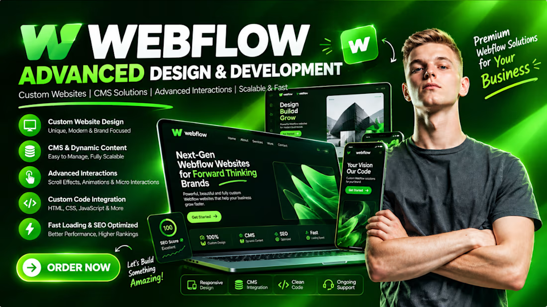
🚀 Need a High-Converting Webflow Website?
Your website is more than just a design — it’s your digital first impression.
I help businesses, startups, agencies & personal brands build premium Webflow websites that are:
✨ Modern & Custom Designed
⚡ Fast & Performance Optimized
📱 Fully Responsive on All Devices
🎨 Pixel-Perfect & Brand Focused
🔄 CMS & Dynamic Content Ready
💫 Advanced Animations & Interactions
💻 Custom HTML, CSS & JavaScript Integration
🔍 SEO-Friendly & Scalable
Whether you need a landing page, business website, portfolio, SaaS website, agency website, or a complete Webflow redesign, I can turn your idea into a professional web experience.
Your idea → My Webflow expertise → A website built to impress & convert.
📩 Have a Webflow project in mind? Let's build something amazing.
#Webflow #WebflowDeveloper #WebflowDesigner #WebDesign #WebDevelopment #WebsiteDesign #WebflowExpert #UIUX #LandingPage #FigmaToWebflow #ResponsiveWebDesign #NoCode #FreelanceDeveloper
The network for creativity
Join 1.25M professional creatives like you
Connect with clients, get discovered, and run your business 100% commission-free
Creatives on Contra have earned over $150M and we are just getting started



Related posts


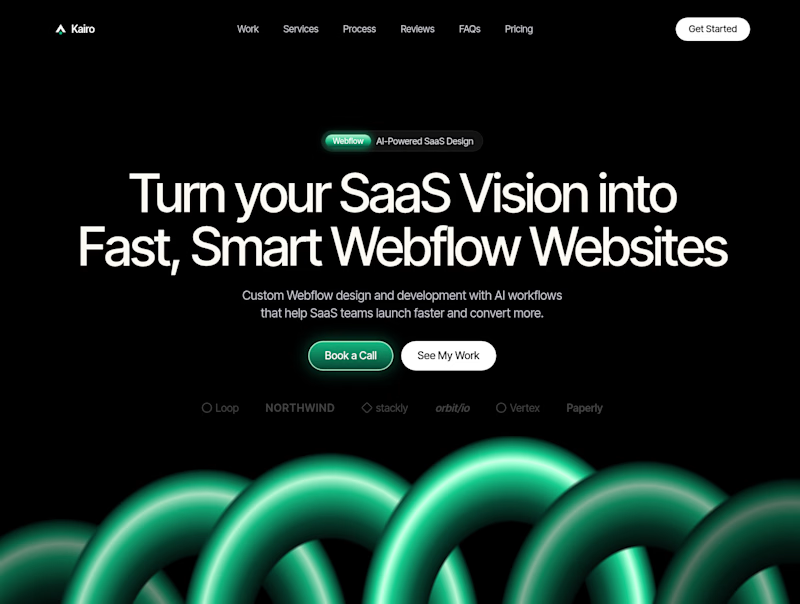
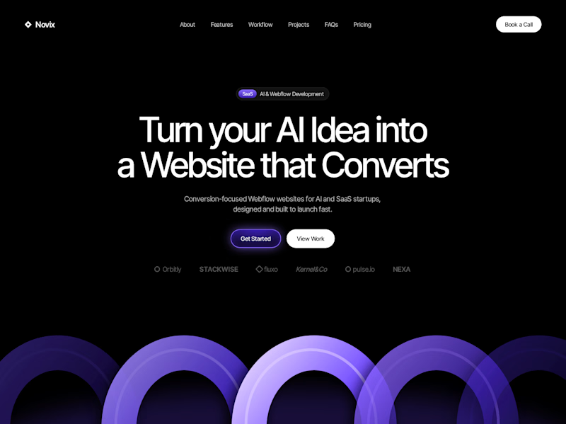

Both look great, but Violet & Black gets my vote! The purple accents give it a more modern, premium feel while keeping the design clean and focused on conversions. Amazing how a color change can create such a different brand personality. Have you tested which version performs better with visitors?


Spline 3D plus GSAP inside Webflow without the site feeling heavy is no small thing. The product interactions in this reel are really clean, Toqir.

Many tries for one effect. That's the honest story of the Inward headline
Inward is a concept landing page I made for noise-cancelling headphones. I wanted the words NOISE TO FOCUS to react to the cursor
Particles came first. Glitch with doubled letters broke reading. Grain was next, then crumbs, which felt dirty. Halftone was too graphic
I went back to particles, made them gentler and kept them only under the cursor. That one stayed
The video shows every version, one after another
None of the dropped versions were wasted. Each one showed what the product didn't want
Which version would you have shipped?

Super cool!