The network for creativity
Join 1.25M professional creatives like you
Connect with clients, get discovered, and run your business 100% commission-free
Creatives on Contra have earned over $150M and we are just getting started
Back to feedPost

My project was Best Selling Price at PlatinumRx.
During a user call, I asked a user if they faced any UI/UX problems in our app. The user said that the design was fine, but offers were more visible on other medicine apps.
So, we worked on making our savings more visible to users.
I designed an experience where users could see the medicine price, applicable PRx coins, coupon discounts, prepaid discounts, and Edge cashback separately.
This helped users understand how much they had to pay now and how much cashback they could get later.
The goal was to improve price transparency, build user trust, and increase conversion.



The network for creativity
Join 1.25M professional creatives like you
Connect with clients, get discovered, and run your business 100% commission-free
Creatives on Contra have earned over $150M and we are just getting started
Related posts

Designed a premium audio e-commerce storefront for VickMix 🎧
From the bold headphone hero section to product listings, audio technology highlights, and a clean product-focused layout, every section is designed to showcase the products and make browsing effortless.
What do you think of this design? Would you keep the minimalist look or make it more colorful? 👇


I'd keep it minimal. The grey palette lets the headphones do the talking.


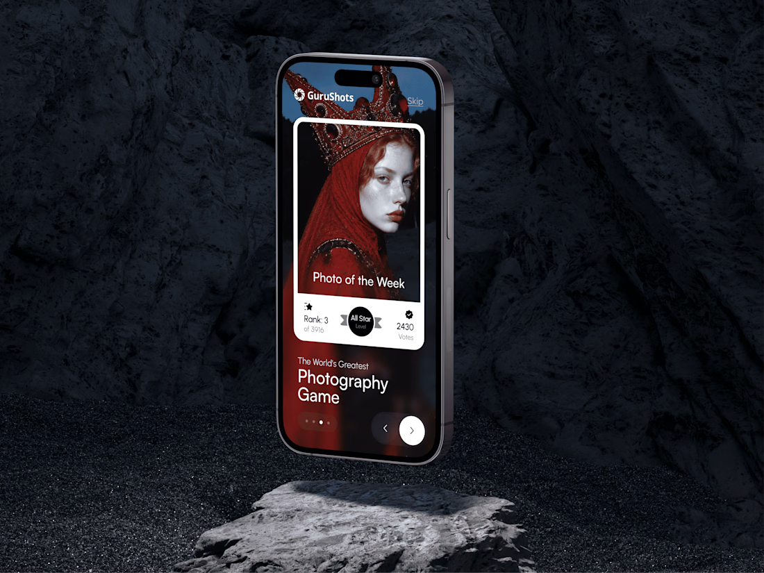
A new day, a new design to share! 📸
This time it is a photography challenge app that brings creativity and competition together through contests, voting, and gamification. What do you think of this one? ✨


A clean design. A seamless shopping experience. A Abaya Shopify store built around the brand. ✨
What do you think of this Jennifer Shopify storefront redesign?
What would you improve or keep as it is? 👇

Well Structured Layout that match the Abaya product Style. Keep up the great Work💯