The network for creativity
Join 1.25M professional creatives like you
Connect with clients, get discovered, and run your business 100% commission-free
Creatives on Contra have earned over $150M and we are just getting started
Back to feedPost
Taste Test

Which store would make you buy the cup?
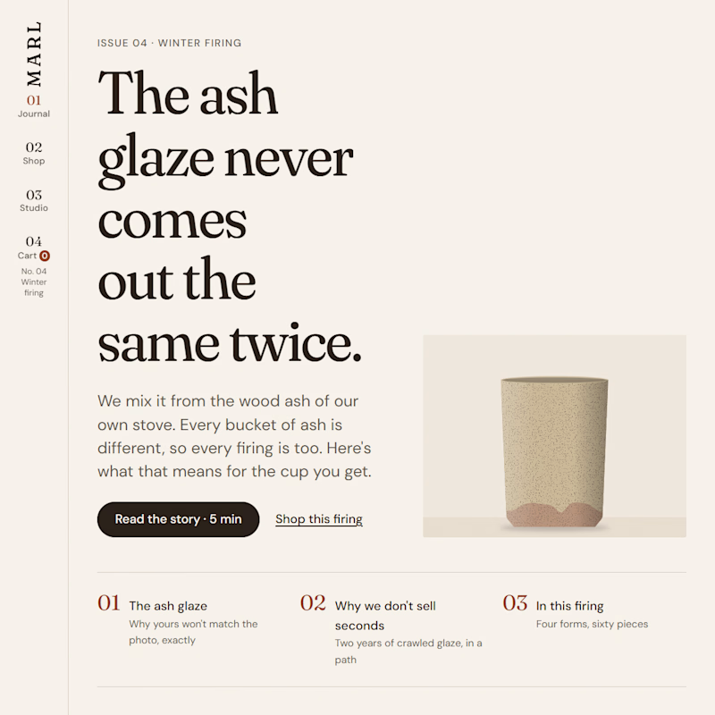
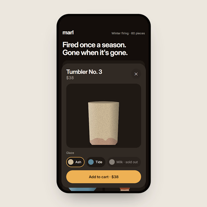
Same pottery, same cups, two completely different stores. MARL is a small pottery that doesn't exist, and this time there's no 3D at all, every cup is drawn in code.
A is a magazine. Every firing is a new issue, and the cups sit inside the story of how they were made.
B is a pocket app. Tap a cup and the bar at the bottom grows into the product, pick a glaze, and it folds right back into your cart.
Which one would you actually buy from? Vote, then tell me why.
Both are live at tenetary.com/work/three-directions, next to a third direction I left out of the vote.

2 voted
100%
0 voted
0%
2 votes
Closed

Love the clarity here. Thanks for sharing.

A, and the headline is what won me: "The ash glaze never comes out the same twice" already works as a launch email subject. If every firing is an issue, the list becomes where people wait for the next one. B is the easier checkout on a phone, though.
Very good points, that's why I made MARL in 3 different designs to show off my versatility, rather than the same template and colors every time.
Three directions for the same brand says more than three different projects would. It shows how you think, not just how you style.
The network for creativity
Join 1.25M professional creatives like you
Connect with clients, get discovered, and run your business 100% commission-free
Creatives on Contra have earned over $150M and we are just getting started






Related posts


Should a personal brand hero lead with the name or the promise?
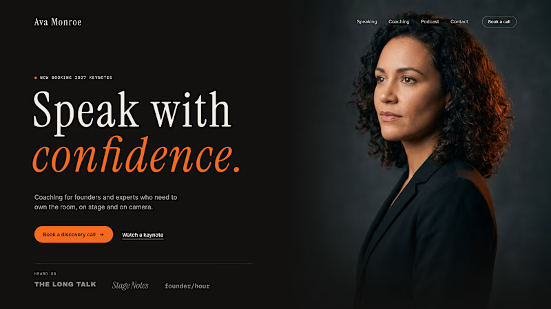
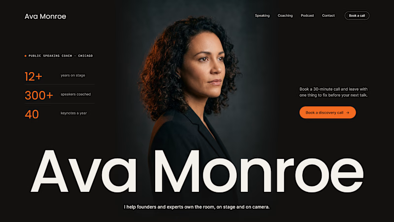
A client of ours is a speaking coach. People find her by name: podcasts, stages, word of mouth. Yet her first hero hid that name in the top-left corner.
We tested two directions:
The promise first. "Speak with confidence" in big type, the name small in the nav. Clear, but it could be any coach on the internet.
The name first. Her name at billboard scale, the promise in one line above it, her face right behind. Someone arriving from a podcast knows instantly they're in the right place.
When people search for you, your name is the headline.
Which one would you ship for a personal brand?
43 voted
51%
42 voted
49%
85 votes
Closed

Name first — podcast listeners arrive looking for her.

Lime Cream or Peach Fuzz? 🍋🟩🍑
Two animated isometric sets — same system, different mood. Cast your vote 👇
68 voted
78%
19 voted
22%
87 votes
Closed

Lime Cream. The dark linework pops more on it.

two brands, one tiny taste test.
would you rather look through an Oriel or answer a Calling?
winner gets the full brand. reply with your pick.
35 voted
85%
6 voted
15%
41 votes
Closed

The biggest misconception about branding is thinking it's just a logo. What actually saves founders time and money later is a compact system a focused 2–3 color palette and clear sub-brand rules so every new deck, social post, or product launch looks cohesive without starting from scratch.