The network for creativity
Join 1.25M professional creatives like you
Connect with clients, get discovered, and run your business 100% commission-free
Creatives on Contra have earned over $150M and we are just getting started
Back to feedPost

My PX Adoption Diagnostic™: Finding the gaps between product value and user adoption
A product can have great features and still struggle with activation, engagement, and retention.
Why?
Because building value and helping users realize value are two different challenges.
That’s why I developed my PX Adoption Diagnostic™, based on my PX Adoption Engine™ framework.
I look beyond individual screens and ask:
→ Can users quickly understand the product’s value?
→ Where do they lose momentum during onboarding?
→ What prevents them from reaching their “aha” moment?
→ Which features are difficult to discover, understand, or trust?
→ Where does friction appear across key user journeys?
→ What could be contributing to drop-off and weak retention?
→ For AI products: do users understand and trust what the AI is doing?
My diagnostic looks across 4 connected areas:
1. Experience
Where usability, clarity, and journey friction affect the product experience.
2. Onboarding
How effectively the product moves users from first interaction toward meaningful activation.
3. Learning
Whether users have the guidance and context they need to understand the product and its capabilities.
4. Adoption
What helps—or prevents—users from repeatedly using valuable features and building lasting product habits.
The outcome isn't just a list of UX problems.
It is a structured view of adoption barriers + prioritized opportunities + practical recommendations that product teams can use to improve activation, feature adoption, engagement, and retention.
I see this as the space between:
UX → Learning → Adoption → Growth
Especially for SaaS, AI, EdTech, HealthTech, FinTech, and enterprise digital products.
If you're wondering “Why aren't users getting the value we're building?”, that is exactly the question I designed the PX Adoption Diagnostic™ to investigate.
🔎 Get your PX Adoption Diagnostic™:
rishniperera.com/get-px-adoption-diagnostic/
#ProductExperience #ProductAdoption #UXStrategy #ProductDesign #SaaS #AI #Onboarding #Retention #ProductGrowth
The network for creativity
Join 1.25M professional creatives like you
Connect with clients, get discovered, and run your business 100% commission-free
Creatives on Contra have earned over $150M and we are just getting started
Related posts

BUCX — Online Rewards & Offers Mobile App
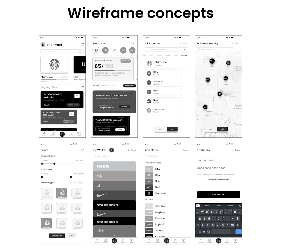
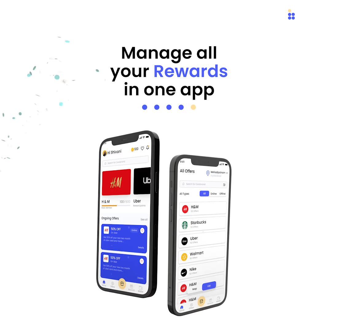
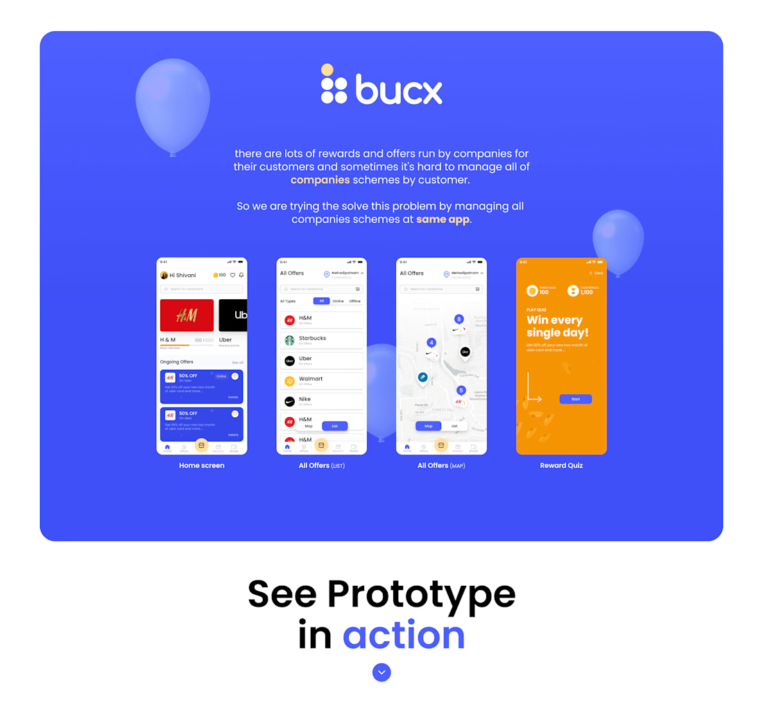
I designed the UI/UX for BUCX, a mobile application that brings rewards, coupons, and promotional offers from multiple brands into one platform.
The main challenge was simplifying different loyalty programs into a single, intuitive experience where users could easily discover offers and manage rewards.
What I designed:
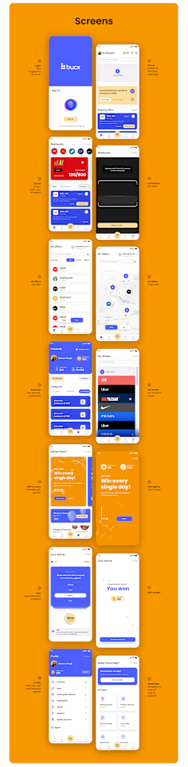
Personalized dashboard: Displays reward points, ongoing offers, and featured brands.
Offer discovery: List-based browsing with online and offline offer filters.
Location-based offers: Interactive map interface for discovering nearby promotions.
Reward quiz: Gamified experience designed to encourage daily engagement.
Rewards management: Organized navigation for accessing offers, rewards, and wallet features.
Interactive prototype: Created connected mobile screens and user interactions in Figma.
My role: UI/UX Design, Mobile App Design, Interaction Design, and Figma Prototyping.
https://www.behance.net/gallery/150992309/BUCX-online-rewards-app


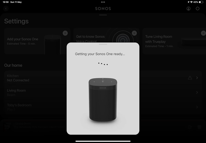
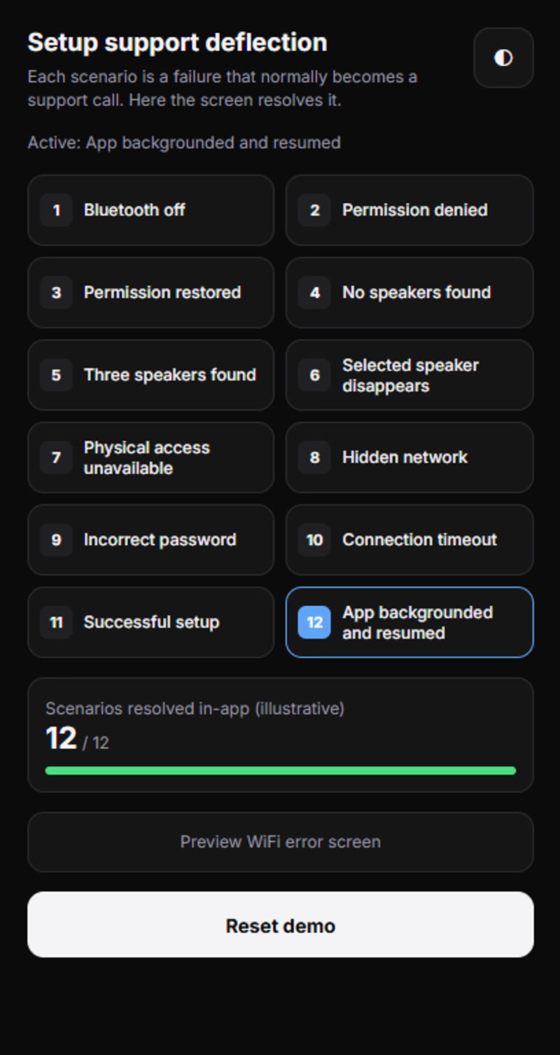
12 Scenarios. 1 Mission: Make Setup Friction Disappear. | SONOS UX
What if a setup failure didn't mean the end of the experience? 🎵
I turned 12 frustrating setup scenarios into 12 opportunities for a smarter, smoother user experience.
No generic error loops. Just clearer guidance, smarter recovery, and better product thinking.
This is what happens when design meets problem-solving. ⚡
Curious? Explore the project, test the demo, and tell me what you think!
If this inspires you, share it with your design community. 🤝
Want to experience it yourself? The live demo link is waiting for you in the comments!
— Arif Khan | Design Forensics
0 voted
1%
0 voted
1%
0 votes
Closed

Designing for the setup failure instead of just the happy path is the right call, since that is where people get frustrated. Which of the 12 scenarios turned out to be the hardest to make feel smooth?

Your SaaS product might be solving the wrong problem. And most designers don't realize it.
Before jumping into Figma, designing dashboards, or creating beautiful interfaces, there's something much more important to understand.
The difference between a Business Problem and a User Problem.
In Part 01 of my SaaS Product Design Masterclass, I'm breaking down:
🔹 1.1 — Start with the Business Problem
🔹 1.2 — Understand the Business Impact
🔹 1.3 — Identify the User Problem
🔹 1.4 — How Business Problems and User Problems are connected, but different.
Here's an important thought:
A business wants to achieve a goal.
A user wants to solve a problem.
Great digital products understand both.
This is where meaningful product differentiation begins — not with UI, but with problem understanding.
🎯 This is Part 01 of my 10-hour practical SaaS Product Design series, where I'll walk through the complete process of understanding and designing a SaaS product.
If you're a UX/UI Designer, Product Designer, aspiring designer, or SaaS founder, this series is for you.
One question: Do you start your design process with business problems or user problems?
Share your thoughts below!
#SaaSProductDesign #UXDesign #ProductDesign #UXResearch #DigitalProduct


Useful way to explain it.