The network for creativity
Join 1.25M professional creatives like you
Connect with clients, get discovered, and run your business 100% commission-free
Creatives on Contra have earned over $150M and we are just getting started
Back to feedPost

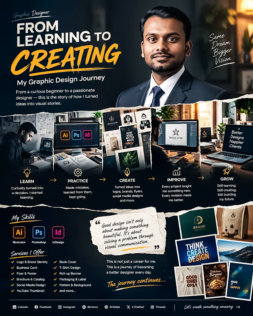
From Learning to Creating. My Graphic Design Journey 🎨
Every designer has a beginning.
Mine started with curiosity, uncertainty and a simple decision: I wanted to learn how to turn ideas into communication.
At the beginning I didn't know everything. I made mistakes struggled with typography, colors, layouts, software and countless small details that experienced designers make look easy.
I kept learning.
Step by step I improved my skills in Adobe Illustrator, Photoshop and InDesign. I started creating logos, branding materials, flyers, social media designs, packaging, thumbnails, posters and many other visual projects.
The biggest lesson I have learned is this:
Good design's n't only about making something beautiful. Good design is about solving a problem through communication.
Every project has taught me something. Every revision has made me better. Every difficult brief has pushed me to think creatively.
Today I’m still learning, still experimenting and still improving.
My journey isn't finished—. Thats what makes it exciting.
I’m building my career one design, one project and one client relationship at a time.
This is not a career, for me. This is a journey of becoming a designer every day.
If you're also building something from zero remember:
Start where you are. Learn what you don't know. Keep creating. Don't stop.
🚀 The journey continues.
#GraphicDesigner #GraphicDesign #DesignJourney #CreativeJourney #DesignerLife #AdobeIllustrator #AdobePhotoshop #AdobeInDesign #BrandIdentity #LogoDesign #FreelanceDesigner #CreativeDesigner #DesignPortfolio #VisualCommunication #Freelancing


The network for creativity
Join 1.25M professional creatives like you
Connect with clients, get discovered, and run your business 100% commission-free
Creatives on Contra have earned over $150M and we are just getting started











Related posts

Second Serve Club — Exploring Visual Identity Through AI & Design.
For this branding challenge, I created a series of original logo marks in Adobe Illustrator, inspired by vintage tennis culture.
I then explored how these designs could come to life by combining my own typography, monograms and colour identity with AI-generated visuals using ChatGPT.
From the texture of a clay court to embroidered details on tennis balls, the goal was to bring the brand identity into a more tangible, realistic setting.
An exploration of how traditional graphic design and AI can work together to create a cohesive visual world.
Designed by me. Visualised with AI. 🎾
Full brand identity case study coming soon.
#BrandIdentity #VisualIdentity #GraphicDesign #AIDesign #ChatGPT
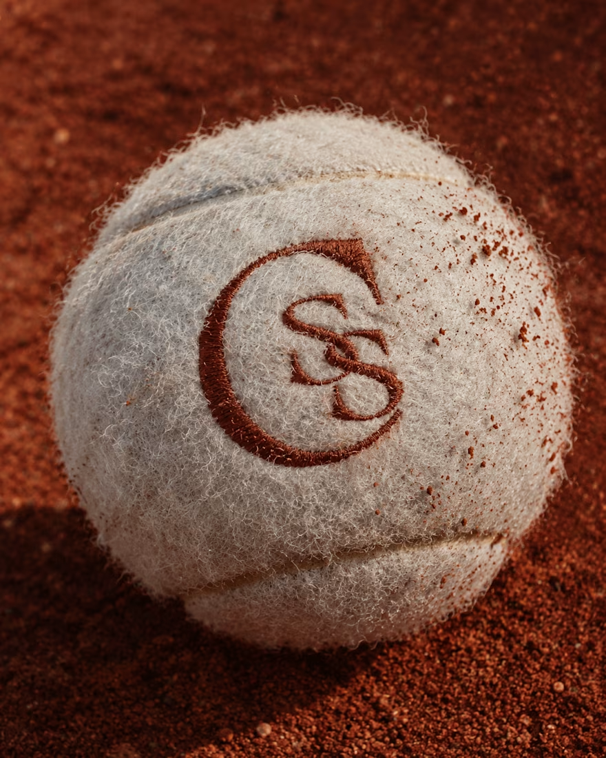

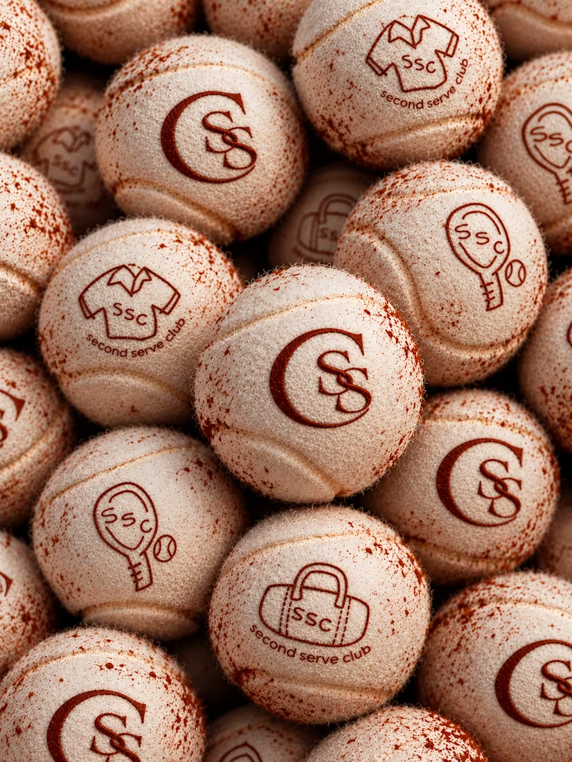

The SS mark stamped into the tennis ball felt is a great detail. Looks very real on the clay court.


HEATD is a heated Pilates and yoga studio in Mableton, Georgia. The name already said it all, so we made one decision from day one: the heat would be the whole brand 🔥
Amazing project and amazing team.
Collab with @gerbzagency

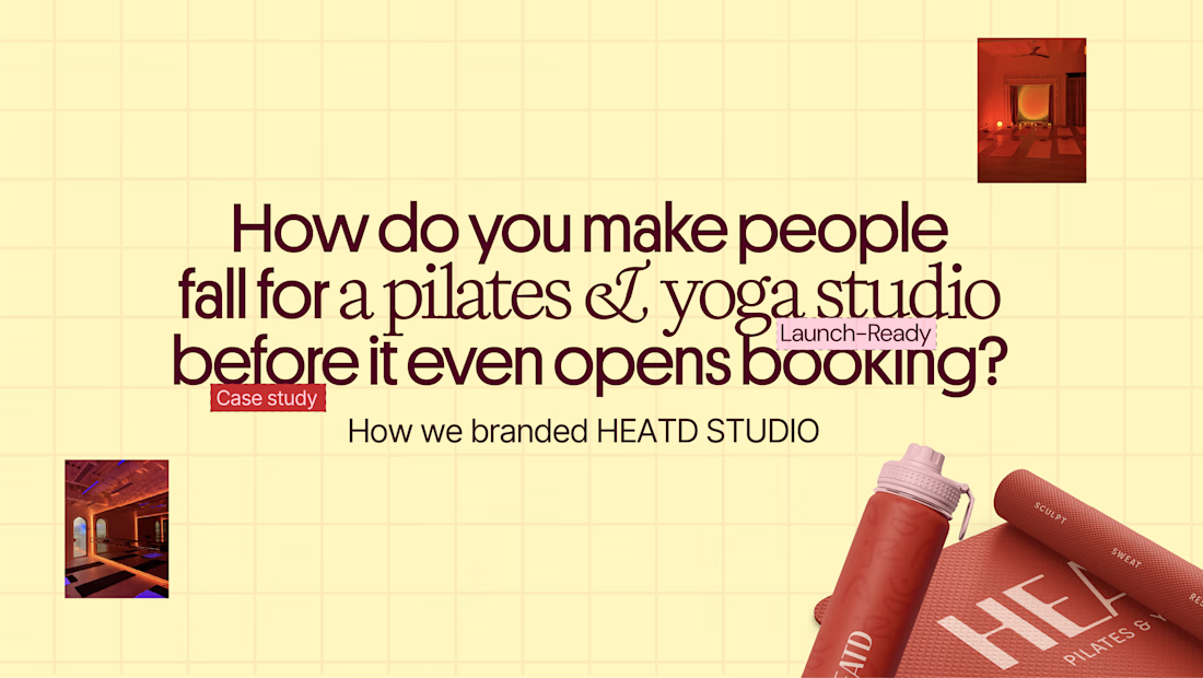
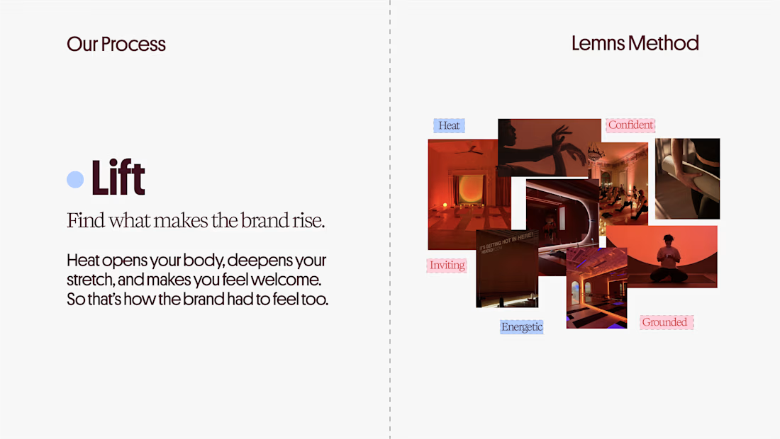
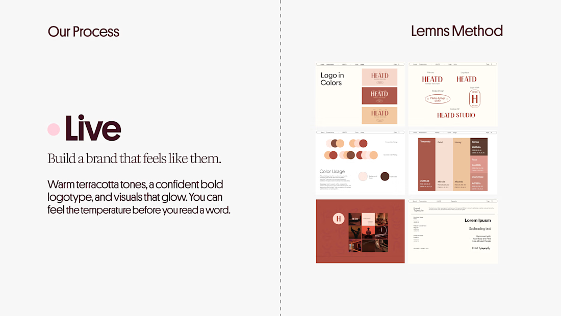
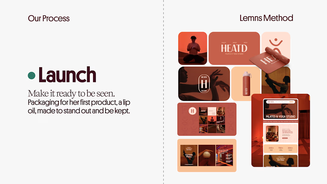

Curious how the terracotta palette got settled here: did the colour come first and the type follow, or the other way round? The heat idea reads as much through the warm tones as through the name itself.

Finally a Contra Top Independent!
Been part of this community for a few years now, sharing my work, joining challenges, meeting some great people, and even picking up a few wins along the way.
I've genuinely enjoyed being part of Contra and seeing how much the platform has grown.
This one means a lot. Big thanks to the Contra team for the recognition!
More to come!
