The network for creativity
Join 1.25M professional creatives like you
Connect with clients, get discovered, and run your business 100% commission-free
Creatives on Contra have earned over $150M and we are just getting started
Back to feedPost
I made a $3 million change to a product website.
I didn't write new copy. I didn't change the colors. I didn't redesign the whole thing.
I just made the product visible.
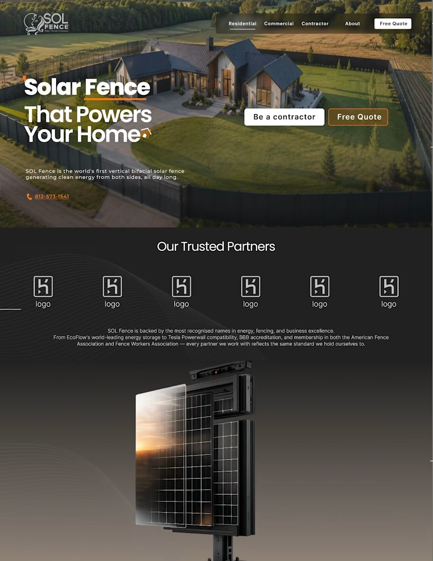
I was working on a website for a company selling high ticket solar panel fences. The product was impressive. The problem was simple.
Homeowners and contractors were being asked to spend thousands on something they couldn't fully see or understand.
So I used AI to generate an exploded 3D diagram of the fence panel — pulled apart layer by layer. Every component. Every layer. Right there on the page.
Because here's what I've learned about expensive products:
People don't buy what they can't understand.
A contractor needs to see what he's installing before he commits.



You provided a solution without making it complex. This is really a smart thinking.

Thanks Shivil
The network for creativity
Join 1.25M professional creatives like you
Connect with clients, get discovered, and run your business 100% commission-free
Creatives on Contra have earned over $150M and we are just getting started











Related posts

A few years ago I had the chance to take a course where one of the modules was taught by a designer I really admire, Joseph Berry.

The goal was to create a website for a product, in this case, a speaker. We went through the entire process, from receiving the brief to the very last detail, even modeling the product ourselves in 3D using Spline.
I learned so much, and also got to meet great designers. It’s amazing to see how each one has a different process, and having the chance to observe that and take a bit from each way of doing things to make it your own and develop a unique result really helps you grow a lot as a professional.
I’m sharing some frames from the project, hope you like them!

Great website design visuals I like the color palette ❤️❤️
Great job Ivan🎉🎉


🌲 Nordhaus | Prefab Timber Homes Website (Framer)
Homes that grow quietly with the forest, now on the web. 🏡
Nordhaus is a website for a Latvian builder of prefabricated timber homes, created in Figma and built in Framer as a responsive site for desktop, tablet and mobile. It brings the brand's calm Nordic character through full-screen photography, a scroll-driven process story, a horizontal model gallery and interactive testimonials.
✨ Template coming soon to Framer.


Wonderful design man

I designed and built Encore, a scheduling app for a three-office orthodontic practice, then made its launch film the same way I made the app: from the real thing.
Every screen in the film is the live app, recorded on an iPhone 17 Pro simulator. I built the phones as 3D models in Rive, mapped the recordings onto their displays, and choreographed the camera, a three-phone orbit, and a closing wall of twenty screens on a single Rive timeline. No mockups, no After Effects. Swap a screen or retime a move and the film re-renders.


Nice work!!