The network for creativity
Join 1.25M professional creatives like you
Connect with clients, get discovered, and run your business 100% commission-free
Creatives on Contra have earned over $150M and we are just getting started
Back to feedPost

Made a set of ad creatives for OFFSIDE, a fictional cap brand 🧢
I wanted to push a gritty street look: torn paper, blue marker accents, concrete textures. I also tested a few classic ad mechanics: first-order discount, gift packaging, a countdown drop, social proof.
It’s a practice project, so I’d really love an outside perspective. What works, what feels like too much, where does readability suffer? Constructive feedback is very welcome 🙌

The network for creativity
Join 1.25M professional creatives like you
Connect with clients, get discovered, and run your business 100% commission-free
Creatives on Contra have earned over $150M and we are just getting started



Related posts

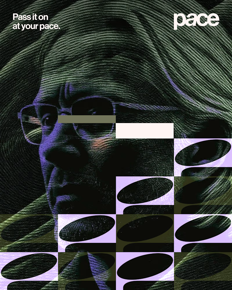
Experimental layouts for Pace. Which one do you like?
23 voted
52%
21 voted
48%

44 votes
Closed

Looks cool.

All I did was copy the Figma page link, paste it into Claude Code, and give it a few instructions. Oh chim! it brought the whole thing to life
What do you think?


Going from a Figma link straight to motion is wild, "oh chim" is the right reaction 😂 Did you connect the Figma MCP, or did Claude Code work it out from the link alone?

We kept zooming in on a planet until it didn't fit on the phone.
A ringed gas giant grows until it fills the whole screen and lands on a deep boom. It's drawn in text characters, one per cell, against black space.
It's 11 seconds, and the sound is ours too.
What should we fly past next?
The whole code garden: https://contra.com/p/oRob3r7o
https://givemeprompts.com/lab/
