The network for creativity
Join 1.25M professional creatives like you
Connect with clients, get discovered, and run your business 100% commission-free
Creatives on Contra have earned over $150M and we are just getting started
Back to feedPost

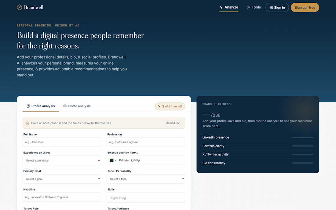
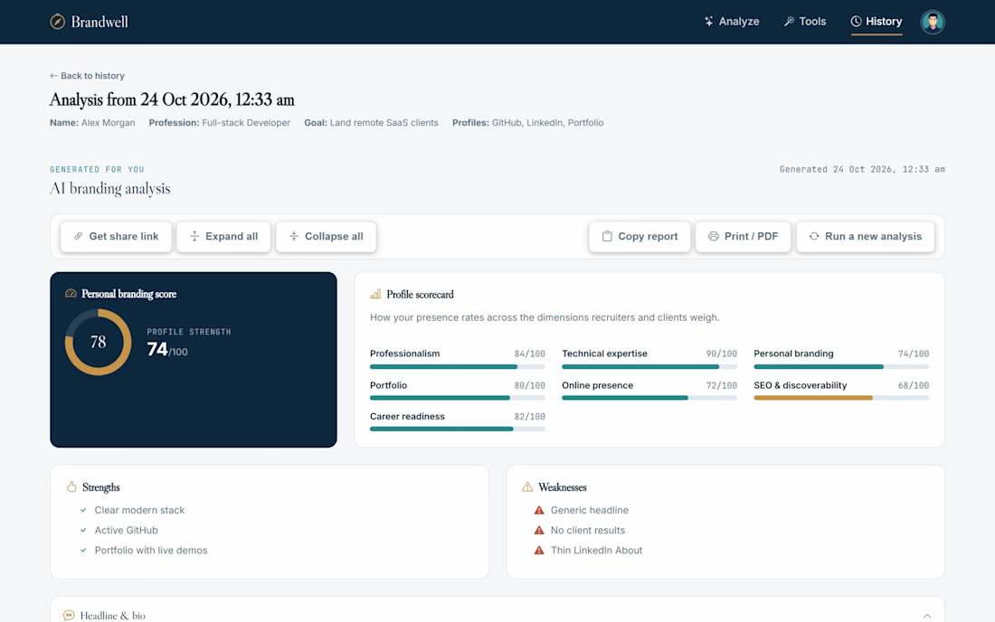
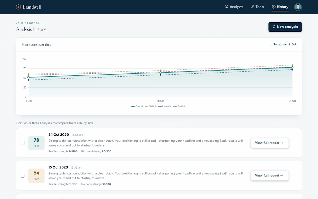
Currently building Brandwell, an AI tool that turns your online presence into a clear, scored action plan.
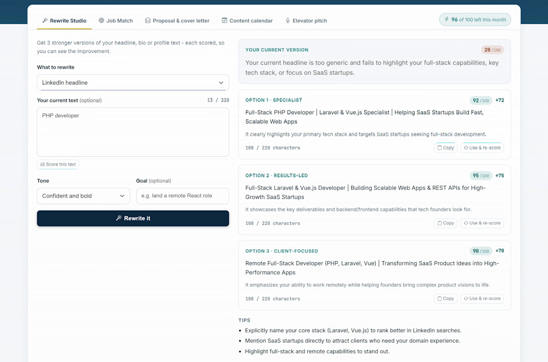
New this sprint: AI Rewrite Studio, Job Match, a proposal writer, a 4-week content calendar and elevator pitches, all written from your own profile.
Also shipped: much faster pages (~30 ms), encrypted admin settings and a fully responsive admin panel.
Built with PHP, MySQL, Gemini AI and Bootstrap. Open to feedback and collaboration!
The network for creativity
Join 1.25M professional creatives like you
Connect with clients, get discovered, and run your business 100% commission-free
Creatives on Contra have earned over $150M and we are just getting started



Related posts

The era of custom brand systems is here.
I’ve been building systems that make it easy to tweak, adapt, and evolve brand assets without starting from scratch every time.
Here’s a little preview of one I’m working on 👀


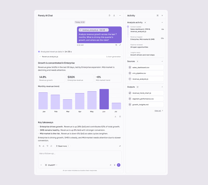
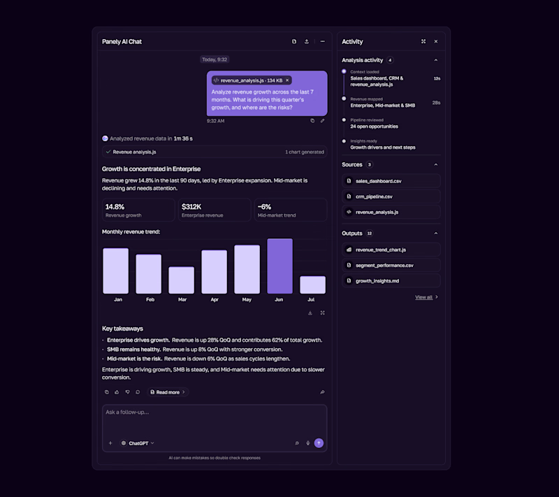

I'd pick Light for an analysis tool, the charts and sources read better on a pale surface and the violet bars still pop. Dark works as the night option. Is the sources panel on the right open by default?

Really liked how these designs turned out!
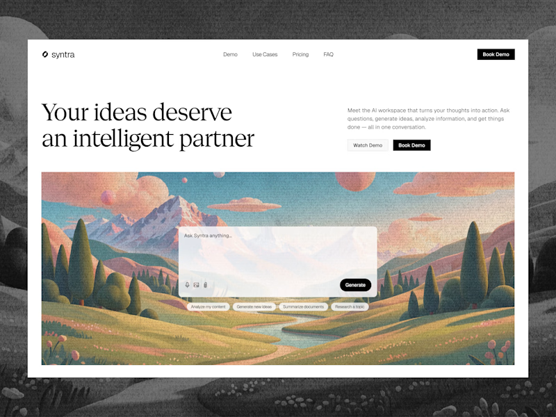
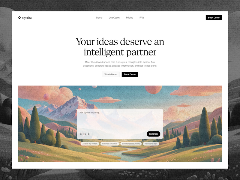
Explored a concept for AI SaaS product, focusing on a clean interface and a simple, intuitive chat experience.
Tried two different layout variation for the hero section.
Which would you like?
13 voted
57%
10 voted
43%
23 votes
Closed

Really clean concept! 👏
I like the second layout more — the headline "Your ideas deserve an intelligent partner" + the chat preview below makes the AI feel real and easy to use immediately. The first one is also clean, but this one sells the product faster.
I also design SaaS...