The network for creativity
Join 1.25M professional creatives like you
Connect with clients, get discovered, and run your business 100% commission-free
Creatives on Contra have earned over $150M and we are just getting started
Back to feedPost

A YouTuber once showed me a thumbnail that looked amazing on his laptop.
Big image.
Sharp details.
Beautiful typography.
Then I opened YouTube on my phone.
It almost disappeared.
The face became tiny.
The text became difficult to read.
The important visual details blended together.
And that's when I realized something designers often forget:
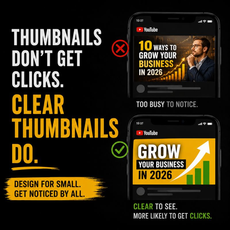
A thumbnail isn't viewed at the size you designed it.
Most people encounter it while scrolling through a crowded screen, surrounded by dozens of competing videos.
So when I design a thumbnail, I don't only ask:
“Does this look good?”
I ask:
“Can I understand the idea when this is tiny?”
The subject needs to be obvious.
The text needs to be readable.
The contrast needs to be strong.
And there should be one clear visual idea that makes the viewer curious enough to stop.
A thumbnail can be beautifully designed and still fail if its message disappears at small size.
That's why I always test thumbnails at the size viewers are actually going to see them.
Design it big.
Test it small.
Make the idea impossible to miss.
Because on YouTube, the best-looking thumbnail isn't necessarily the one that gets noticed.
The one that survives the scroll has the advantage.
The network for creativity
Join 1.25M professional creatives like you
Connect with clients, get discovered, and run your business 100% commission-free
Creatives on Contra have earned over $150M and we are just getting started
Trending
retrofuturism
Share your favorite designs from the past exploring the distant future. Or your own take on the aesthetic 🚀
halftone
Dots. Texture. Grain. Let's see your designs using the halftone technique.

Midjourney
Creatives are showing off what they're making with Midjourney.
colorgrade
Video editors sound off: How do you enhance the mood of your video in color grading?





Related posts


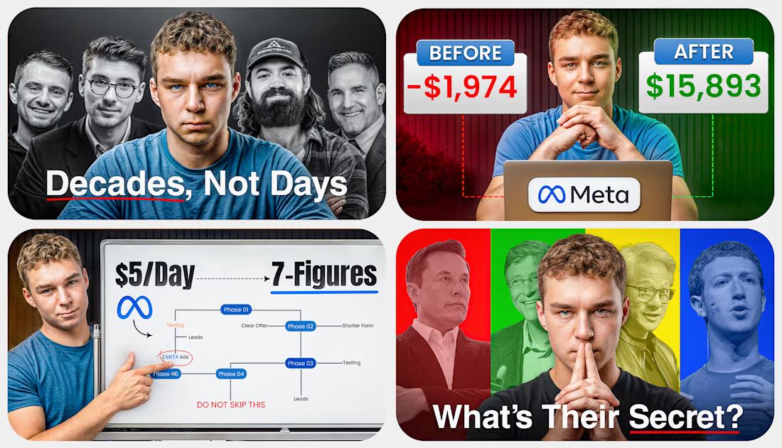

nice work


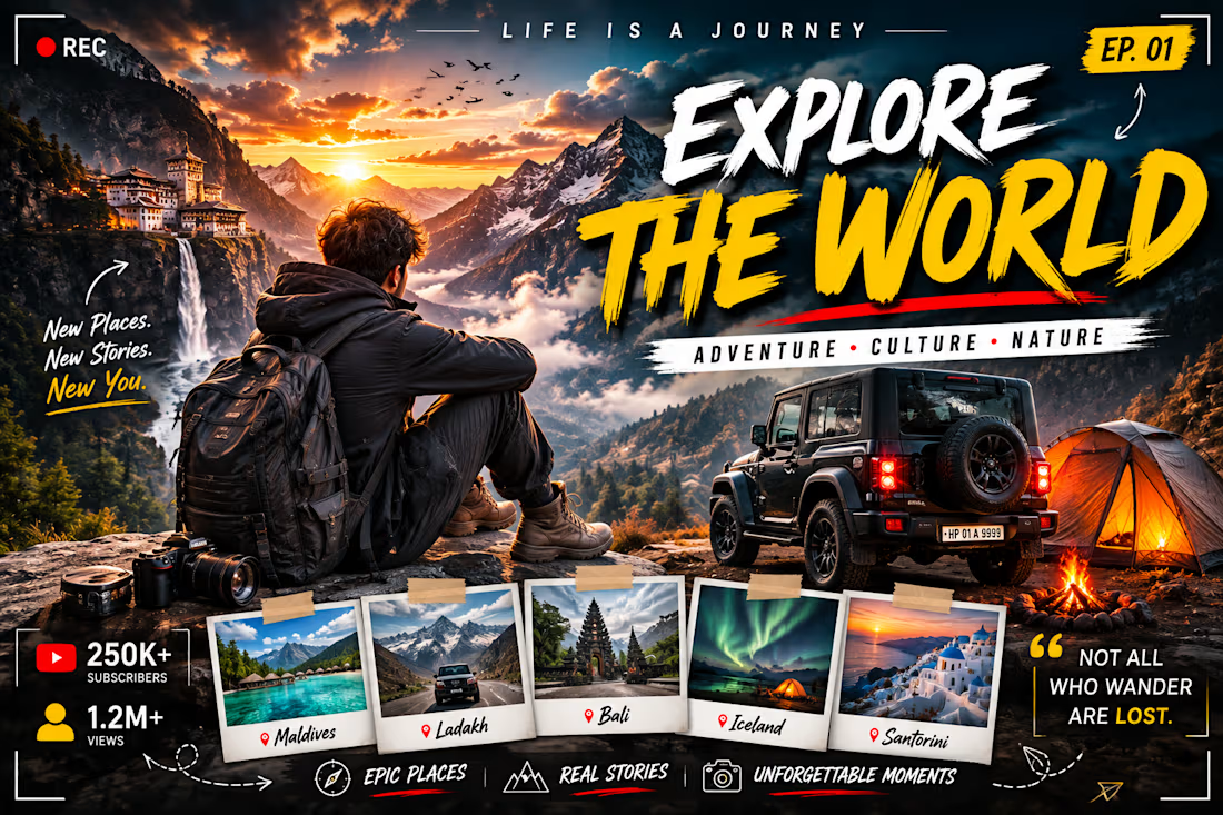

Designed a high-impact YouTube thumbnail for an AI/technology video, focusing on strong visuals, clear typography, and attention-grabbing composition.