The network for creativity
Join 1.25M professional creatives like you
Connect with clients, get discovered, and run your business 100% commission-free
Creatives on Contra have earned over $150M and we are just getting started
Back to feedPost

NOIRÉ — Luxury E-commerce Website
About the Project
NOIRÉ is a luxury e-commerce website designed and developed for a modern perfume/essentials brand. Built with a clean, minimal black-and-white aesthetic that reflects the brand's "quiet luxury" identity — where design speaks through restraint, not excess.
Key Features
Product catalog with dedicated Women/Men category pages
New Arrivals & Sale sections with dynamic product cards
Full shopping cart functionality
Fully responsive, elegant UI with editorial-style typography
Content managed through Sanity headless CMS for easy product updates
My Role & Highlights
Designed and developed the entire website end-to-end — from UI to CMS integration
Built a content model in Sanity to let the client manage products without touching code
Focused on typography and whitespace to create a premium, editorial shopping feel
Ensured full responsiveness across devices for a consistent luxury experience
Outcome
The result is a polished, minimal e-commerce experience that positions the brand as premium and design-forward — combining aesthetic restraint with practical, easy-to-manage functionality for the client.


The network for creativity
Join 1.25M professional creatives like you
Connect with clients, get discovered, and run your business 100% commission-free
Creatives on Contra have earned over $150M and we are just getting started







Related posts

A luxury property deserves a presentation that does it justice.
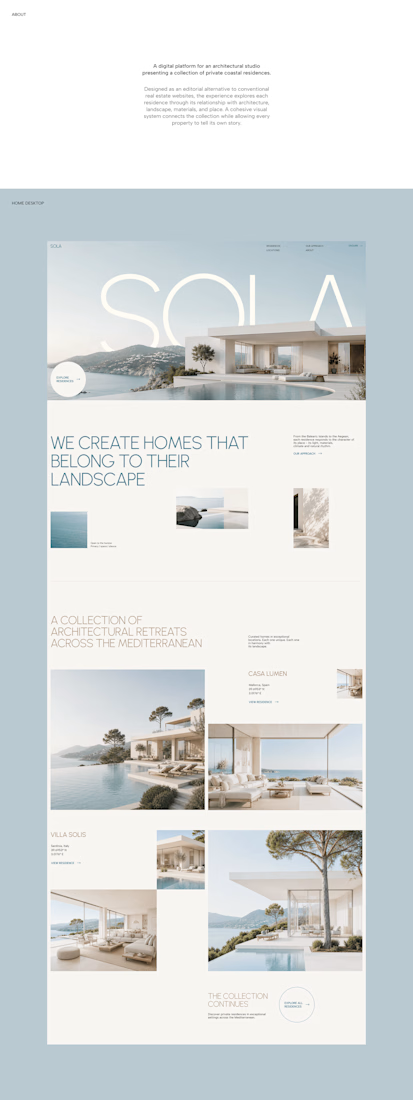
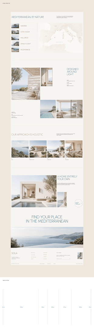
With SOLA – Architecture Studio & Luxury Real Estate, I wanted to bring the beauty of modern coastal architecture into the website itself.
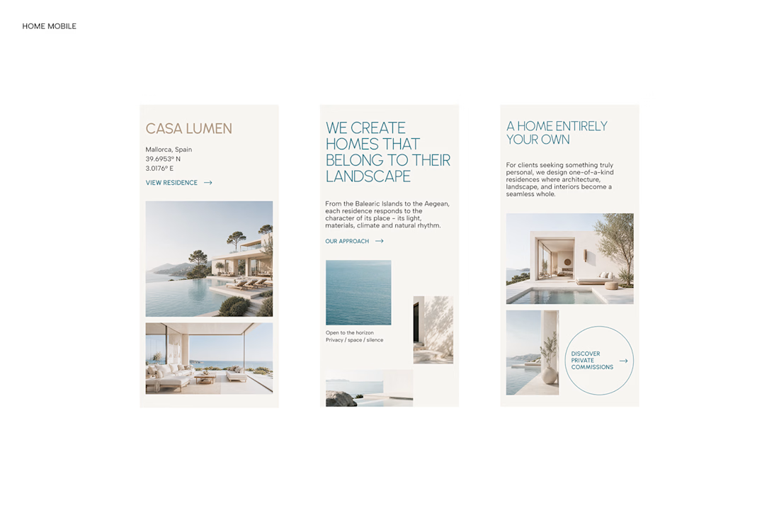

From the large property images and soft blue tones to the clean layout across desktop and mobile, every part of the design helps create a calm, premium feel while making the homes the centre of attention.
I like how the website brings architecture and digital design together, giving visitors a chance to explore the properties before making an enquiry.
If you were looking for a luxury home, would a website like this make you more interested in the property?
#WebDesign #Architecture #LuxuryRealEstate


Incredible work, you transformed SOLA into a premium property brand.


Every element feels perfectly placed! 👏

++1 to my portfolio
[https://www.breyden.com/ ]
The Break Disc Company for BMW, Mercedes, Skoda, Seat...


Really strong craftsmanship.