The network for creativity
Join 1.25M professional creatives like you
Connect with clients, get discovered, and run your business 100% commission-free
Creatives on Contra have earned over $150M and we are just getting started
Back to feedPost

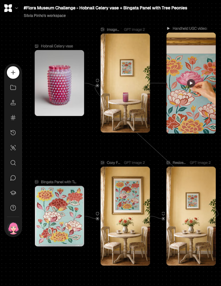
Don't be fooled by the simplicity of this canvas - this one had me wanting to bang my head against the wall at times 😅 (I just got so mad I deleted all the crap!)
For this last submission, I chose the "Hobnail Celery vase", by Hobbs, Brockunier and Company.
This one, as you'll see in the video walkthrough in the comments, really struck me, not only for the color but for its translucence, light reflection, and the texture. I could just stare at it for hours 😍
and again, because I really enjoyed imagining a world where two pieces lived together in my previous submission, I also picked the "Bingata Panel with Tree Peonies" by Teruyo Shionara.
This one had the variety of warm tones - from the yellows to the pinks and reds and oranges in between - and was really calling my name. PLUS, seeing it together with the vase, it just clicked something in me 💡
As always, here's the public project link: https://app.flora.ai/view/js7aegs59at1hk640n5yc01m3d8dtjva
My canvas and final video are here - and the walkthrough can be found in the comments 👇

The network for creativity
Join 1.25M professional creatives like you
Connect with clients, get discovered, and run your business 100% commission-free
Creatives on Contra have earned over $150M and we are just getting started











Related posts

An Instagram post for a Journal business. The main core was to communicate the message "hope and comfort". I decided to make use of light shades of blue and green for it.





Archive gems are the best! Love that you still love it after all this time - that's when you know it's timeless work. 👀