The network for creativity
Join 1.25M professional creatives like you
Connect with clients, get discovered, and run your business 100% commission-free
Creatives on Contra have earned over $150M and we are just getting started
Back to feedPost

Full design system. New UX writing. Remapped user flows. Wireframes to high-fidelity, then shipped live on the App Store.
The brief wasn't "make it pretty." It was harder: design for people who are already at their limit, where one confusing screen could be the difference between someone reaching out for help or giving up.
Every weakness in the old UX/UI got fixed. The results since launch have been incredible.
Full case study 👇 Curious what you'd have done differently.


The network for creativity
Join 1.25M professional creatives like you
Connect with clients, get discovered, and run your business 100% commission-free
Creatives on Contra have earned over $150M and we are just getting started





Related posts


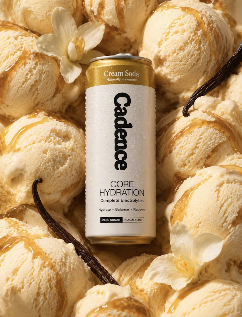
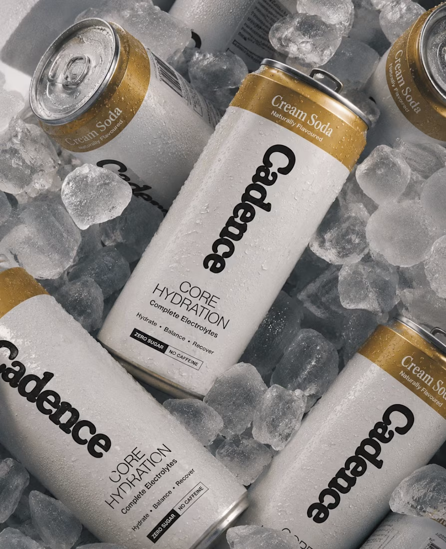

Looks 100% real

🚀 Just completed the UX/UI design and website redesign for Spartan SEM!
The goal was to bring their refreshed brand identity to life with a modern, conversion-focused website and a better user experience.
Really enjoyed working with the team and seeing the design go live!


This is amazing

Design Exploration!
SHUTO - A Traditional Saree Website
Check out my new template - https://framer.link/ko3JZYj


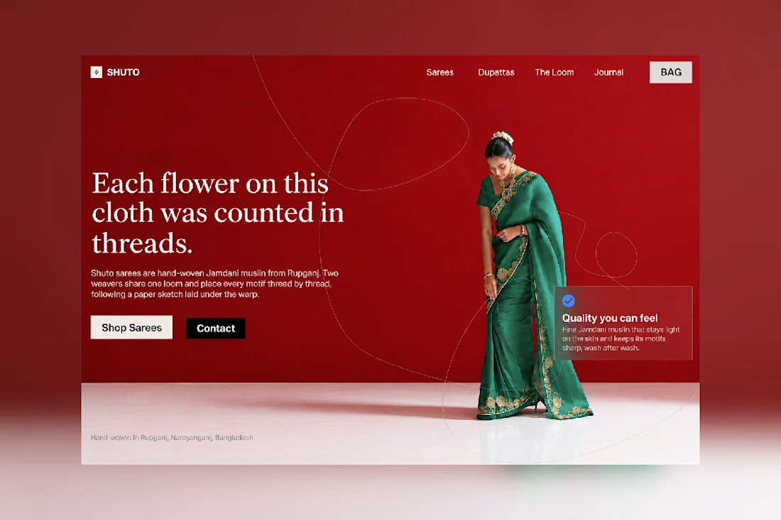

Great showcase this is very amazing