The network for creativity
Join 1.25M professional creatives like you
Connect with clients, get discovered, and run your business 100% commission-free
Creatives on Contra have earned over $150M and we are just getting started
Back to feedPost


Nice work!
The network for creativity
Join 1.25M professional creatives like you
Connect with clients, get discovered, and run your business 100% commission-free
Creatives on Contra have earned over $150M and we are just getting started



Related posts

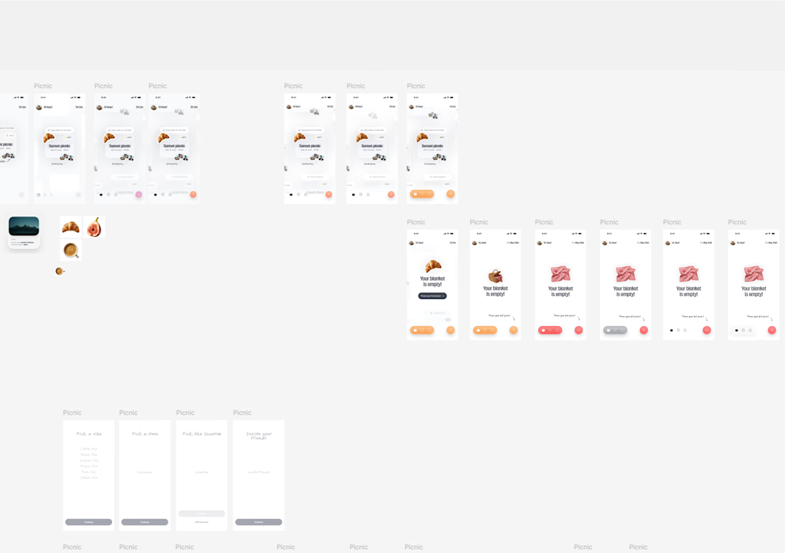
sneak peek into my figma playground... a new app in the making☀️

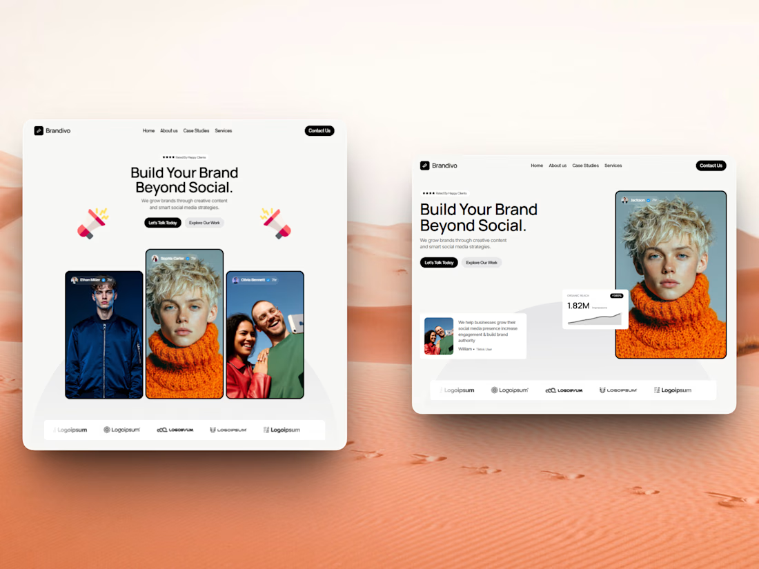

I'd pick the right one. The headline and image split is cleaner and the stats card gives proof right away, the left feels busier with three portraits. Is this template for Webflow?


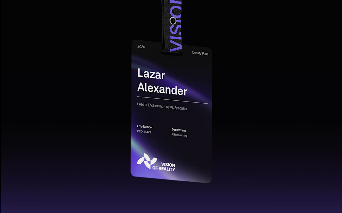
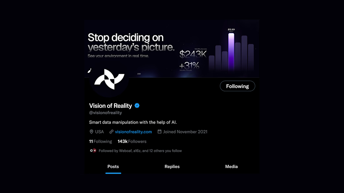


100% agreed. Tech superiority only wins when the brand positioning makes it memorable. Love that sharp, folded geometric mark and the deep contrast across the web layout. Pure enterprise polish!