The network for creativity
Join 1.25M professional creatives like you
Connect with clients, get discovered, and run your business 100% commission-free
Creatives on Contra have earned over $150M and we are just getting started
Back to feedPost
A Rendering Is More Than a Final Image --
A rendering is more than a final image. It is where costly mistakes can be identified while they are still easy to correct. In 2026, 22% of homeowners reported difficulty visualizing the finished space at the start of a project.
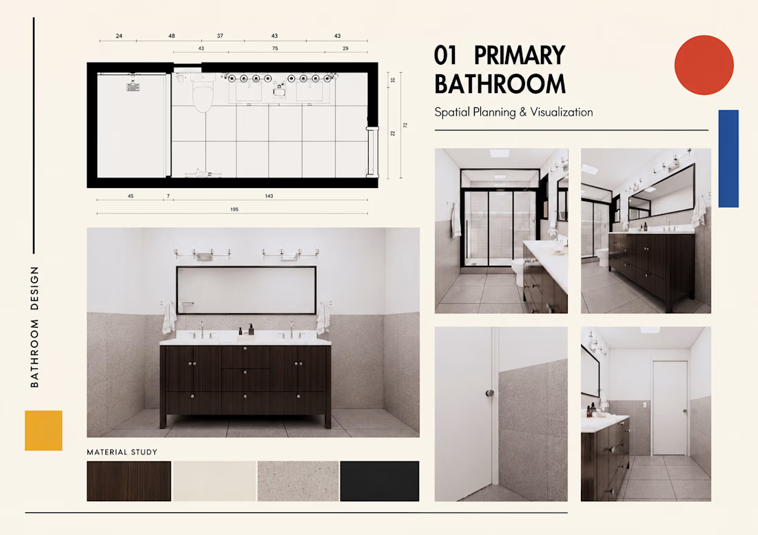
For this bathroom, I coordinated the double vanity, large mirror, shower enclosure, and illuminated niche across the floor plan, technical drawings, and 3D visualization. This process makes feedback more precise and approvals more confident.
For architecture and interior design studios, it creates a reliable bridge between concept and execution. When the drawings and visualization tell the same story, decisions become faster and clients can understand the space before construction begins.


The best renders don't just impress, they solve problems before they become expensive. Great explanation of the real value behind architectural visualization.

The material study swatches next to the plan view make this feel like an actual client-ready deliverable, not just a pretty render. That 22% stat on homeowners struggling to visualize a finished space really is the whole business case for doing renderings up front, do you usually lead with that in client pitches?

Hi! I don't usually open with the stat itself, but the logic behind it shapes how I sequence deliverables. On shorter-timeline projects, I present the floor plan and raw 3D perspectives first, then refine through a couple of revision rounds before bringing in the final renders....
The network for creativity
Join 1.25M professional creatives like you
Connect with clients, get discovered, and run your business 100% commission-free
Creatives on Contra have earned over $150M and we are just getting started





Related posts

Exploring kinetic typography and 3D text animation in Blender ✨
Playing with movement, depth, color and distortion to turn typography into part of the visual itself.
More motion experiments coming soon.


This is lovely!
Well done


See our Civil Aviation 3D motion video for Nicomatic. Created for Paris Air Show 2023 ✈️


This is so detailed and creative, especially the pacing

🚀 Oda — an architecture studio template for Framer, with agent skills
Oda is a website template for architecture and interiors studios, laid out like a drawing set: graphite lines on warm paper, title blocks, sheet numbers and line drawings that draw themselves.
The Framer edition comes with five skills for Framer's agent, so you can make the site yours in plain language:
👉 /oda-rebrand — "Rebrand this for our studio in Porto." Studio name, city, the sun study's location and time zone, colours (contrast-checked), fonts and copy, in the right order.
👉 /oda-content — "Add three projects." CMS items with every field filled, ASCII slugs, sheets kept in order.
👉 /oda-code-components — "Make the cabin draw twice as fast." Properties first, code only when a property can't do it.
👉 /oda-design-system — new pages and sections use the Oda styles, grid and section numbering.
👉 /oda-before-publish — the checklist the template was built to pass, on every page at Desktop, Tablet and Phone.
What's in the template:
· A timber cabin that draws itself, with a sun study you can drag. The shadow uses real solar maths for your city.
· Project sheets on a sideways track, and a floor plan that builds as you scroll.
· Materials with drawn textures, a team section, awards and a contact form with a sketch pad.
· Responsive down to 390 px, WCAG AA contrast, reduced-motion support.
Framer edition $59. Also available in plain HTML and React.
https://no-code.supply/templates/oda/


Nice temple and nice animations congratulations Lauri good job🎉🎉🎉