The network for creativity
Join 1.25M professional creatives like you
Connect with clients, get discovered, and run your business 100% commission-free
Creatives on Contra have earned over $150M and we are just getting started
Back to feedPost

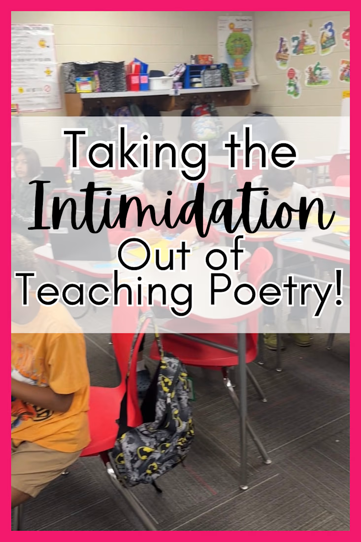
Take the intimidation out of teaching poetry with these strategies AND A FREE lesson plan and game.


The network for creativity
Join 1.25M professional creatives like you
Connect with clients, get discovered, and run your business 100% commission-free
Creatives on Contra have earned over $150M and we are just getting started





Related posts

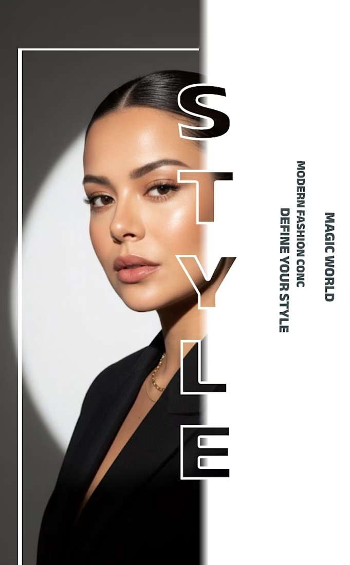
✨ Modern Fashion Poster Design - STYLE ✨
Designed a clean, high-fashion poster concept focusing on bold typography and minimalist aesthetics.
Concept: Modern Fashion | Define Your Style
Tool: Canva / Photoshop
Style: Luxury, Minimal, Editorial
Open to feedback and freelance work!
#GraphicDesign #PosterDesign #FashionDesign #Canva #ContraCommunity

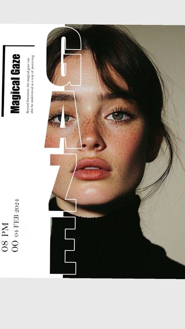

The way you let the bold type dominate the empty space really drives the luxury feel.

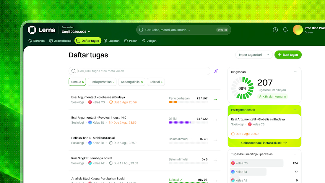
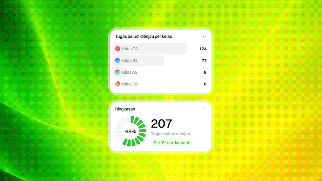
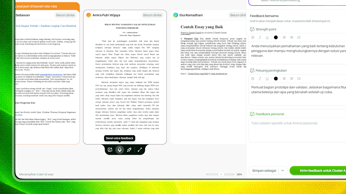
Unused concept for a teacher feedback loop in an LMS.
The challenge was straightforward on paper: make it easier for teachers to give meaningful feedback across multiple classes, often with 100+ students.
But the real friction happened before they even started.
From our findings, teachers often felt overwhelmed by the amount of work waiting for them, so they defaulted to bulk feedback using templates.
It was faster, but it created another problem: students received feedback that felt vague, repetitive, and disconnected from their actual work.
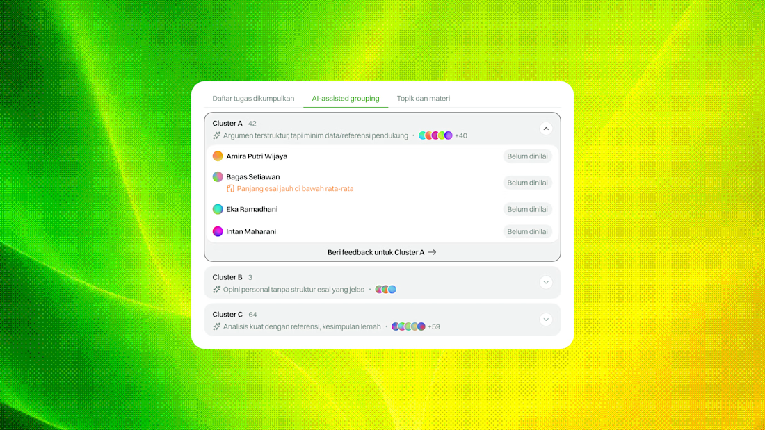
For this concept, I explored two ways to help teachers get started without forcing them into one workflow:
— Focus manually on flagged assignments that need the most attention
— Use AI-assisted grouping to cluster assignments with similar patterns, so teachers can review them in context and respond more efficiently
The idea wasn’t to automate the feedback itself, but to reduce the friction around deciding where to start.
Still an unused concept, but I liked the direction.
What do you think?



Super clean work!

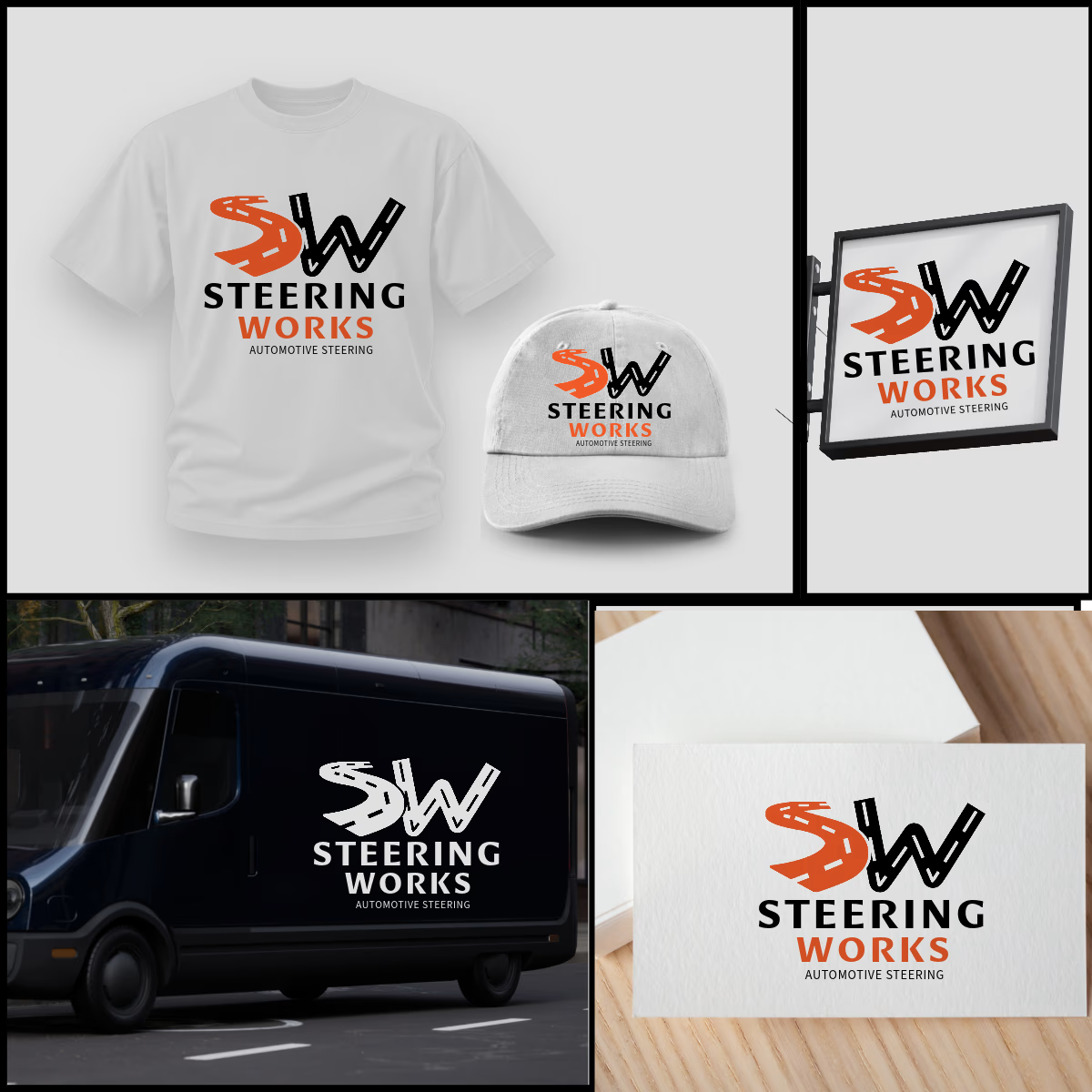
SW logo where S and W are winding roads, inspired by windy road sign idea. The orange S adds energy, black W adds strength. As shown, the design is highly adaptable and works perfectly on t-shirts, caps, van graphics, shop signage, and business cards in both color and single-color white. Strong, memorable, and built for automotive enthusiasts.


That's very attractive great job bro 🎉🎉🔥🔥