The network for creativity
Join 1.25M professional creatives like you
Connect with clients, get discovered, and run your business 100% commission-free
Creatives on Contra have earned over $150M and we are just getting started
Back to feedPost
iPhone Duo — UI Motion Design Study
Overview
An independent UI motion design experiment exploring minimalist interface elements through geometric shapes, circular motion, and smooth transitions.
The Concept
This project explores how simple interface components can become visually engaging through motion. The visual system includes Wi-Fi symbols, circular dots, cellular signal elements, and battery-inspired shapes
Design Focus
Minimalist UI composition
Circular dot animation
Wi-Fi symbol and battery icon design
Geometric transformations
Motion timing and transitions
Clean visual hierarchy
My Role
UI Design and Motion Design Experimentation
Tools
Figma and
Project Type
Independent concept project created for portfolio development and creative exploration.
Objective
To explore the relationship between simple interface elements and motion, creating a clean, cohesive visual experience.
This is a self-initiated concept project and is not affiliated with or endorsed by Apple.


Nice work

Thanku for your feedback 🙌🏻😊
The network for creativity
Join 1.25M professional creatives like you
Connect with clients, get discovered, and run your business 100% commission-free
Creatives on Contra have earned over $150M and we are just getting started



Related posts

If your members pay premium. Your website should look like it.
Animation really changes the way you look at a website.
The premium is in the details. 🤌
Hero section with animation for a Tennis Sports Club Membership Platform.
Full landing page WIP; gonna share it very soon.


The animation adds a lot to the premium feel for a tennis club membership platform. Looking forward to seeing the full landing page.

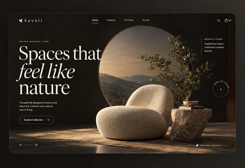
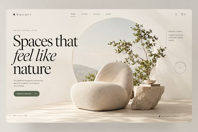
Spaces that feel like nature.
I kept coming back to one question on this concept: does a furniture brand feel more premium in low light or in daylight? So I built both.
The warm version sells atmosphere. The light version sells the product. Both use the same type scale and the same circular motif holding a landscape behind the piece.
Still undecided. Which would you ship?
6 voted
50%
6 voted
50%
12 votes
Closed

Daylight