The network for creativity
Join 1.25M professional creatives like you
Connect with clients, get discovered, and run your business 100% commission-free
Creatives on Contra have earned over $150M and we are just getting started
Back to feedPost

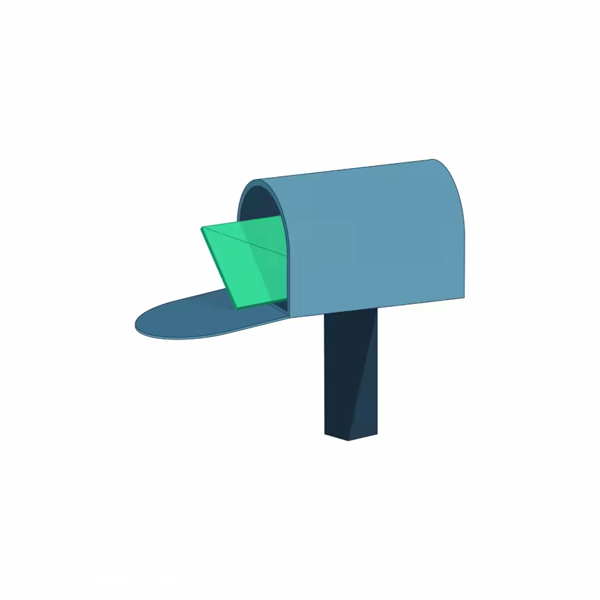
It’s been a week since I started learning isometric illustration.
Still figuring things out, still hitting Ctrl+Z constantly, but I can finally feel the improvement. Here are some of the pieces I made during the process. Feedback welcome.
The network for creativity
Join 1.25M professional creatives like you
Connect with clients, get discovered, and run your business 100% commission-free
Creatives on Contra have earned over $150M and we are just getting started





Related posts




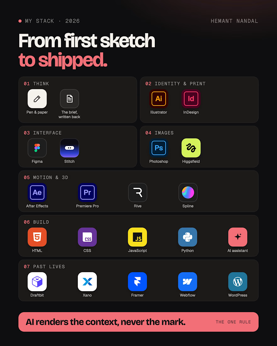
The tools I use to take a brand from first sketch to shipped, in 2026. 🔥
Pen and paper first, and the brief written back to you before I open anything.
Illustrator and InDesign for identity and print. Figma and Stitch for interfaces. Photoshop and Higgsfield for images. After Effects, Premiere Pro, Rive and Spline for motion and 3D. HTML, CSS, JS and Python, with an AI coding assistant, for builds.
✅ One rule across all of it: AI renders the context, never the mark. Your logo, type and layouts are drawn by hand.
What that means for you: one designer from the brief to the shipped files, so nothing gets lost between handoffs.
Need a brand, a product or a launch? My DMs are open. 💬


So cool!