The network for creativity
Join 1.25M professional creatives like you
Connect with clients, get discovered, and run your business 100% commission-free
Creatives on Contra have earned over $150M and we are just getting started
Back to feedPost

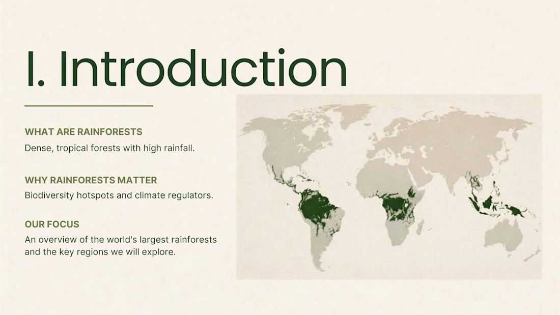
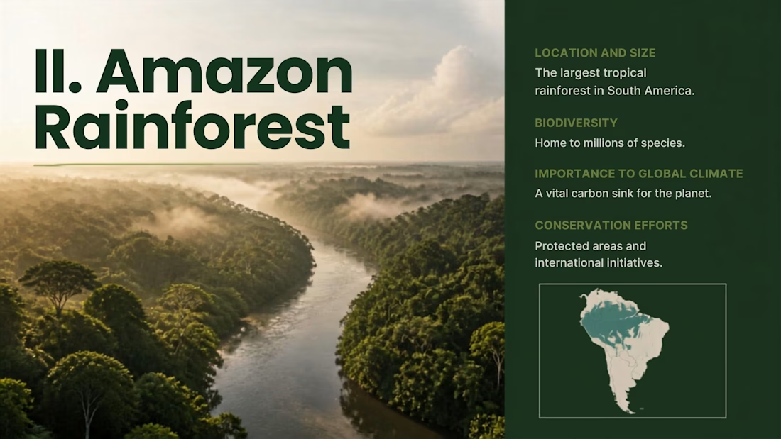
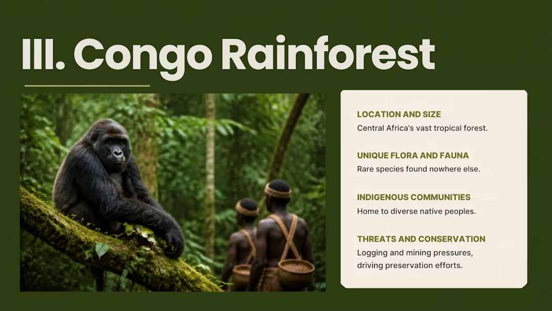
I didn't want this to look like another “school presentation.”
So I focused on one thing:
make the information feel visual.
🌿 Stronger typography
🌿 Better hierarchy
🌿 Immersive imagery
🌿 Consistent layouts
🌿 Cleaner storytelling
This is how I approached the redesign of a presentation about the world's largest rainforests.
Have a deck that feels outdated or boring?
Send it to me. Let's give it a visual upgrade. 👀



The network for creativity
Join 1.25M professional creatives like you
Connect with clients, get discovered, and run your business 100% commission-free
Creatives on Contra have earned over $150M and we are just getting started





Related posts

This is Mikuna. From WhatsApp chaos to a confirmed lesson.
Small language studios shouldn't have to manage every student through WhatsApp.
Mikuna started from a simple problem: a student wants to book a lesson, but the process quickly becomes a chain of messages about language, goals, tutors, availability, payment, changes and confirmations.
So I designed a system where the student handles the coordination themselves, while the tutor gets a ready-to-teach agenda.
The student can:
→ Choose a language and learning goal
→ Find the right tutor
→ Pick an available time
→ Purchase credits
→ Book the lesson
→ See their upcoming lessons and remaining credits
The tutor gets:
→ An organized agenda
→ Upcoming and past lessons
→ Relevant student context
→ One-click access to the lesson
Behind the interface, the system also handles tutor availability, booking conflicts, credits, payments and cancellation rules.
The idea was simple:
From managing conversations to managing lessons.
Mikuna was built for the Contra × Lovable Challenge, starting from an existing brand identity created at SUR Studio and reimagining it as a complete appointment-based product.


Love this! Such a clean solution to a very real problem for language studios. The shift from WhatsApp chaos to a seamless booking experience is brilliant.


Vänster Home GmbH
For Vänster Home GmbH, I engineered a high-end European e-commerce build designed to reflect modern architectural design and premium living space aesthetics. The goal was to establish strong brand authority through minimalist visual hierarchy, custom collection navigation, and high-converting storytelling.
I structured the homepage around a cohesive "Designed for..." campaign framework (covering Living, Dining, Lighting, and New Arrivals) to guide buyer intent seamlessly. To maximize user trust and clarity, I completely restructured the inventory data transforming long, cluttered supplier titles into refined product names paired with standardized technical specifications and lifestyle-focused features. This build demonstrates complete end-to-end e-commerce architecture, from editorial layouts down to conversion-focused product listings tailored for luxury retail shoppers.



Clean restructure from supplier titles to real product names, that step alone usually gets skipped. For a GmbH store selling into the rest of the EU, did you end up handling VAT-inclusive pricing per country through Shopify Markets, or did the client stick to one DE price shown everywhere?

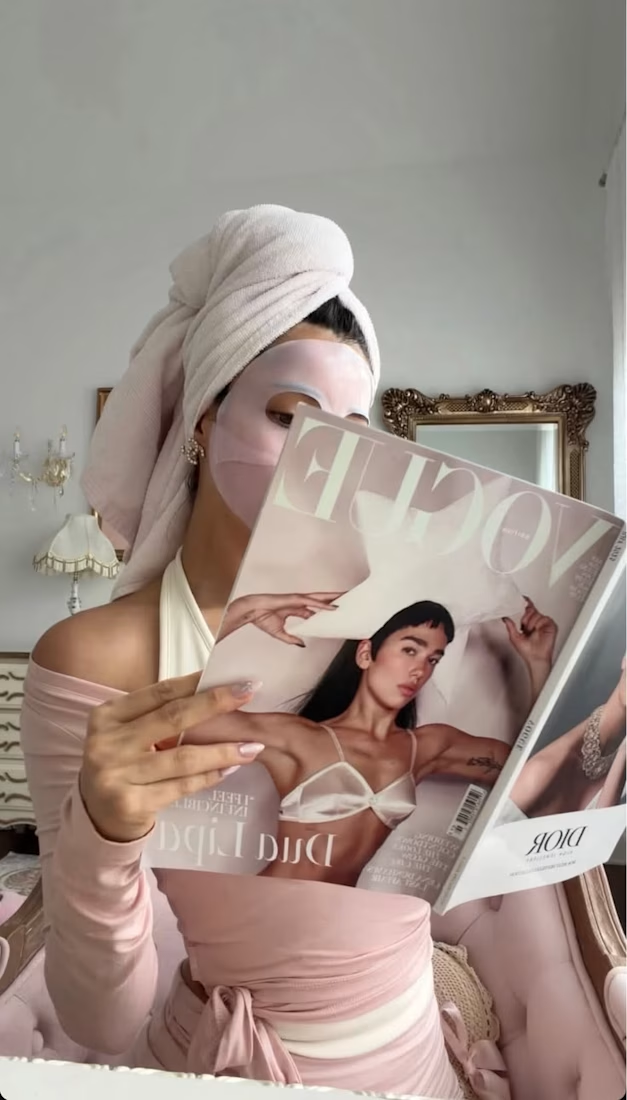
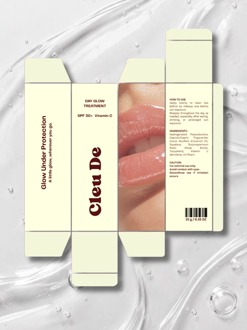
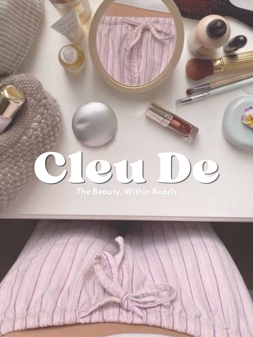
Beauty, within reach.
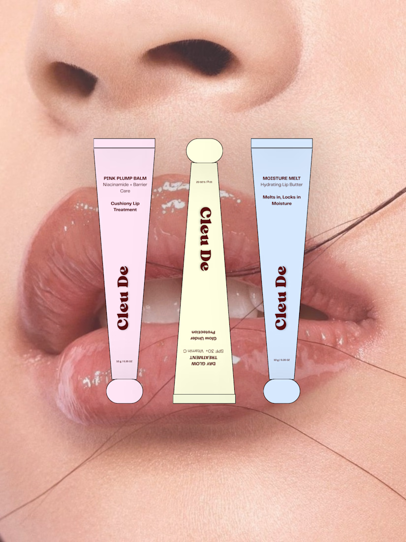
Cleu De was imagined as an everyday lip care brand — something small enough to carry everywhere, but playful enough to become part of your personal style.
The concept explores three lip treatments, soft playful colors, compact packaging, and little everyday moments where beauty naturally fits into your routine.
A little exploration of making beauty feel more personal, playful, and within reach.


Good work 👍🏻