The network for creativity
Join 1.25M professional creatives like you
Connect with clients, get discovered, and run your business 100% commission-free
Creatives on Contra have earned over $150M and we are just getting started
Back to feedPost

Hey Contra! 👋🎨
I’m officially new here! 🚀
I’m Leo, a Graphic Designer & WordPress Developer who loves turning ideas into clean, creative, and eye-catching designs.
I’m currently open to new projects, collaborations, and creative opportunities! ✨
Need a flyer, branding, social media designs, or a website that actually looks good? 👀
Let’s create something awesome together. 🤝
Happy to be here, Contra!
The network for creativity
Join 1.25M professional creatives like you
Connect with clients, get discovered, and run your business 100% commission-free
Creatives on Contra have earned over $150M and we are just getting started











Related posts

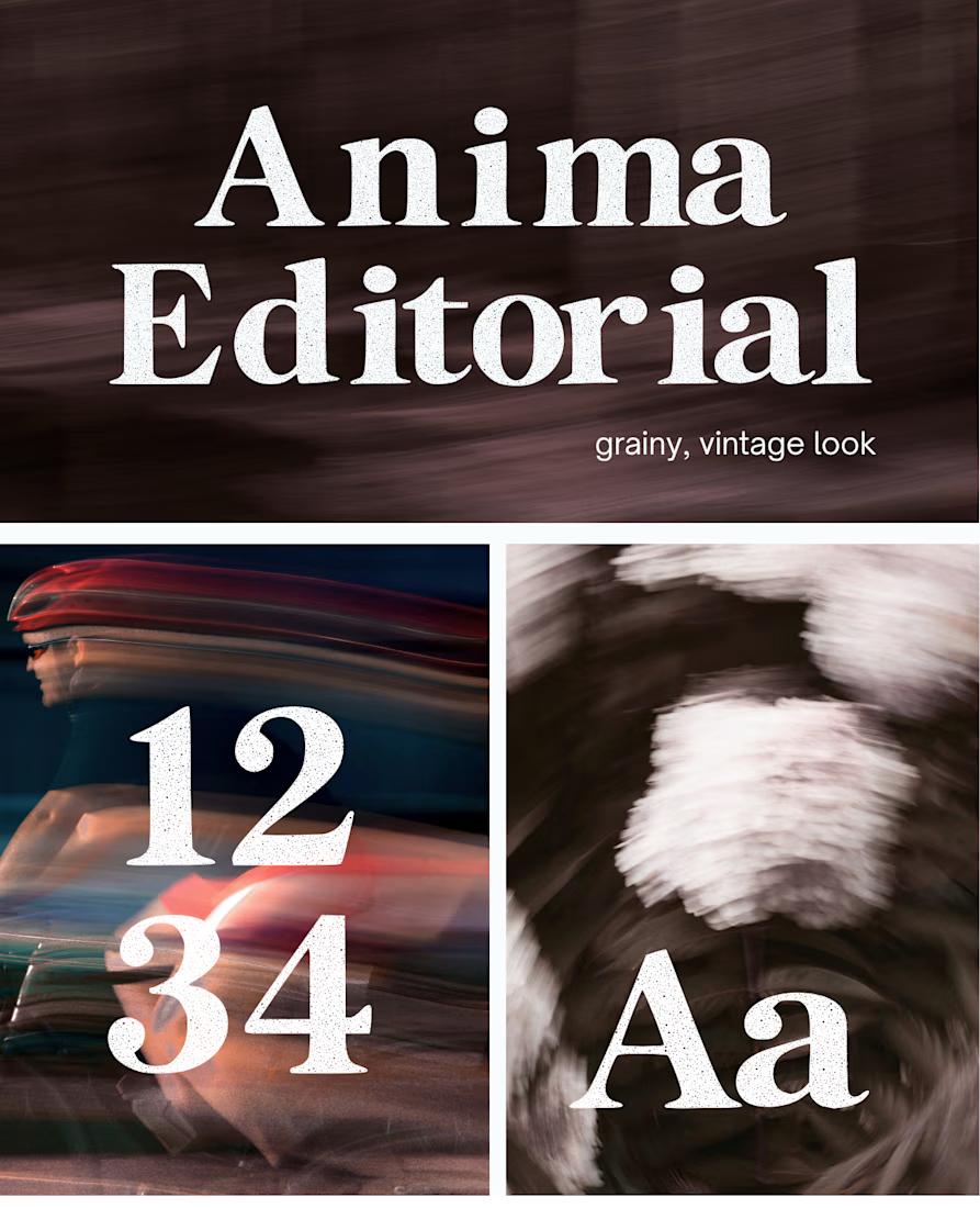
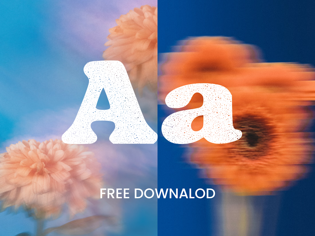
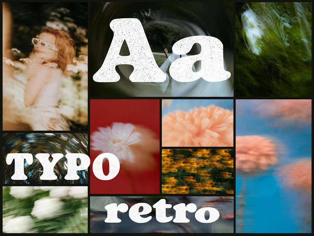
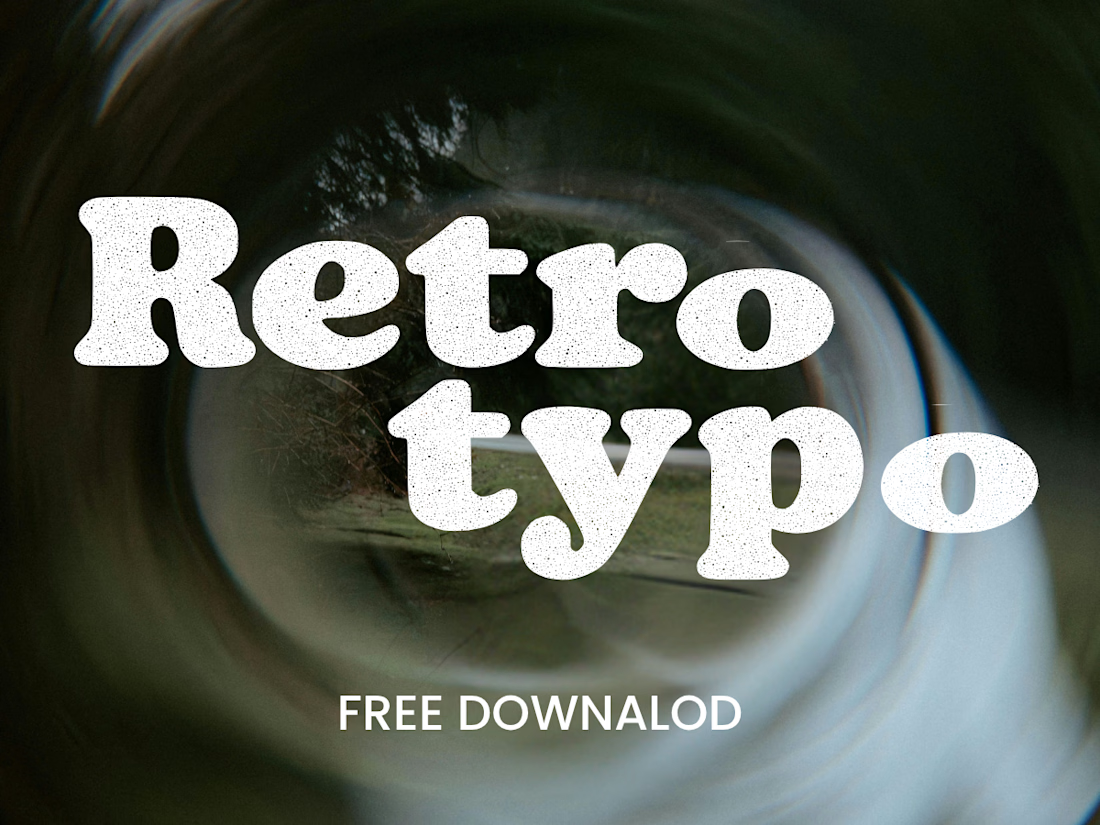
I created this font & it is free to download and use in your free or paid projects. Enjoy 🚀 find it at https://twaperdigital.com/anima-editorial



I like this font
Anima is a self-initiated type design project inspired by vintage print, worn ink and analog photography.
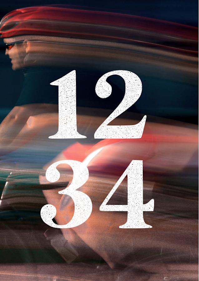
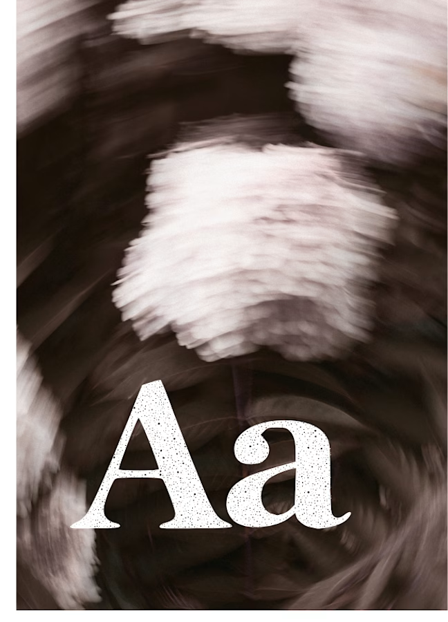
The collection includes two experimental serif typefaces: Anima Editorial, with elegant proportions and contrasting strokes, and Anima Retro, with softer, bolder shapes. Both feature grain built into the letterforms.
I developed the creative direction, custom fonts and promotional artwork, combining AI-assisted exploration with font development. The campaign pairs textured typography with motion-blurred photography to capture a warm, nostalgic mood. FREE DOWNLOAD AT https://twaperdigital.com/anima-retro

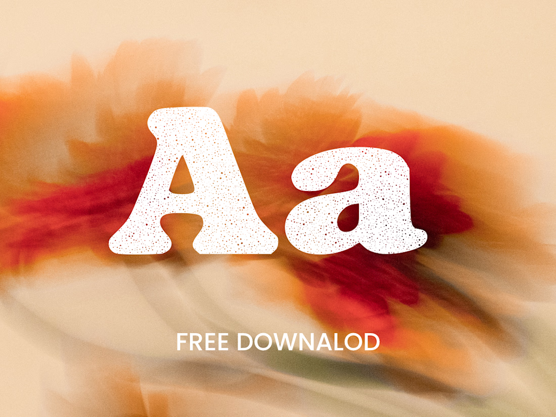

Great job Denisa the font style background and it's effects are great 🎉🎉🎉🎉
keep going Denisa🔥🔥🔥🔥

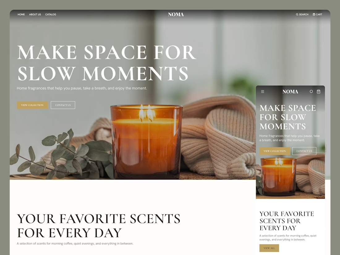
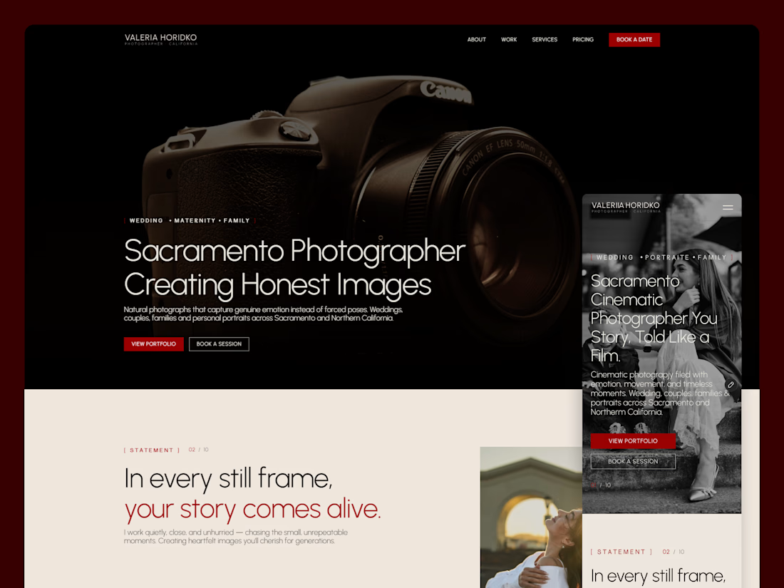
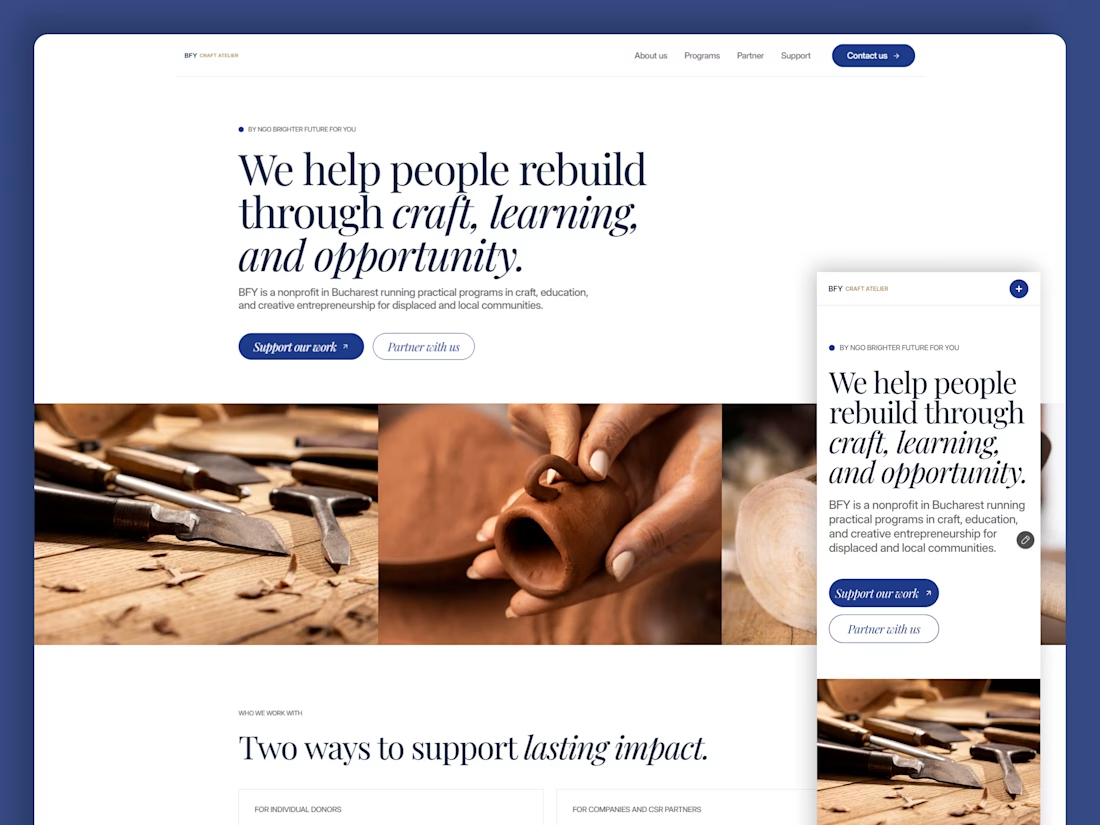
✨ 2 spots open for new website projects!
Looking to launch a new website or give your existing one a fresh look? Let’s make it happen!
I help businesses and startups create modern, user-friendly websites that combine thoughtful UX with polished visuals.
Here’s what I offer:
🎨 UI/UX design in Figma - from wireframes to complete design systems and developer-ready specs.
💻 Framer websites - design, responsive development, animations, and launch.
🛍️ Shopify stores - modern e-commerce experiences tailored to your brand.
Whether you need a landing page, a multi-page website, or an online store, I’d love to help bring your vision to life.
🎁 Use code TKACH10 for 10% off your project.
Have a project in mind? Send me a message, let’s talk!
#WebDesign #Framer #Shopify #UIDesign



Looks great! 👌