The network for creativity
Join 1.25M professional creatives like you
Connect with clients, get discovered, and run your business 100% commission-free
Creatives on Contra have earned over $150M and we are just getting started
Back to feedPost

Day 13/30
For thirteen days I've been designing hero sections for companies that don't exist.
Today I'm sharing one for a company that does. Mine.
Studio Meva. Web design and branding for startups, small businesses, and everything in between.
The challenge was always pointed at this. Every brief taught me something I used here:
→ The carousel is the portfolio.
→ Big type, white space, nothing else. After weeks of lush photography I wanted the studio's own page to be the quiet one. If the work is colorful, the frame should be plain.
If you're building something and need a site that doesn't look like a template, my inbox is open.
Landing page pre-loader by Alireza Sinaei


Love the “quiet frame” call — the hero reads like a gallery wall: huge STUDIO MEVA type on paper-white, then that saturated blue carousel slab with the fine-line dining illustration inside. Keeping the studio chrome minimal so the client work carries the color is a smart Day-13 payoff.
The network for creativity
Join 1.25M professional creatives like you
Connect with clients, get discovered, and run your business 100% commission-free
Creatives on Contra have earned over $150M and we are just getting started





Related posts

Designed the landing page for Smug — an AI support agent that resolves tickets, knows exactly when to escalate to a human, and has zero interest in pretending otherwise.
Most AI support tools go the humble, over-apologetic route. Smug does the opposite — the whole brand is built around a smug little cat mascot and copy like "Handled it. You're welcome." It's a genuinely fun brief: figuring out how to make confidence read as charming instead of obnoxious.
Bold electric blue and orange instead of the usual muted SaaS palette, because a product this confident shouldn't look shy about it. 💙


cool

A little peek at the project I started this week.
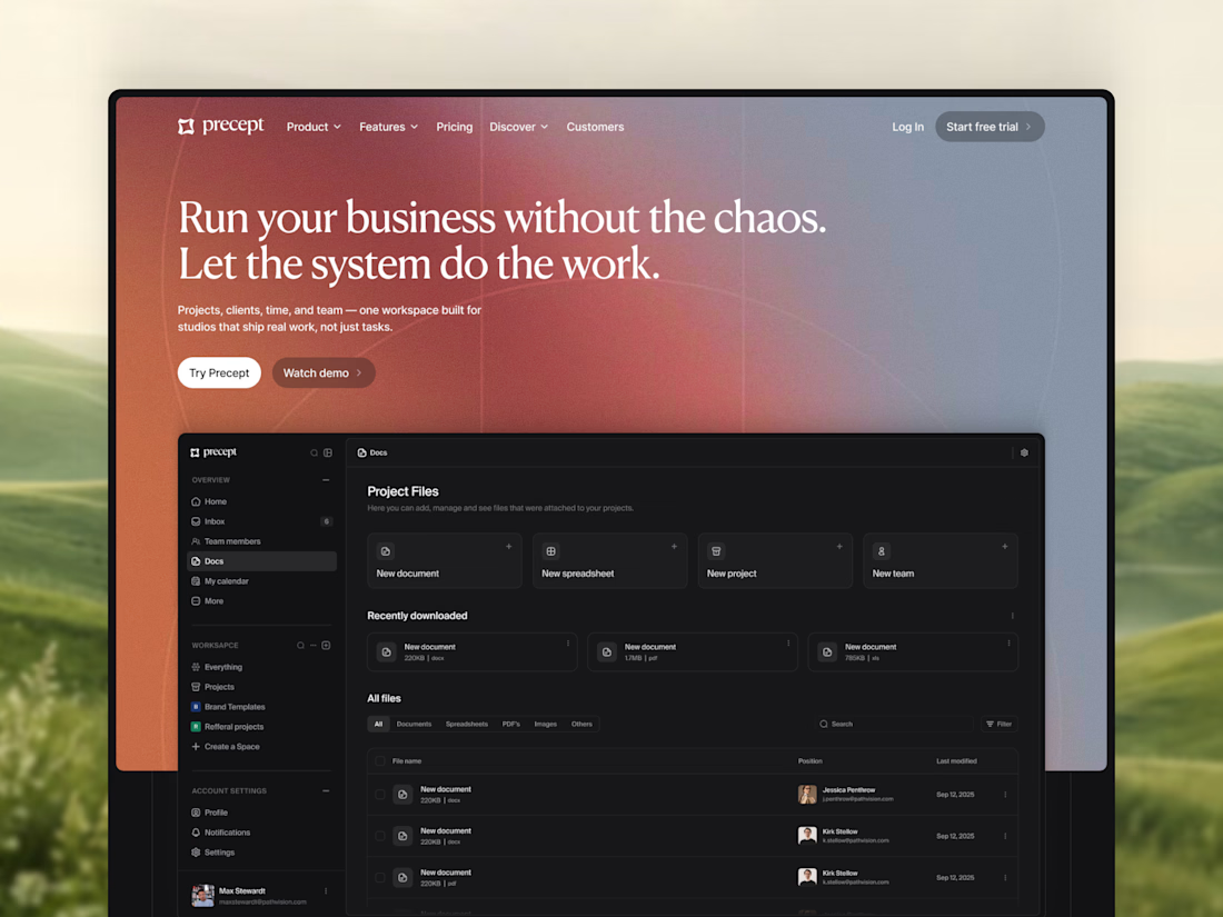
A new hero section for Precept — a project management tool for creative agencies and studios.
Designed in Figma, with development in Framer planned next.
Very excited to see the whole thing come together 🔥

Modern, modern, modern

A self-initiated product: a booking and ordering system for a billiard club in Tbilisi. I designed it in Figma from scratch and built all of it, from the interface to the database.
Guests call the club and nobody answers. They arrive and every table is taken. They want food and wait at the bar. Side Pocket moves all of that to the website.
Key decisions
No guest accounts. A booking needs a name and a phone number. The guest gets a private link to move, extend or cancel. The link is the account.
A 15-minute hold. Guests check in with "I'm at the table." A table nobody claims goes to the waitlist, and the next person gets the same 15 minutes.
Ordering tied to the table. Guests order from their phone during the game, add time themselves and see the bill as it grows.
One screen for staff. Every table's state for the night, late arrivals and orders to serve pinned to the top, bookings and orders boards, alerts in Telegram.
A Telegram bot. It understands "table for 4 tonight at 8" in English or Russian and finishes the booking with buttons.
Scope
Guest site with live availability, single and group booking, waitlist, private booking page, table page with menu, cart and bill, email confirmations and reminders, staff dashboard, Telegram bot.
Stack
React 19, TanStack Start, TanStack Router and Query, Tailwind 4, Radix UI, Supabase Postgres with row-level security, pg_cron, Brevo and Resend, Telegram Bot API, Vitest.
Business rules sit in plain functions, separate from the UI and the database, with 73 tests. Only server functions touch the database.
My role
Product design, UI design, front-end, back-end, database, integrations.
Live demo: side-pocket.lovable.app
Built for the #LovableChallenge by @Contra and @Lovable. #BuiltWithLovable😊


nicety accomplished.. great work