The network for creativity
Join 1.25M professional creatives like you
Connect with clients, get discovered, and run your business 100% commission-free
Creatives on Contra have earned over $150M and we are just getting started
Back to feedPost
Taste Test


Designing Hero section for a Yoga Studio based out of Chennai India.
Which one would you rather pick left or right?
3 voted
75%
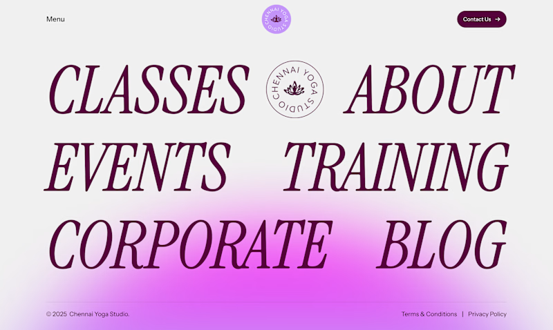
1 voted
25%
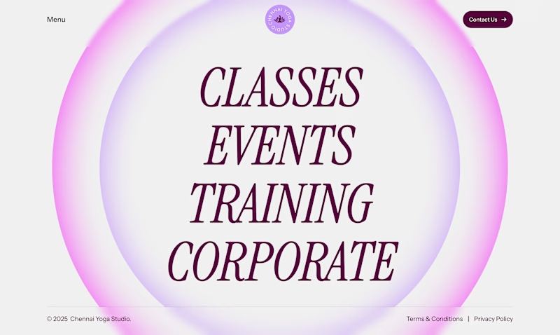
4 votes
Closed
The network for creativity
Join 1.25M professional creatives like you
Connect with clients, get discovered, and run your business 100% commission-free
Creatives on Contra have earned over $150M and we are just getting started











Related posts

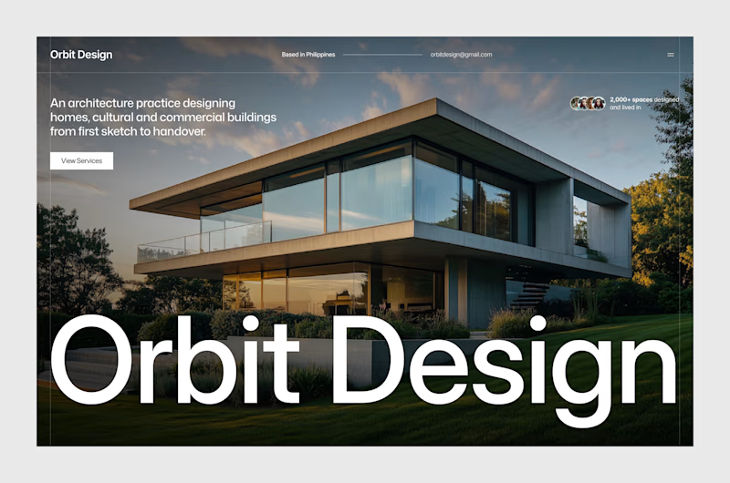
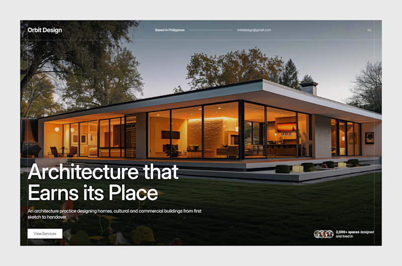
A new project! Done with hero section design exploration. Though some elements are subject to change during development. This is a new exploration after the old one, for some reason.
Which one is better?
Let me read your thoughts!


6 votes
Ends in 1d

Both explorations sound interesting! I voted option 2


Hero Section with Flower. ( Upcoming Agency Framer Template )
What do you think guys?
