The network for creativity
Join 1.25M professional creatives like you
Connect with clients, get discovered, and run your business 100% commission-free
Creatives on Contra have earned over $150M and we are just getting started
Back to feedPost
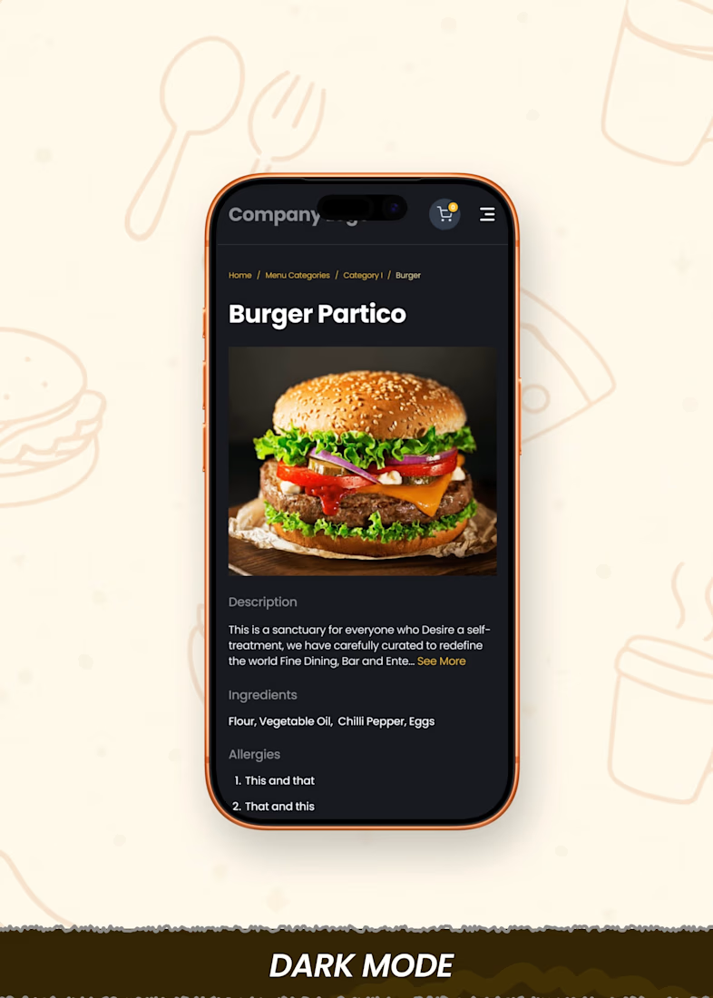
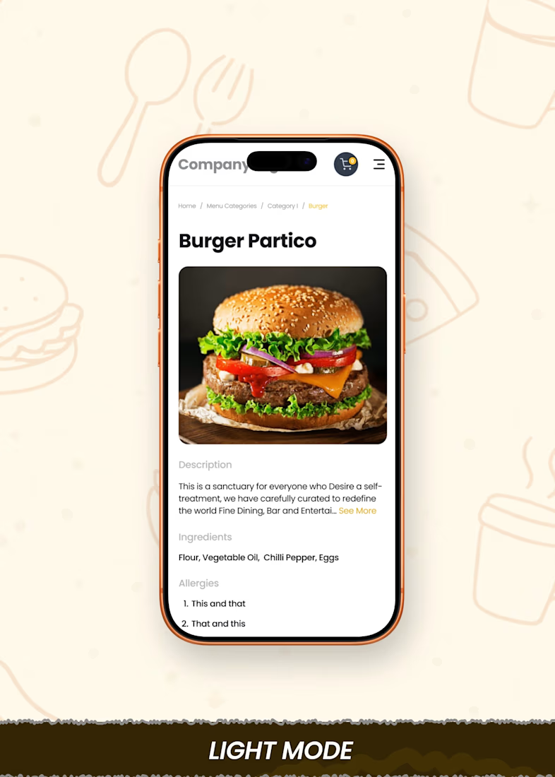
Following up on my last dark mode exploration.
I mentioned how contrast, surfaces, and hierarchy behave differently.
I tried to be more decisive and careful with that here.
This time:
• less harsh contrast
• better separation between sections
• more focus on readability
One thing I am realizing:
In dark mode, it is easier to lose structure if one is not careful.
Still learning.
#Lightmode #Darkmode #Figmadesigns
The network for creativity
Join 1.25M professional creatives like you
Connect with clients, get discovered, and run your business 100% commission-free
Creatives on Contra have earned over $150M and we are just getting started
Related posts
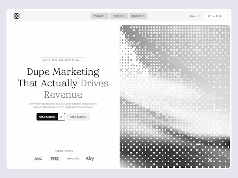
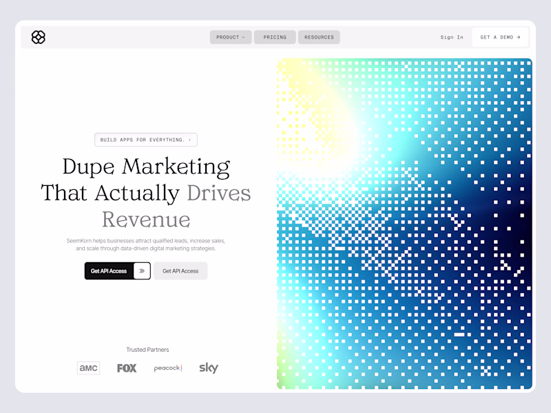
A small update to my portfolio. Light mode ☀️ / Dark mode 🌙
One of those small details that makes browsing a little more enjoyable.
Check it out: https://badretdinov.com
Your portfolio looks experimental yet completed. And its minimal while you go on lets you focus on the projects. Great design overall!
I like monochrome theme so much but the monochrome version kills the spul in this one. I will go with colored!
The moodboard was the hardest part of this whole project.
54 Mirrors had to stand out, but still read as wellness. Those two pull against each other and that's basically the entire brief.
It's a weird artifact, this board. It holds the bold, loud character of the studio, and at the same time I was trying to build a home feeling with raw photo style. Not polished studio shots. Real light, real rooms.
What I wanted people to feel: you're different here, and you're still comfortable here.
Took me way more iterations than I want to admit 😅
Where do you start with a moodboard? Photos first or colors first? 💬
It definetely looks it worth your effort. Nice color and texture choice along with great animation speed. Good work!
Trending
Claude
Claude has entered the design space. How are you using Claude Design?
Contra University
Learn from expert creatives how to earn more using next-gen AI tools.
creativeaiflow
Creative AI workflows are evolving. What tools do you use, and what are their strengths and weaknesses?
freelancerlife
Freelancer life is wins, pivots, and everything in between. What’s yours right now?