The network for creativity
Join 1.25M professional creatives like you
Connect with clients, get discovered, and run your business 100% commission-free
Creatives on Contra have earned over $150M and we are just getting started
Back to feedPost

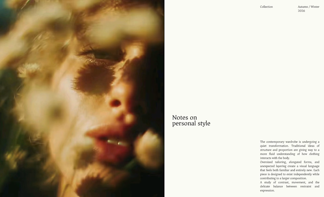
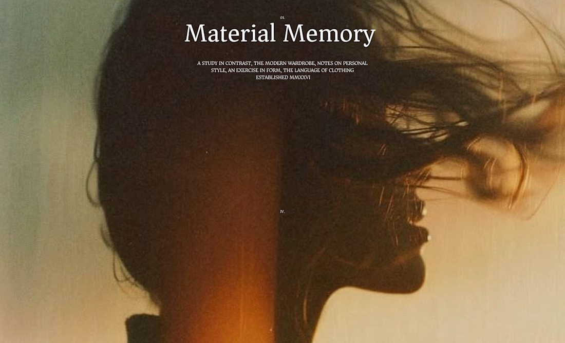
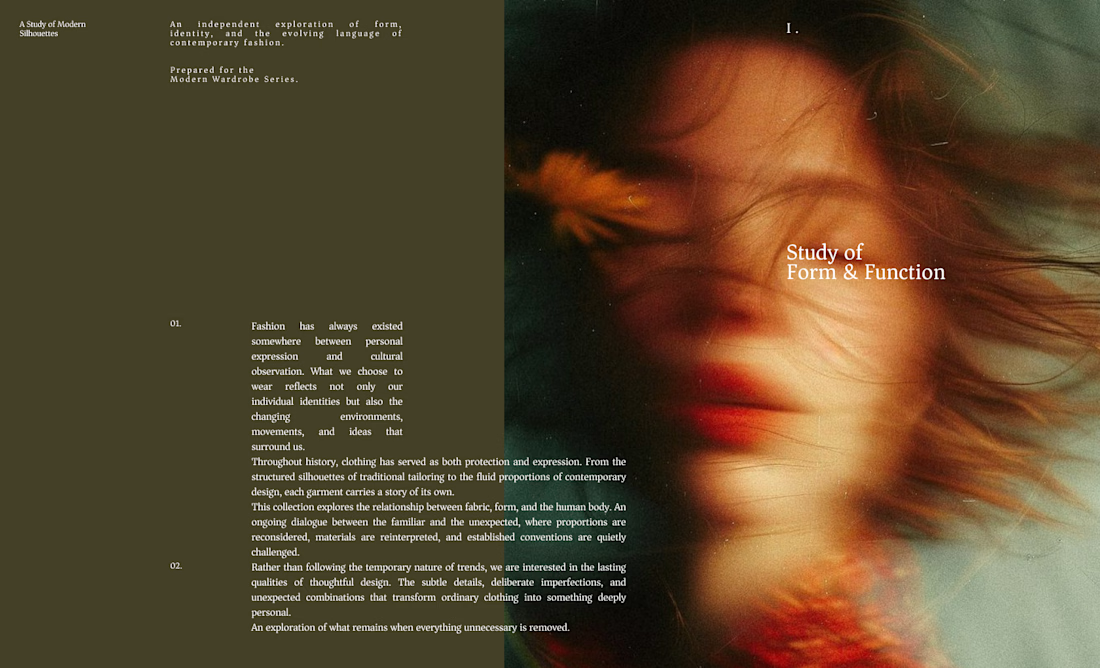
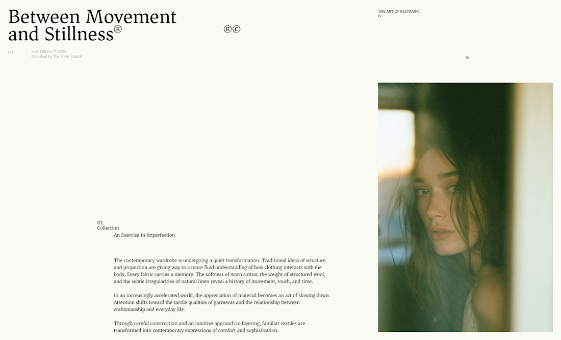
Building my second Framer template.
This time I'm exploring a typography-first portfolio with a minimal editorial aesthetic.
Here's the first hero section—still a work in progress.
Feedback is welcome.


The network for creativity
Join 1.25M professional creatives like you
Connect with clients, get discovered, and run your business 100% commission-free
Creatives on Contra have earned over $150M and we are just getting started



Related posts

I designed these editorial-inspired layouts as part of an exploration for a fictional photography and fashion magazine
↳ Master typography & layout - The foundation of timeless web design. Join 350+ designers inside my 13-hour online course https://typomonday.com/course


Really nice exploration 👍

Card Banking Web Design Exploration
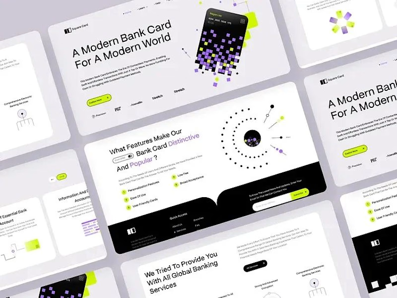
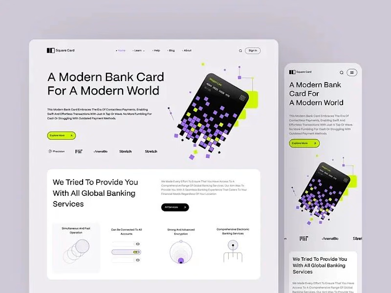
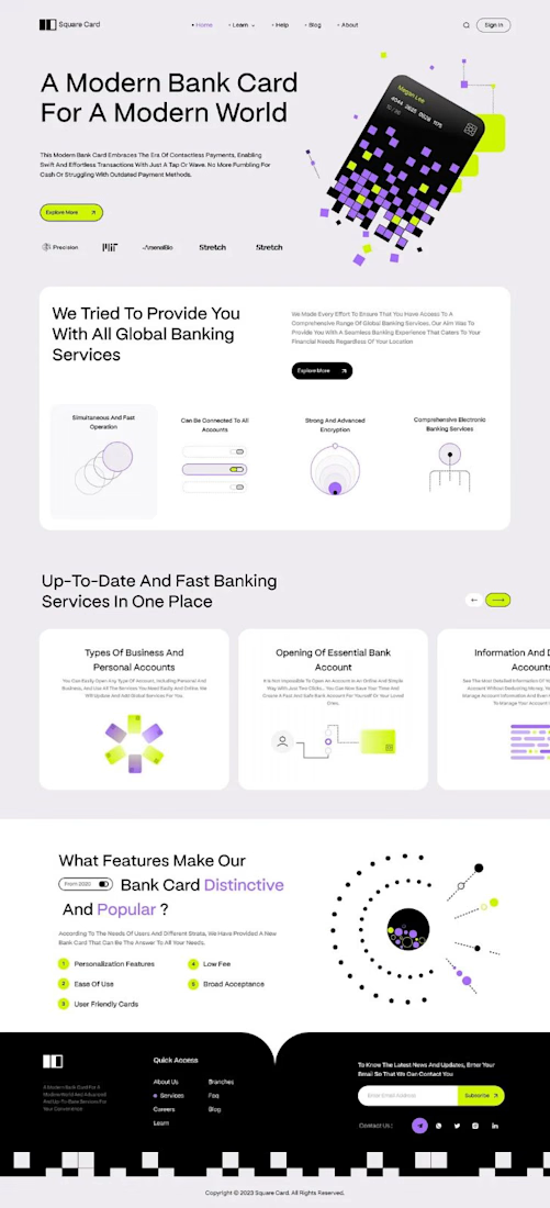
“A modern bank card for the modern world.” That line set the tone, and the layout follows it.
The hero is one pixelated card, built from small squares in lilac, lime and black. It breaks apart into the page, and the product still reads first.
The headline runs large across the left in clean type, so big the message lands before anything else. The card keeps its playful shape, and the words still lead.
Thin line icons and numbered points split the features into small, clear blocks. The busy information gets a strict structure to lean on.
A single lime button sits under the headline and marks where to go next.
Designed by Pixel & Form.
#WebDesign #BankingDesign #FintechDesign #UIDesign #LandingPage #ProductDesign #ResponsiveDesign #CardDesign #Typography #FigmaDesign


Nice work!

Smooth navigation for my luxury restaurant @Framer template – Bordo


nav feels so smooth