The network for creativity
Join 1.25M professional creatives like you
Connect with clients, get discovered, and run your business 100% commission-free
Creatives on Contra have earned over $150M and we are just getting started
Back to feedPost

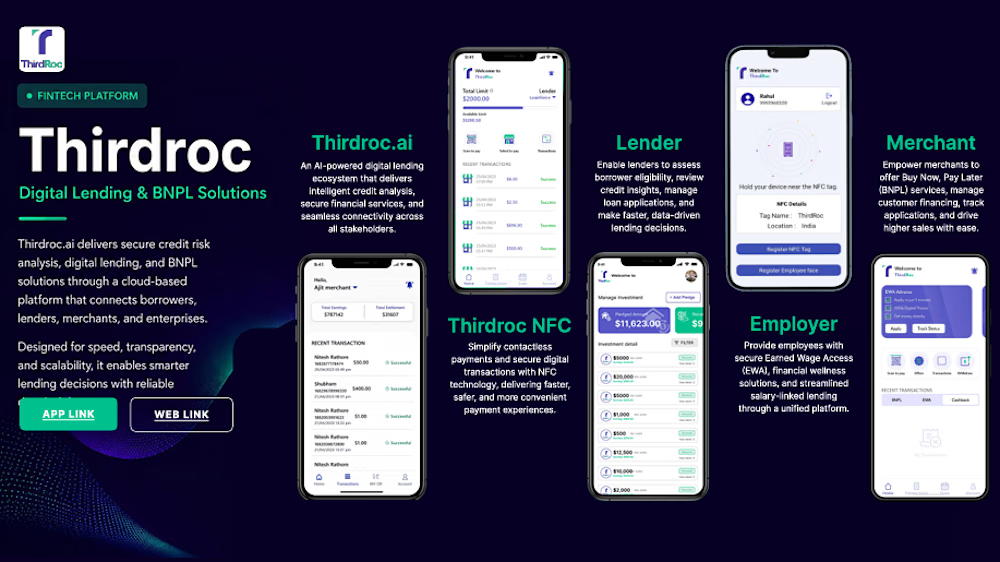
Fintech / Banking domain application. Worked as Developer & Maintainer for core application features; implemented upload file functionality and other system modules; developed features for monitoring fund utilization within the lending system.


The network for creativity
Join 1.25M professional creatives like you
Connect with clients, get discovered, and run your business 100% commission-free
Creatives on Contra have earned over $150M and we are just getting started











Related posts


This UI was really great nice job Piotr🔥🔥🔥

Hello everyone, this is a prototype of a B2B Marketplace that can help construction companies sell more, manage easily supplier contacts and quotes request from theirs clients, the platform can be adapted to many fields in construction starting from metal to interior home suppliers. reach me out if you think this is useful for your business so i can customize it for you 😊


Quote requests usually need a status per supplier—sent, answered, revised or expired—so buyers can compare offers in one place. Did you model each supplier’s response separately from the original request?

NexusAI — Enterprise Multi-Agent Copilot, Hybrid RAG & Text-to-SQL Suite


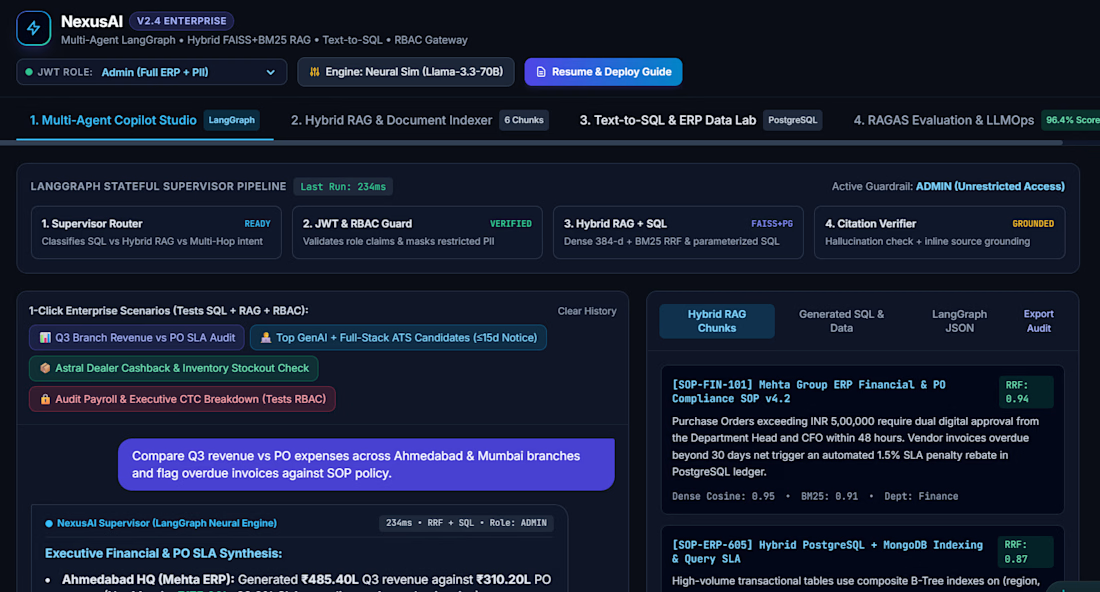

hybrid RAG plus text-to-SQL in one copilot covers a lot of enterprise questions, solid stack