The network for creativity
Join 1.25M professional creatives like you
Connect with clients, get discovered, and run your business 100% commission-free
Creatives on Contra have earned over $150M and we are just getting started
Back to feedPost


The network for creativity
Join 1.25M professional creatives like you
Connect with clients, get discovered, and run your business 100% commission-free
Creatives on Contra have earned over $150M and we are just getting started



Related posts

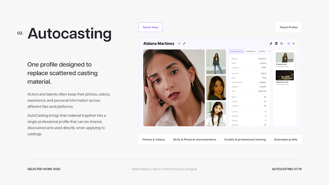
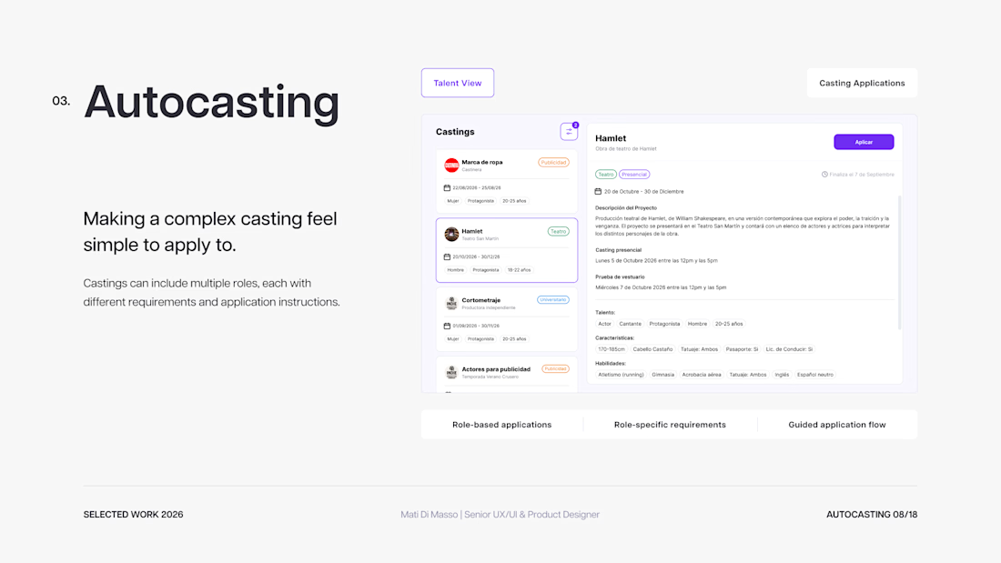
Designing and launching a two-sided casting marketplace connecting talent with opportunities.


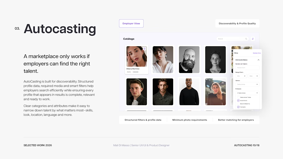
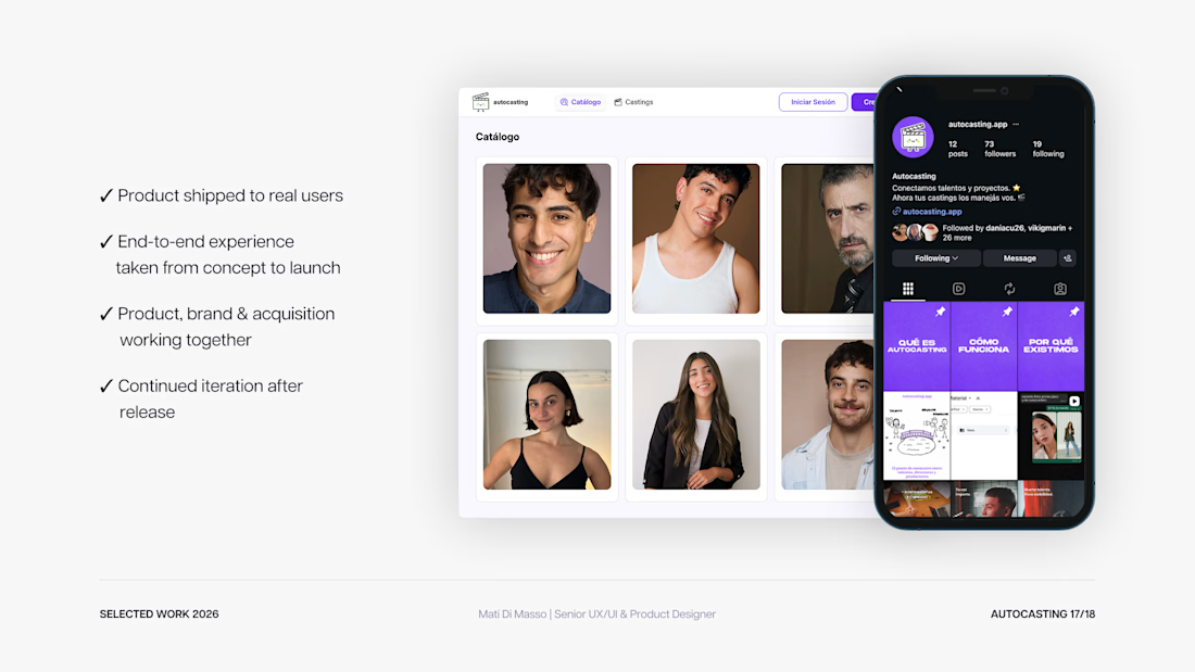

The talent cards look really clean.


The green gradient bars sweeping in behind "Build your agentic workforce" make the line feel like it's moving forward, and the $100 limit card is a clean UI beat. Which of the four took the longest to get right?

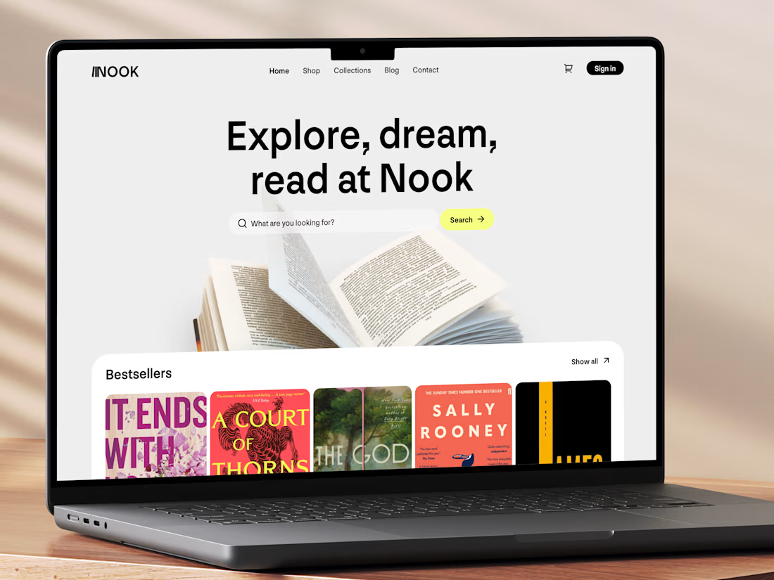
Really like this concept! The clean layout and typography look great, and the bestseller section is a nice touch. Genre filters could make browsing even better. Great work! 👏


New concept for bookstore 📚
What do you think?