The network for creativity
Join 1.25M professional creatives like you
Connect with clients, get discovered, and run your business 100% commission-free
Creatives on Contra have earned over $150M and we are just getting started
Back to feedPost

Health Habit Simulator is a state-driven interactive wellness app built entirely in Figma Make.
Users can adjust their health targets — including sleep hours, hydration levels, and mood score — and instantly see how their metrics, progress indicators, streaks, and overall health score respond in real time.
The system dynamically updates:
Progress percentages
Weekly trend charts
Daily comparison graphs
Overall health score classification
Motivational feedback messaging
All interactions are powered by live state logic without navigating between screens, simulating a real health analytics product experience.

The network for creativity
Join 1.25M professional creatives like you
Connect with clients, get discovered, and run your business 100% commission-free
Creatives on Contra have earned over $150M and we are just getting started





Related posts

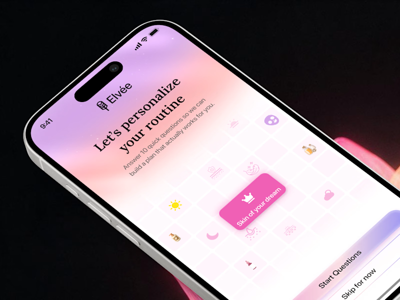
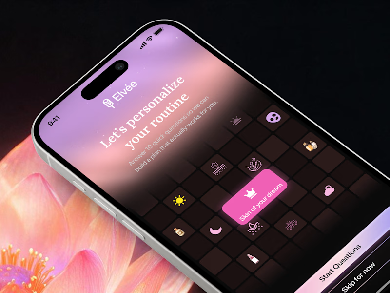
First impressions matter in onboarding 🌸 Which theme sets the right mood for a personalized wellness app? Drop your favorite light gradient or moody dark mode in the comments! 💬

15 votes
Ends in 9h

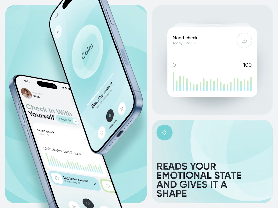
Our latest case study is live! 🌿
Meet Calm, an AI-powered wellness app designed to make mood tracking, emotional insights, and healthier daily habits feel simple and approachable.


AI Plant Care & Disease Detection Mobile App Design
An AI-powered Plant Health Monitoring mobile app designed to help users identify plant diseases, track plant health, monitor environmental conditions, and receive personalized care recommendations. The app combines intelligent diagnostics, smart reminders, and real-time health insights to make plant care simple, proactive, and accessible for both home gardeners and plant enthusiasts.


Premium and eye catching work