The network for creativity
Join 1.25M professional creatives like you
Connect with clients, get discovered, and run your business 100% commission-free
Creatives on Contra have earned over $150M and we are just getting started
Back to feedPost
EMBER & OAK is a brand identity concept inspired by natural textures, warm earthy tones, and timeless elegance. I developed an 8-section visual storyboard featuring logo design, typography, colour palettes, packaging, and brand applications to create a cohesive, premium brand experience with a modern yet organic feel.


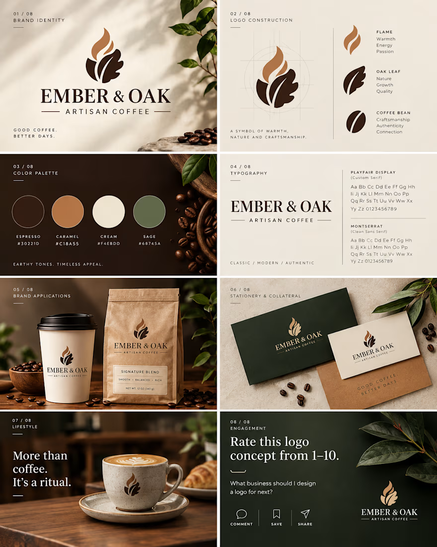

Rating it a 7. The espresso, caramel, cream and sage palette and the flame inside the oak leaf are tidy, but a flame and a leaf with coffee beans is the first mark most coffee brands reach for. The logo construction slide shows the shape is built carefully. Next push is one detail nobody else's coffee mark has.

Thank you for the honest feedback! I appreciate it. Definitely see your point about making the mark more unique. Something I’ll keep in mind moving forward!
The network for creativity
Join 1.25M professional creatives like you
Connect with clients, get discovered, and run your business 100% commission-free
Creatives on Contra have earned over $150M and we are just getting started



Related posts




Which packaging color catches your eye first?
6 voted
46%
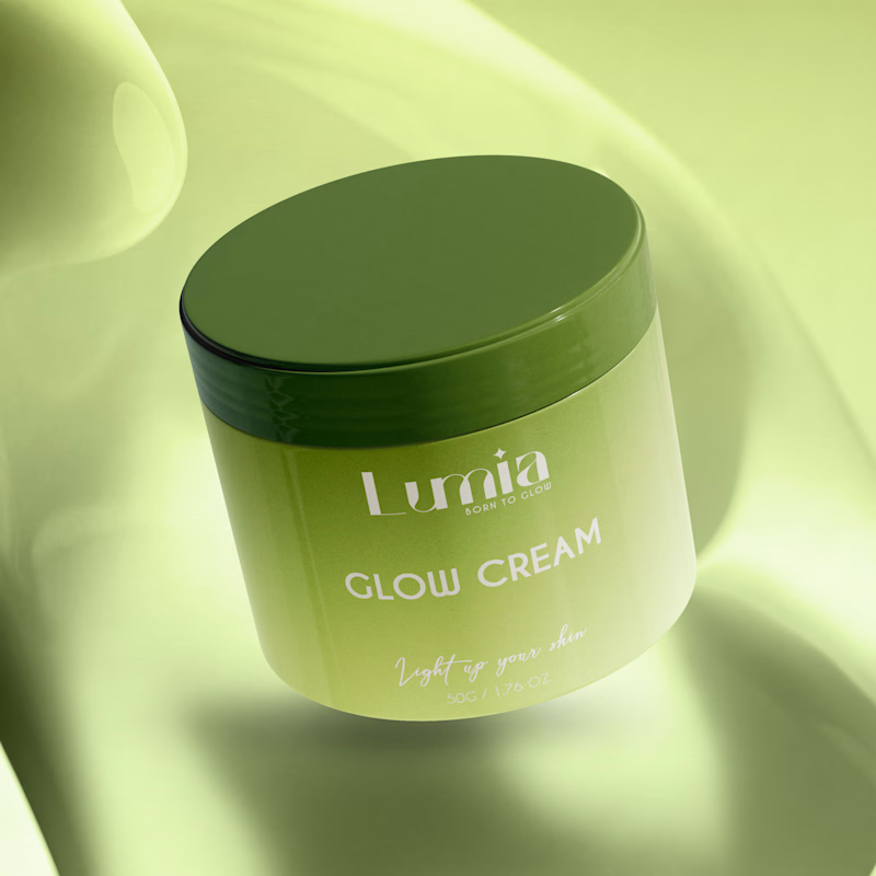
7 voted
54%
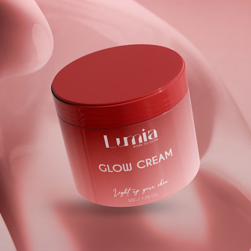
13 votes
Closed

The green version catches my eye first: the dark olive lid gives the lighter jar a clear focal point. I would also test the small white label text at thumbnail size, since the soft lighting reduces its contrast in both versions.

I left SUBDERMA for dead a while ago.
Reopened the file. It still had a pulse.
So I fitted it with new hardware, new skin, new rules.
Case study out soon.