The network for creativity
Join 1.25M professional creatives like you
Connect with clients, get discovered, and run your business 100% commission-free
Creatives on Contra have earned over $150M and we are just getting started
Back to feedPost

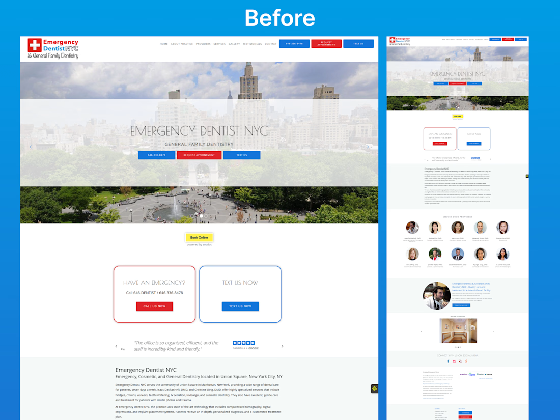
Most healthcare websites don’t fail because of bad design.
They fail because users don’t know what to do next.
This project focuses on redesigning an emergency dental website with one clear goal:
Turn confusion into immediate action.
Problem in the original design:
No clear primary CTA
Too many competing actions (Call, Text, Book)
Weak first impression
No urgency for emergency users
Poor visual hierarchy
Information overload
Users had to think… instead of act.
Solution in the redesign:
Strong, emergency-focused hero section
Clear “Call Now” primary action
Simplified user flow
Trust signals placed above the fold
Clean layout with better spacing and hierarchy
Reduced cognitive load for faster decisions
Outcome:
A modern, conversion-focused landing page designed to help users take action within seconds — especially in high-intent situations like dental emergencies.
This project highlights the importance of UX strategy over just visual design.
Because good design doesn’t just look better.
It performs better.


The network for creativity
Join 1.25M professional creatives like you
Connect with clients, get discovered, and run your business 100% commission-free
Creatives on Contra have earned over $150M and we are just getting started
Related posts

How to design an app with an interactive map using Figma Make
You can duplicate the prototype here: https://psxid.figma.com/jan_mraz
/FigmaPartner/


Owo 😍
I built this fully functional frontend prototype in under 24 hours using Figma Make. ✨
From first idea to a working web experience with real user input and a complete frontend flow.
The concept:
An app that lets you send personalized digital posters to someone on a flight, displayed directly on their seat screen. You can even enhance the moment with real world surprises delivered during the flight.
Bringing a bit of emotion and connection into a place that usually feels pretty distant.
Really enjoying what’s possible with Figma Make right now.
Curious what you think about the idea. 👀

Great job!

https://www.figma.com/proto/miMTszlSlXavztNxPQU5IX/Work_2026?node-id=1201-76290&viewport=-8339%2C-2216%2C0.37&t=RvefdBa4Pjgi1LqV-1&scaling=scale-down&content-scaling=fixed&page-id=519%3A33497&starting-point-node-id=1209%3A77306
Hi All, im trying to decide on a way to showcase my designs.
Below are two setups
A - Simple, a White Line Border
B - A line-based Minimal Browser.
Which do you prefer
If you need a full screen view you can view here in the link above
Thank you!
21 voted
53%
19 voted
47%
40 votes
Closed

The white?


Trending


Notion
Notion isn’t just where you work, it’s starting to work for you. What agents are you building?
portfolioreview
The best portfolios tell a story, not just show a grid. Share yours for feedback.
brandguidelines
Brand guidelines are becoming living systems, not static documents. What are you building for your clients?
aivideo
AI video tools are moving at warp speed. Which ones are you experimenting with?
freelancerlife
Freelancer life is wins, pivots, and everything in between. What’s yours right now?