The network for creativity
Join 1.25M professional creatives like you
Connect with clients, get discovered, and run your business 100% commission-free
Creatives on Contra have earned over $150M and we are just getting started
Back to feedPost


The network for creativity
Join 1.25M professional creatives like you
Connect with clients, get discovered, and run your business 100% commission-free
Creatives on Contra have earned over $150M and we are just getting started







Related posts


Would you buy a course if you couldn't see what's inside?
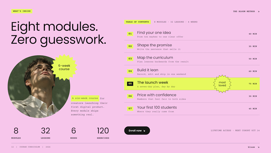
On most Kajabi sales pages, the curriculum sits in a collapsed accordion, and most visitors never open it. So we designed it as an open table of contents: the whole course, readable at a glance.
Three decisions make it work:
1. Numbers you can scan. Big module numbers on a highlight turn eight modules into a path, not a wall of text.
2. Time next to every module. Effort is part of the price. "75 min" answers a question buyers are shy to ask.
3. One module in the spotlight. The signature lesson gets the star. The rest stay calm, so the eye knows where the value peaks.
And one quiet fix: neon lime on pink looks bold but reads at about 1.1:1 contrast. We keep lime as a marker behind dark text, never as the text itself.
A curriculum is the product. Show it like one.
Do you open course accordions, or scroll right past them?

Really like the thinking behind this! Making the curriculum visible upfront reduces friction and helps buyers evaluate both the content and time commitment. The highlighted module also creates a clear focal point. Definitely prefer this over hiding everything behind an accordion. Nice work👏
Your Hero Section Has One Job: Be Clear.
You don’t need huge headlines or long explanations. You need the right image + short headline + clear offer.
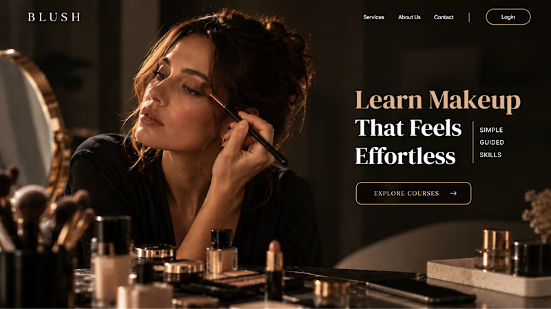
For the first version, we worked on the branding, the image and the copy together, so at first glance it’s clear: this is a makeup course, and here’s what you’ll get.
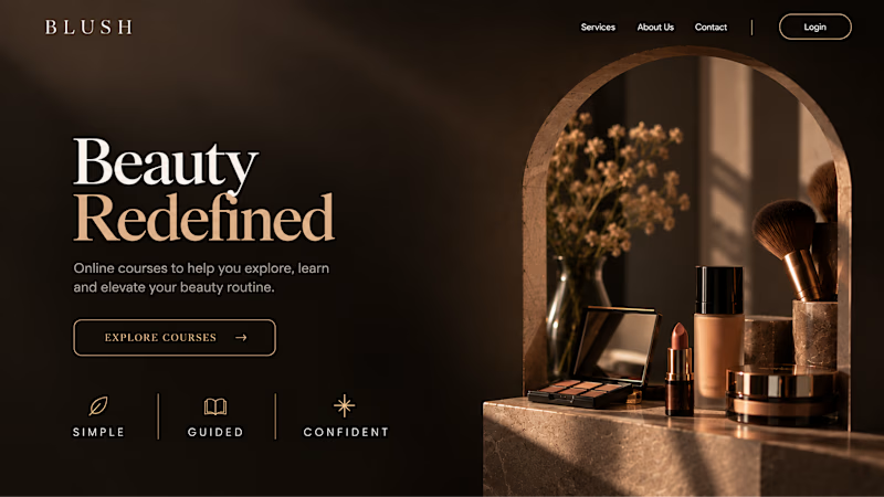
The second version is still beautiful and still feels like beauty. But what are you actually getting? A makeup course? Products? A store? That’s the problem with a Hero that looks good but isn’t thought through.
Your first screen doesn’t need to say everything. It just needs to say the right thing.
31 votes
Ends in 11h


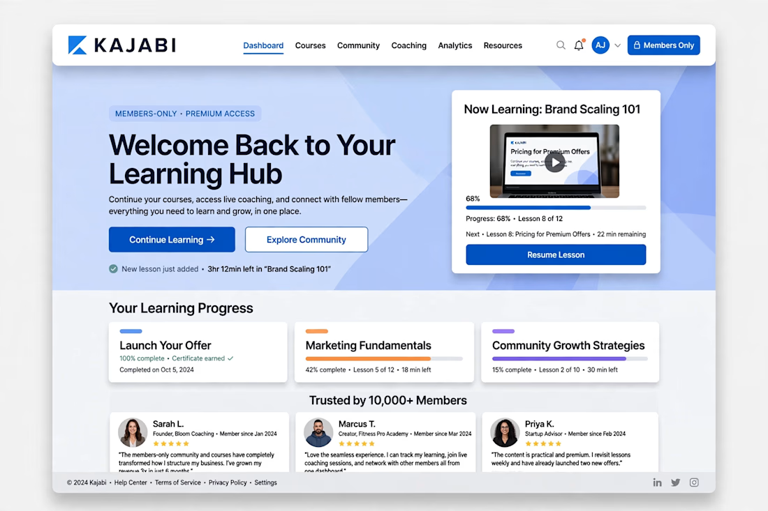
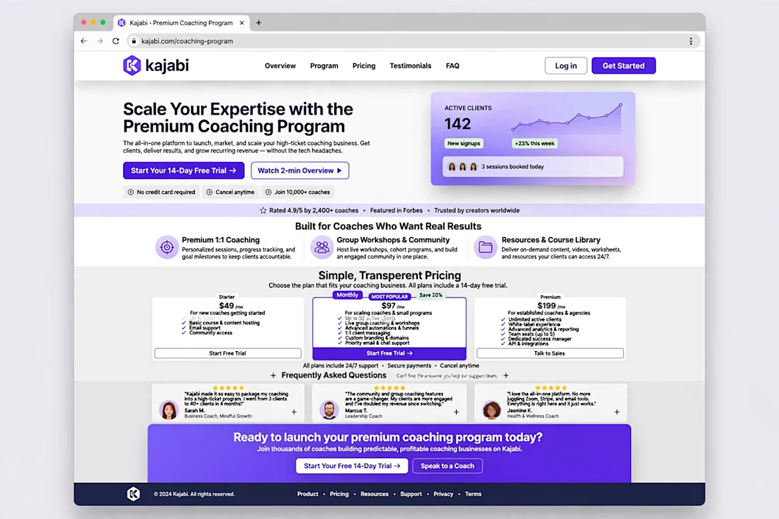
Kajabi Website Rebrand + High-Converting Landing Page | Members-Only UX



Cool work Naeem