The network for creativity
Join 1.25M professional creatives like you
Connect with clients, get discovered, and run your business 100% commission-free
Creatives on Contra have earned over $150M and we are just getting started
Back to feedPost

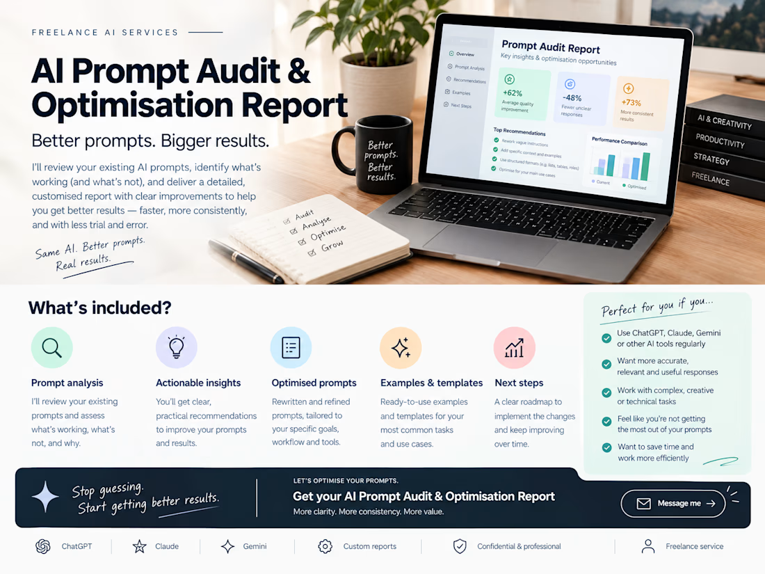
AI Prompt Audit & Optimisation Report
A professional prompt review service designed to turn underperforming, inconsistent, or overly complicated AI prompts into clearer, more reliable, and more effective instructions.
The report examines your existing prompts and identifies opportunities to improve:
Clarity & structure
Instructions & context
Output quality & consistency
Efficiency & unnecessary complexity
Prompt-specific weaknesses and gaps
Each audit provides practical recommendations and an optimised version of the prompt, giving you a clearer foundation for getting better results from AI.
Built for founders, freelancers, marketers, agencies, creators, and teams who already use AI but want to get more out of their existing prompts.
Less trial and error. Better prompts. More consistent AI output.


The network for creativity
Join 1.25M professional creatives like you
Connect with clients, get discovered, and run your business 100% commission-free
Creatives on Contra have earned over $150M and we are just getting started







Related posts

Juice & Beverage Shopping App UI/UX Design
A fresh and modern juice and beverage shopping app designed to deliver a smooth and engaging shopping experience. Featuring vibrant product visuals, intuitive navigation, interactive animations, and a clickable prototype, this design makes it easy for users to explore beverages and enjoy a seamless ordering journey.
The project combines clean UI, thoughtful UX, and engaging micro-interactions to create a visually appealing and user-friendly mobile shopping experience.


You did a great Job! 🔥