The network for creativity
Join 1.25M professional creatives like you
Connect with clients, get discovered, and run your business 100% commission-free
Creatives on Contra have earned over $150M and we are just getting started
Back to feedPost
One of the things I enjoy most about healthcare projects is turning complex medical information into something clear, calm, and easy to navigate.
These are a few screens from my recent work for Forsa EggBank — an international egg bank focused on quality, transparency, and trust.
Which slide catches your attention first?


Love the clean and calming approach. The first slide definitely caught my attention😍

Thank you so much! 😍 I’m happy to hear that.

The hero screen (the first one) caught my eye immediately! But looking closer, the layout on the right with the clear feature breakdown is great UX. Turning complex medical data into something so clean and scannable is no easy task. Great job!
Thank you so much! 😊 That was exactly the goal making complex medical information feel clear and easy to scan. So glad the feature breakdown stood out to you! ✨

Awsome😍
Thank you😍

The most focussed on 1 slide. He is so handsome

Huge respect for turning complex data into such a neat UI! 🩵🤍
Thank you so much! 🩵

The first screen looks incredible and immediately grabs attention! You did a fantastic job turning complex medical content into a calm, clean, and highly trustworthy experience. Beautiful typography layout! 🩺✨
Thank you so much! 🥹✨ I'm really happy to hear that. Creating a clean and trustworthy experience was one of the main goals of this project, so your feedback means a lot!


It’s like a breath of fresh air on this sweltering summer’s day

Nicely done, Nataly! 🙌
The network for creativity
Join 1.25M professional creatives like you
Connect with clients, get discovered, and run your business 100% commission-free
Creatives on Contra have earned over $150M and we are just getting started



Related posts

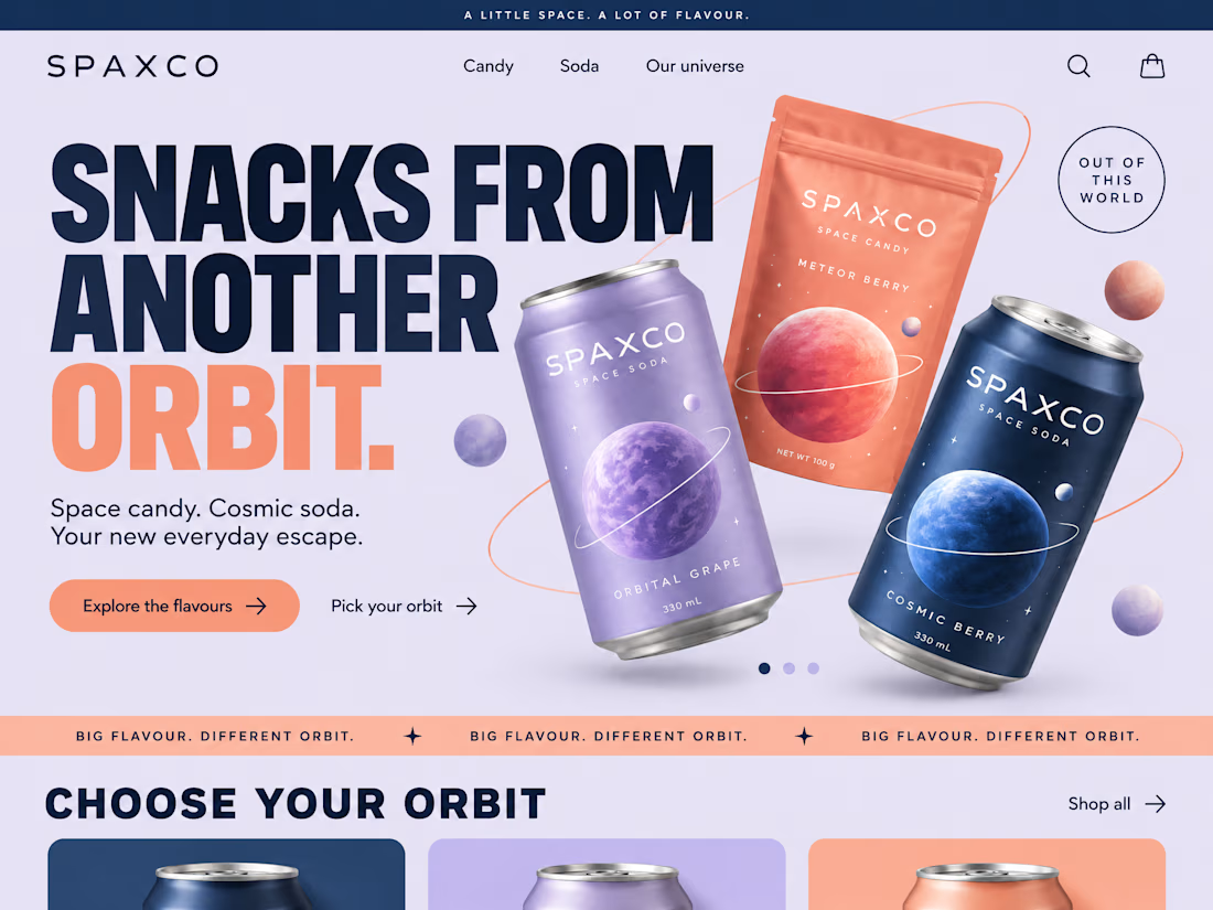
First impressions happen in seconds. We made them count.
A landing page should do more than look good. It should tell a story, build trust, and make the next step feel natural.
We brought together bold visuals, thoughtful layouts, and clear messaging to create an experience that keeps visitors engaged from the first scroll to the final click.
Good design catches the eye. Great design gives people a reason to stay.
What's your next big idea?



Nice and clean work tbh

New here, so I'm slowly filling in my portfolio and getting to know the place. So far I like it.
Here's an extract from Software Intelligence, a Framer site I designed and built a few months ago for an enterprise data consulting startup.
The visual idea mirrors what they do with data: compact blocks that animate, break apart and recompose, like charts taking shape. Few effects, all consistent, everything managed through the CMS.
If you have a minute, take a look at the full case study.
I'd love to know what you think, especially whether the motion supports the content or ends up overpowering it.

This is impressive! 🤝