The network for creativity
Join 1.25M professional creatives like you
Connect with clients, get discovered, and run your business 100% commission-free
Creatives on Contra have earned over $150M and we are just getting started
Back to feedPost

Phyra, A fictional supplement brand.
Exploring how a simple idea can develop into a distinctive visual identity.
Inspired by the structure of cells, the six-dot symbol sits at the heart of the Phyra identity. Stripped back to its simplest form, it creates a clean, geometric mark that feels considered and memorable.
From logo development to typography, layouts and imagery, I’ve been exploring how the identity can expand into a cohesive visual system across different applications.
This is just the beginning, with the full identity expansion coming soon.:
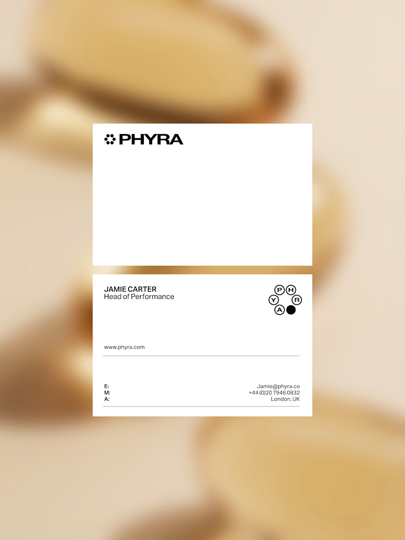
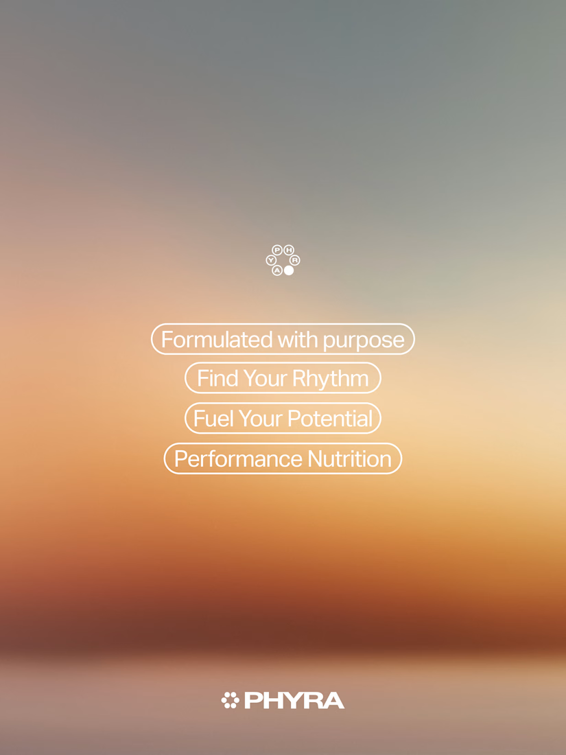

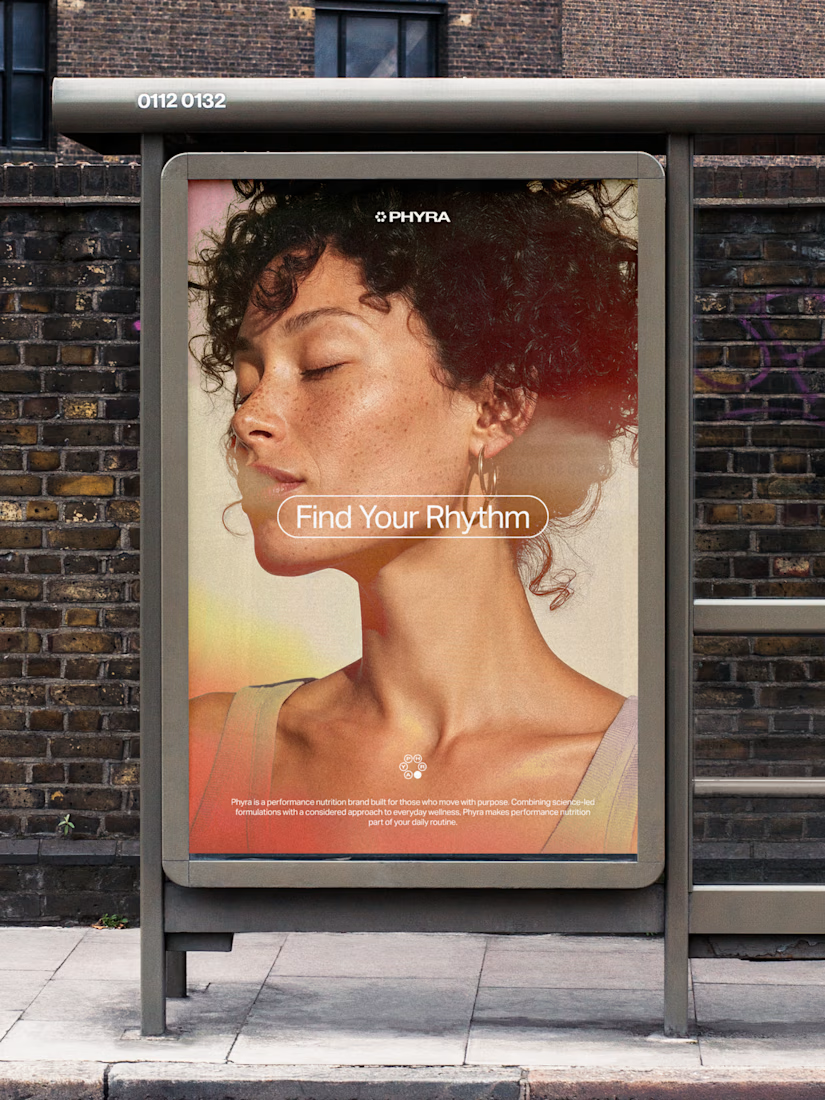

The six-dot ring still reads clearly at small scale on the tulip photo, which is a good sign for the mark. For the full expansion, are you planning to use the dot arrangement as a pattern or motion element, or keep it strictly as the logo?

The six-dot symbol small in the corner of the card and the tulip photo is quiet and premium, and the warm gradient with the Find Your Rhythm and Fuel Your Potential pills fits a supplement brand. My challenge: a ring of dots is also what a loading spinner looks like, and a tulip...
The network for creativity
Join 1.25M professional creatives like you
Connect with clients, get discovered, and run your business 100% commission-free
Creatives on Contra have earned over $150M and we are just getting started



Related posts

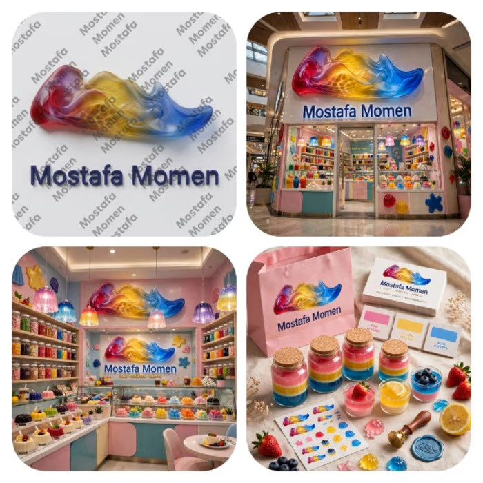
All kids want to feel joy and everybrand has it's own that's my Advanced 3D jelly branding logo case study
This design is mix between natural waves pure nature coloring with (Red, Yellow, Blue) color palette with unique jelly look that let you feel the beauty of jelly taste
This case study help sweet brands to attract potential clients be memorable by and recognizable by it's uniqueness and specially with building trust by showing professionalism
Thanks for everyone who support me❤️



Amazing Work!

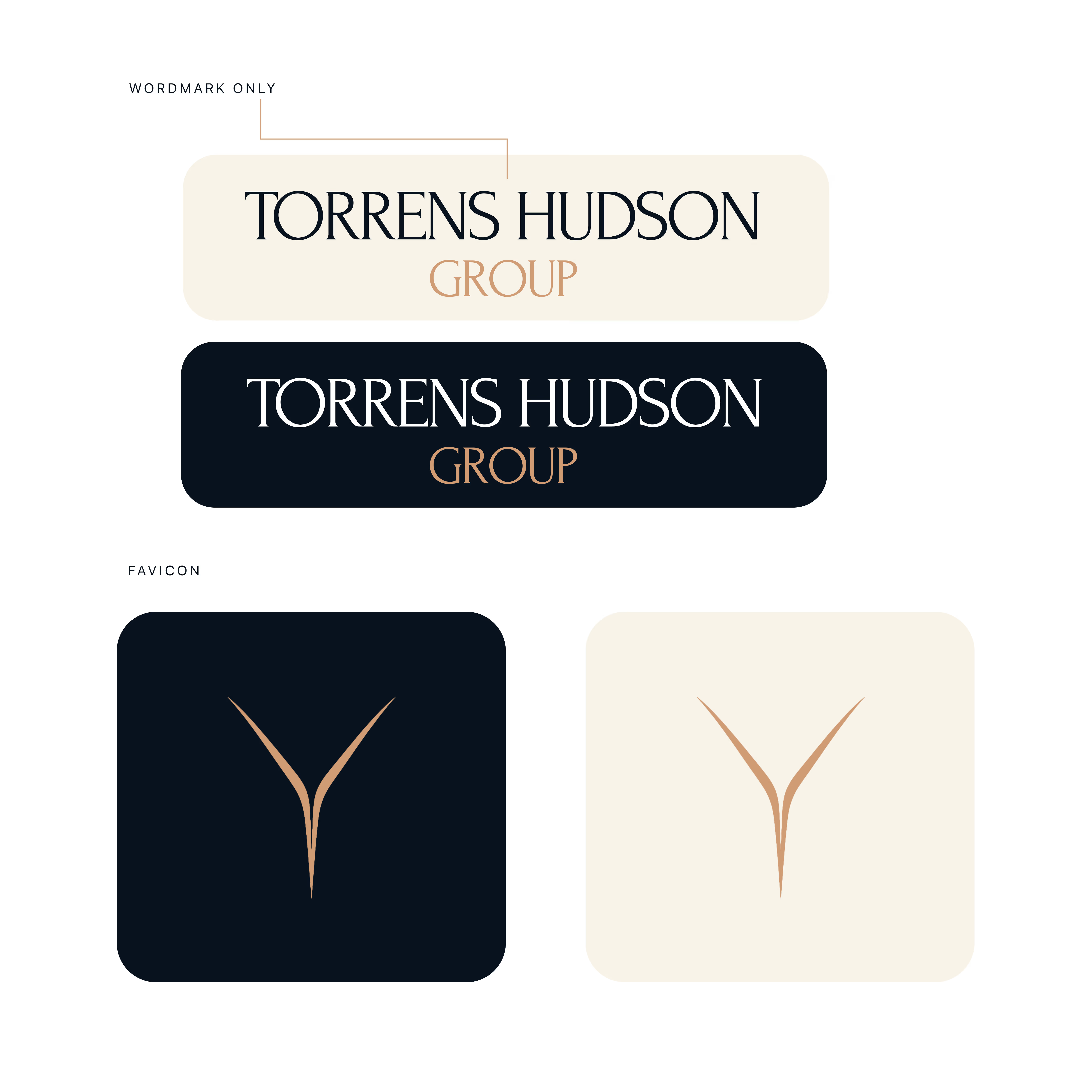
Torrens & Hudson - Brand Identity
Brand identity concept with an editorial serif wordmark, a minimal converging-rivers mark, and a navy, cream and bronze palette.

Nice work 🎉🎉

Social posts we designed for Fulcrum, a physical therapy clinic in Boulder.
Each post comes from the clinic itself: the booking flow, the rates, the therapists, patient reviews and a map to the clinic. Labels sit small above the text, and the photos stay clean.
They use the same fonts, colors and photos as the Fulcrum website template.
Get Fulcrum: https://contra.com/products/x6wj97P2-fulcrum
Live preview: https://fulcrumphysio.framer.website/?utm_source=contra
