The network for creativity
Join 1.25M professional creatives like you
Connect with clients, get discovered, and run your business 100% commission-free
Creatives on Contra have earned over $150M and we are just getting started
Back to feedPost

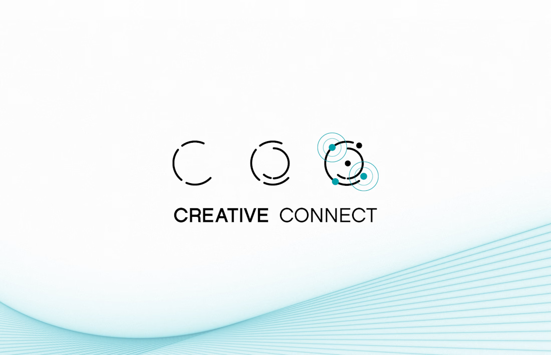
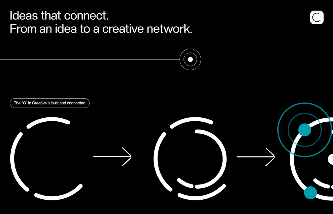
What happens when a simple letter becomes a symbol for creative connection?
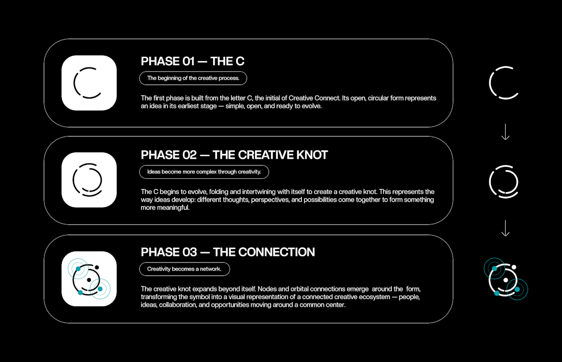
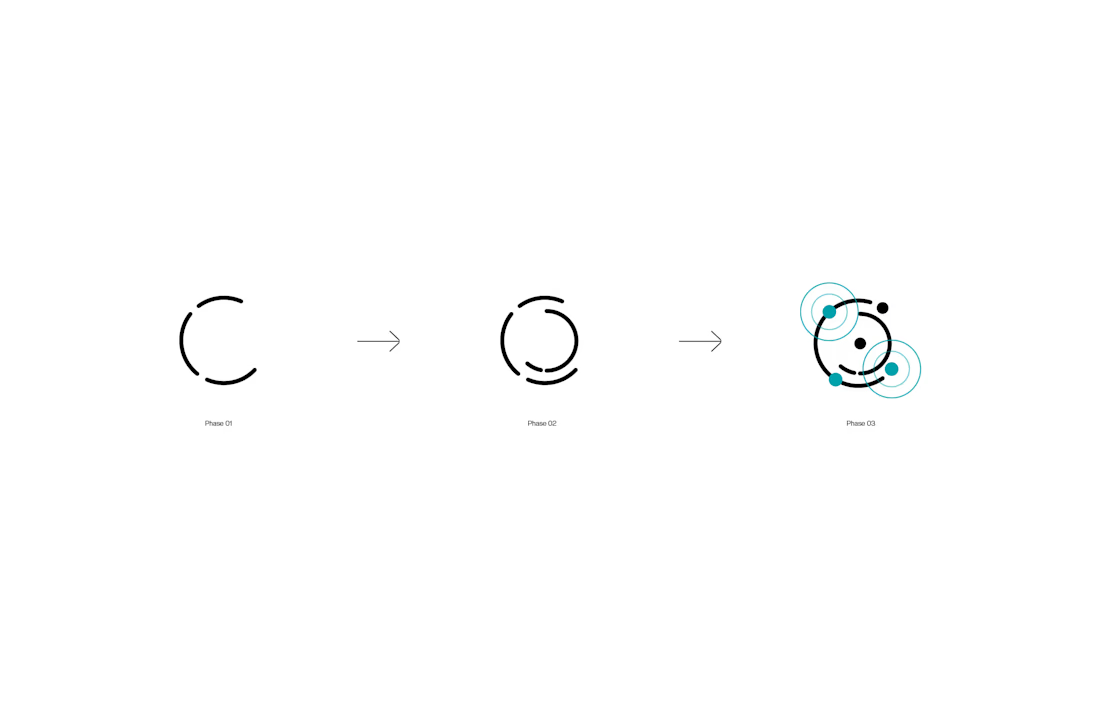
For Creative Connect, the idea started with something simple: the letter C.
From there, the form evolved into a creative knot — an exploration of how ideas become more complex as different perspectives, thoughts, and possibilities intertwine.
The final phase takes that idea further. The knot expands into a network of connections, representing the people, ideas, and collaborations that make creativity move forward.
Three phases. One evolving idea.
From a simple C to a connected creative ecosystem.
Have a brand that needs an identity with a story behind it? Let’s create something meaningful together.
Available for new collaborations → Start your project here


The network for creativity
Join 1.25M professional creatives like you
Connect with clients, get discovered, and run your business 100% commission-free
Creatives on Contra have earned over $150M and we are just getting started

Challenges
View all


Related posts

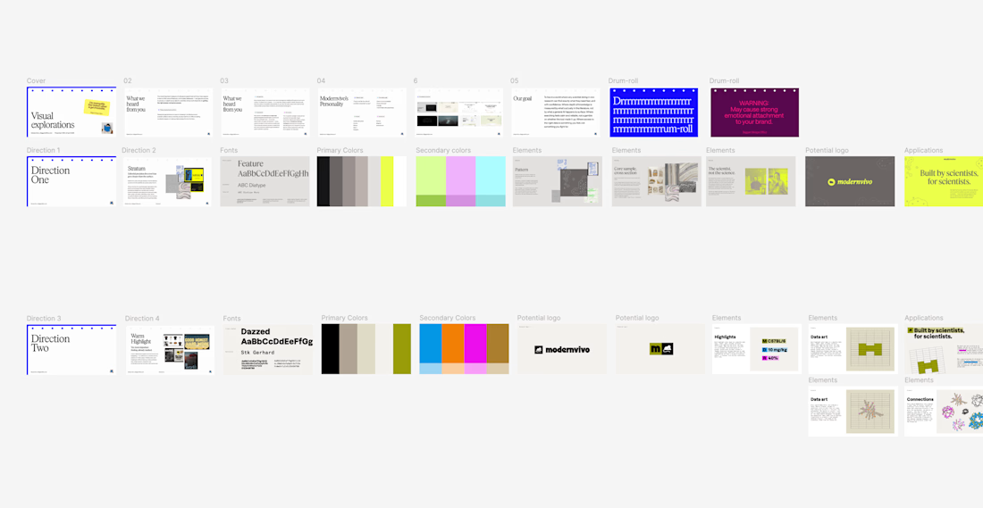
after presenting more brand directions than I can count, one thing I’ve learned: I never jump straight into showing the visuals.
first I want to establish what we're actually trying to solve.
what we heard from the client. what they want to be known for. where they sit in the market. what needs to feel different.
then the big idea, and how it translates into type, colour, imagery and graphic elements.
only then the designs.
context changes how you judge the work.


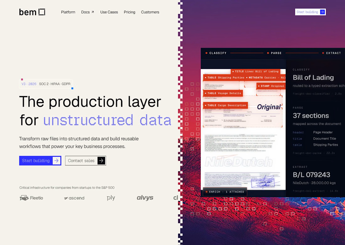
For bem, our Document Mode images start neutral, with the red/blue treatment and pixel dissolve applied later in Figma. If your campaign needs several formats, keeping that treatment editable lets you adjust the finish without regenerating the photograph.

Luxury Fashion E-commerce Landing Page
A premium e-commerce website concept created for a modern luxury fashion brand. The experience focuses on elegant visuals, refined typography, and an intuitive shopping journey that reflects the brand's premium identity.
Project Goal💯
The objective was to design a sophisticated online shopping experience that combines visual storytelling with seamless product discovery. Every section was crafted to highlight the brand's quality, build trust, and encourage conversions while maintaining a clean, minimal aesthetic.


Stunning work