The network for creativity
Join 1.25M professional creatives like you
Connect with clients, get discovered, and run your business 100% commission-free
Creatives on Contra have earned over $150M and we are just getting started
Back to feedPost

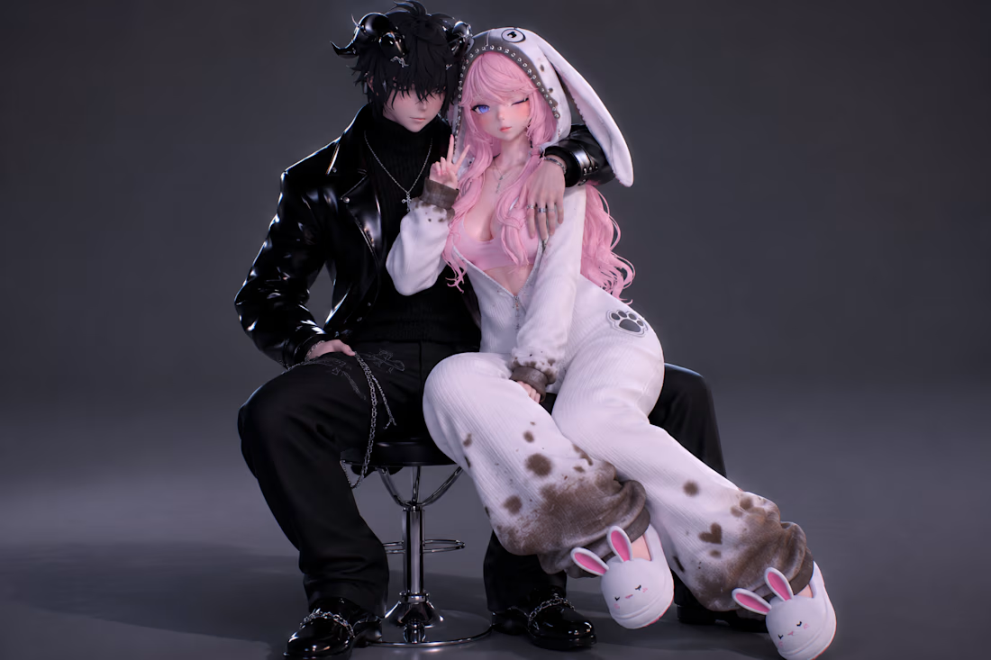
Custom VRChat avatars designed with unique aesthetics, detailed outfits, and personalized features to bring clients' virtual characters to life.


The network for creativity
Join 1.25M professional creatives like you
Connect with clients, get discovered, and run your business 100% commission-free
Creatives on Contra have earned over $150M and we are just getting started








Related posts

Pika just launched their plugin in ChatGPT.
I just used it and created this video.


wow really nice!

Spent the last few days diving deeper into Rive, focusing heavily on character animation and state machines to bring this fictional German learning app to life.
Learning a new language shouldn't feel like staring at a spreadsheet. Here is how I used smooth, reactive animations to make interactive feedback feel natural and engaging:
Rive CLI + Claude is truly a game changer🔥


I designed and built Encore, a scheduling app for a three-office orthodontic practice, then made its launch film the same way I made the app: from the real thing.
Every screen in the film is the live app, recorded on an iPhone 17 Pro simulator. I built the phones as 3D models in Rive, mapped the recordings onto their displays, and choreographed the camera, a three-phone orbit, and a closing wall of twenty screens on a single Rive timeline. No mockups, no After Effects. Swap a screen or retime a move and the film re-renders.


Nice work!!