The network for creativity
Join 1.25M professional creatives like you
Connect with clients, get discovered, and run your business 100% commission-free
Creatives on Contra have earned over $150M and we are just getting started
Back to feedPost

Nine marks, one designer: the logos behind my products and clients.
Every brand here started with the same question: what's the one thing it has to say at a glance? A hand that points to what's next (Brady UX). Three bars with one pulled out of line, because that's what a return is (ReturnStack). A wave rising through the H like a beacon (VitalHaven). A pin that drops where a memory lives (Dropat). Four colored layers stacked behind tab, because your hours stack up.
Each one is shown on the background it was designed for, because a logo is only as good as where it lands.

The network for creativity
Join 1.25M professional creatives like you
Connect with clients, get discovered, and run your business 100% commission-free
Creatives on Contra have earned over $150M and we are just getting started

Challenges
View all


Related posts


Web Design for Contra Labs — an extension of the Brand Identity we created.
Translating the visual language, principles, and character of the identity into a cohesive digital experience.


My Top Featured Projects on @Contra Labs 🔥
⚡| NEXVOLU
⚡| HYDRUM VEIL
⚡| NOIRÉ
Each project explores a different direction, but the goal stays the same: build brands that stand out.
Which project is your favorite?
Drop the name below 👇


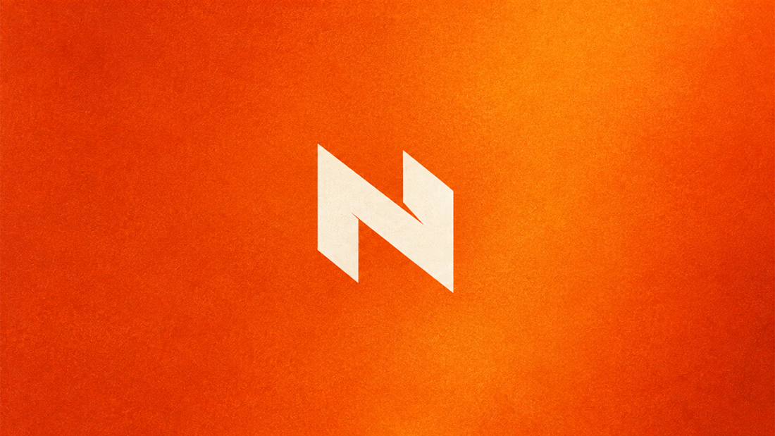
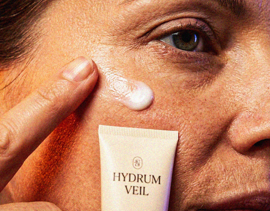
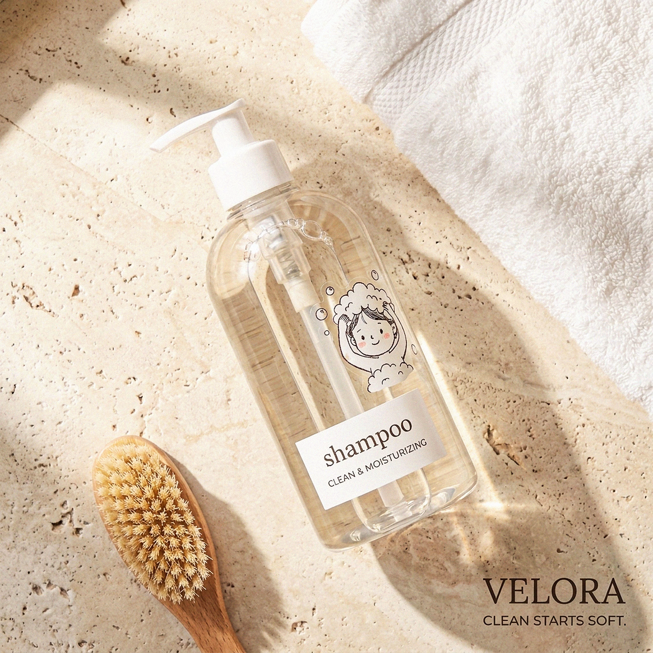
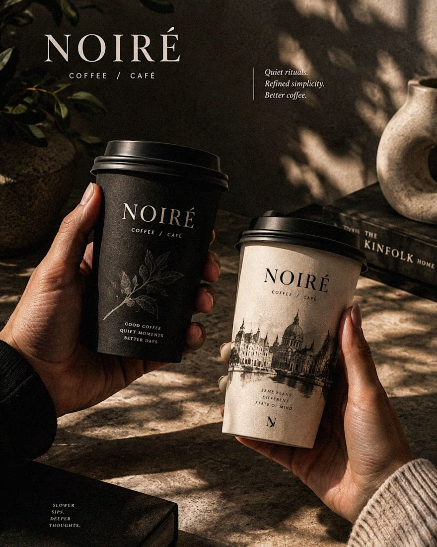

These are 🔥 Mine are all fav 🙌
Congo for Featured on @Contra HQ & @Contra Labs ... 😍

Which book cover design theme speaks the clearest?
6 voted
38%

10 voted
62%

16 votes
Closed


