The network for creativity
Join 1.25M professional creatives like you
Connect with clients, get discovered, and run your business 100% commission-free
Creatives on Contra have earned over $150M and we are just getting started
Back to feedPost


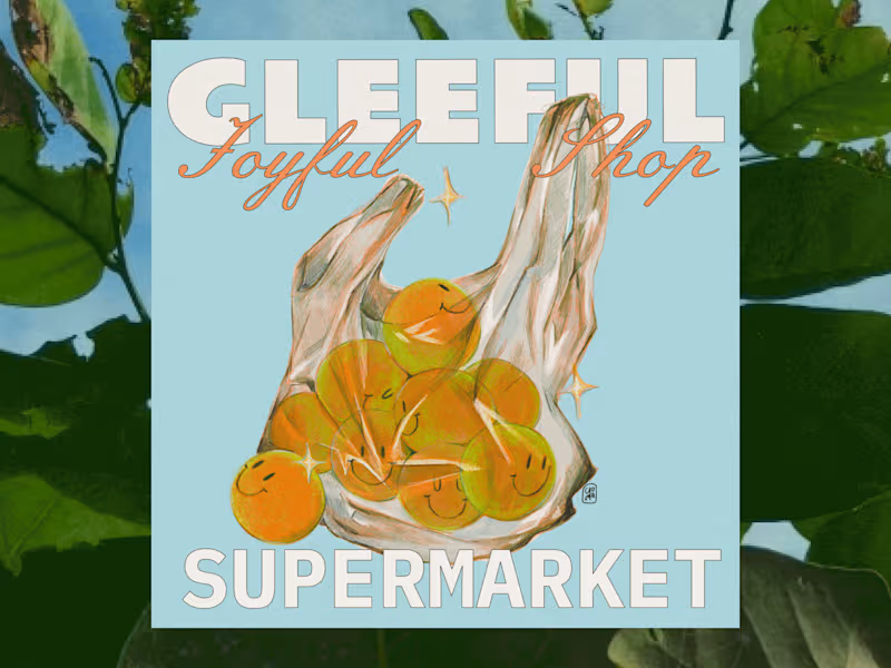


The pairing of illustration with the website makes sense here. When the site itself carries the same playful tone as the graphics, the product feels less like a template and more like a place. Did the illustrations come first and shape the layout, or did the Squarespace structure decide where the illustrations could sit?
The network for creativity
Join 1.25M professional creatives like you
Connect with clients, get discovered, and run your business 100% commission-free
Creatives on Contra have earned over $150M and we are just getting started

