The network for creativity
Join 1.25M professional creatives like you
Connect with clients, get discovered, and run your business 100% commission-free
Creatives on Contra have earned over $150M and we are just getting started


The network for creativity
Join 1.25M professional creatives like you
Connect with clients, get discovered, and run your business 100% commission-free
Creatives on Contra have earned over $150M and we are just getting started
Related posts

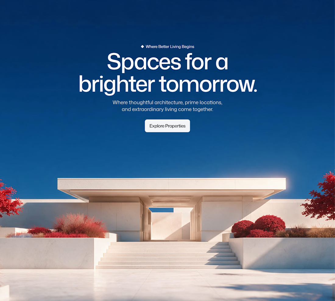
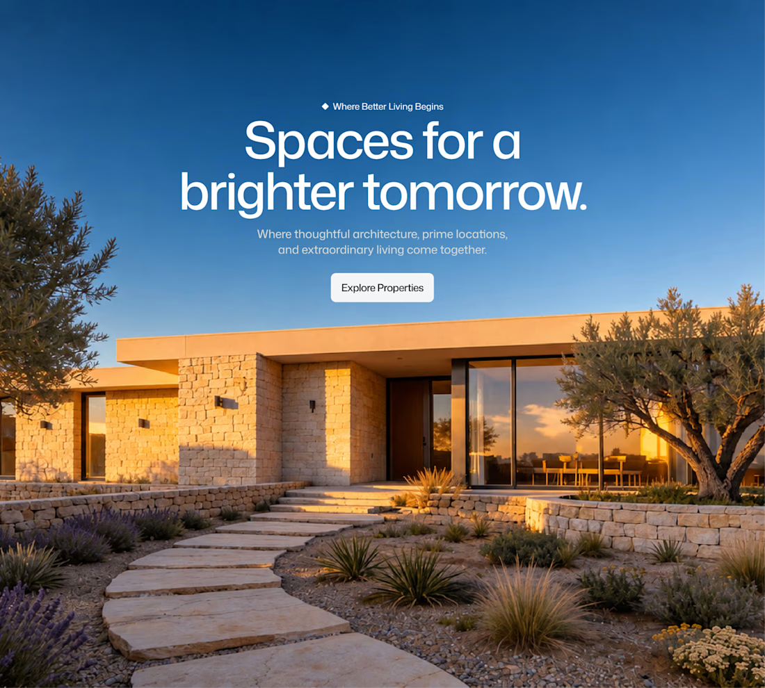


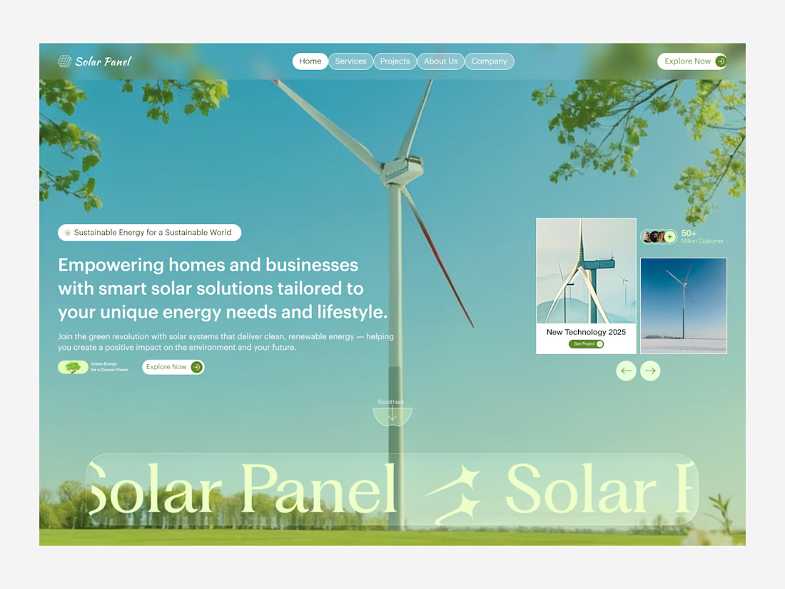

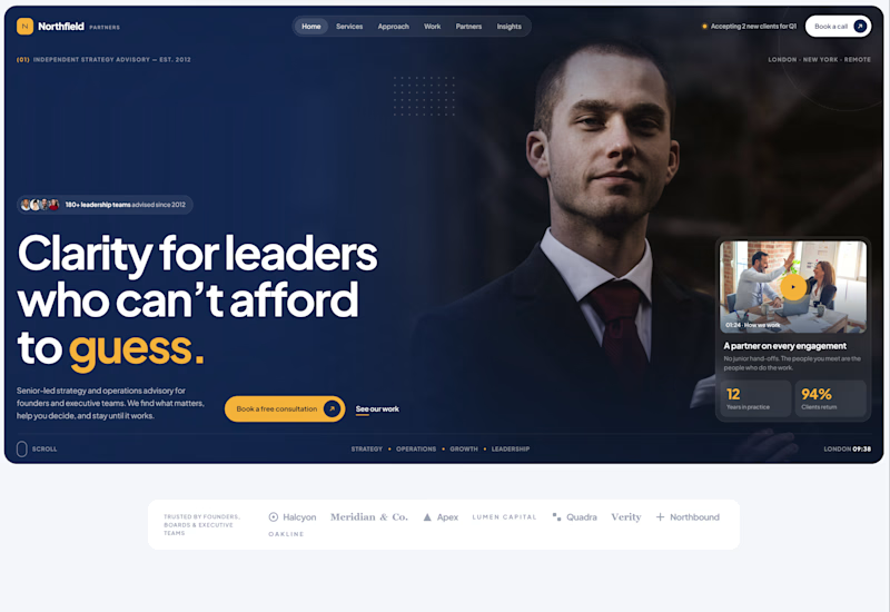
Exploring two different hero directions for a new project.
Same message, two completely different visual approaches.
Which one makes a stronger first impression?
A or B? Curious to hear your thoughts!

8 votes
Ends in 1d

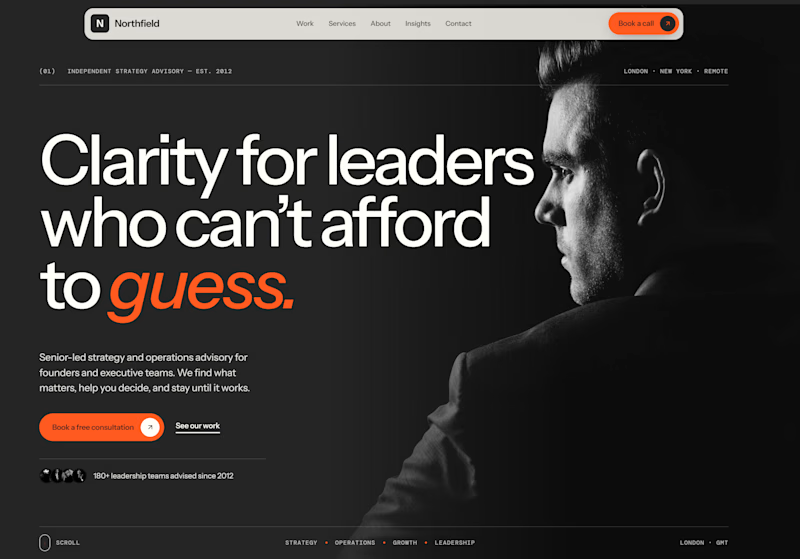
Both are strong. I lean towards the dark version, because the orange accent on the italic "guess." pops and the profile portrait gives it a more editorial, confident feel. The navy one reads a bit more corporate, which could suit a more conservative audience. Nice exploration!