The network for creativity
Join 1.25M professional creatives like you
Connect with clients, get discovered, and run your business 100% commission-free
Creatives on Contra have earned over $150M and we are just getting started
Back to feedPost


For the Contra × Lovable Challenge,
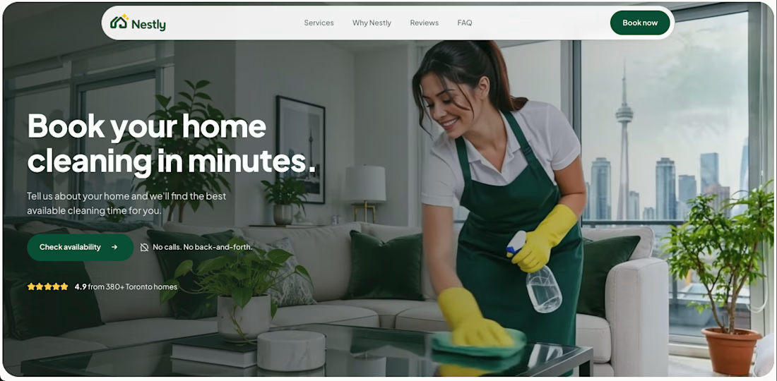
I built Nestly — a home cleaning service booking experience. 🏡
The challenge was simple:
Turn a customer inquiry into a confirmed booking.
But for a home cleaning service, there’s usually a lot of back-and-forth in between.
A customer might start with:
“I need someone to clean my apartment this Friday.”
The business still needs to know:
→ What cleaning service?
→ How large is the home?
→ Any add-ons?
→ What time works?
→ How much will it cost?
Before
The inquiry is unstructured.
Customers have to wait for replies, pricing, and availability, while the business manually collects information and schedules the job.
After
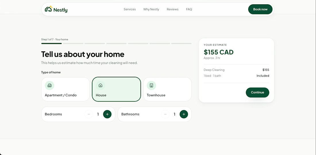
Nestly turns that inquiry into a structured booking flow.
Customers can:
→ Choose a service
→ Add home details
→ Select extras
→ See pricing
→ Pick an available schedule
→ Review and confirm
The business receives a clear, actionable booking instead of another message to process manually.
The goal wasn’t just to design a better booking form.
It was to shorten the distance between:
“I need a cleaner.”
and
“Your cleaning is booked.”
For the walkthrough, I focused on making that before-and-after transformation easy to understand.
Built with Lovable for the Contra × Lovable Challenge.
Live URL: https://nestly-book-cleaning.lovable.app/
Video walkthrough: https://jumpshare.com/share/VReLcFbLhPeFGdVGoNOs

The network for creativity
Join 1.25M professional creatives like you
Connect with clients, get discovered, and run your business 100% commission-free
Creatives on Contra have earned over $150M and we are just getting started






Related posts


The magnifier zooming into the call request is a smart way to show the booking flow. Did you build the zoom in After Effects?


Should a personal brand hero lead with the name or the promise?
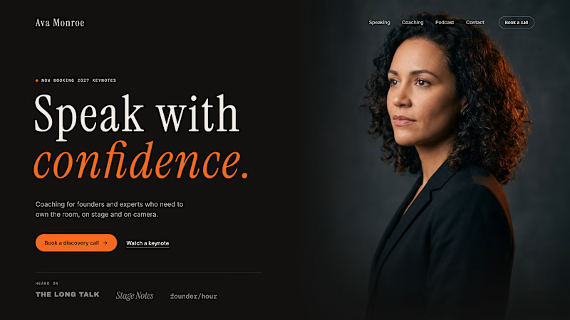
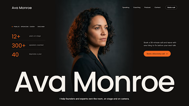
A client of ours is a speaking coach. People find her by name: podcasts, stages, word of mouth. Yet her first hero hid that name in the top-left corner.
We tested two directions:
The promise first. "Speak with confidence" in big type, the name small in the nav. Clear, but it could be any coach on the internet.
The name first. Her name at billboard scale, the promise in one line above it, her face right behind. Someone arriving from a podcast knows instantly they're in the right place.
When people search for you, your name is the headline.
Which one would you ship for a personal brand?
43 voted
51%
42 voted
49%
85 votes
Closed

Name first — podcast listeners arrive looking for her.


Love the attention to detail! The smooth scrolling, subtle animations, and interactive elements make the mobile experience feel clean, modern, and engaging. Great work! 👏