The network for creativity
Join 1.25M professional creatives like you
Connect with clients, get discovered, and run your business 100% commission-free
Creatives on Contra have earned over $150M and we are just getting started
Back to feedPost

Aero — Rethinking the Air Travel Experience ✈️
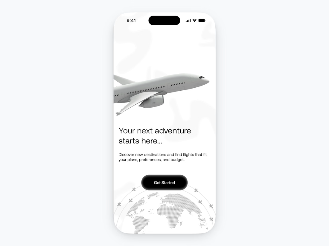
One thing I paid a lot of attention to while designing this app was onboarding.
Onboarding is often treated as a few screens users have to swipe through before reaching the actual product.
But for an airline app, it can do much more.
A good onboarding experience should quickly answer three questions:
What is this app?
Users should immediately understand what the product helps them do.
Why should I trust it?
Travel involves bookings, payments, personal information, and important plans. The experience needs to feel reliable from the beginning.
What can I do here?
The path from opening the app to finding a flight should feel clear and effortless.
For this concept, I focused on keeping the onboarding simple, visual, and purposeful.
Instead of overwhelming users with information, each screen introduces one core value:
✦ Discover destinations
✦ Find the right flight
✦ Manage your journey with ease
Good onboarding isn't about adding more screens.
It's about helping users understand the product before asking them to use it.
That first impression can have a huge impact on how comfortable someone feels moving forward.
Still working on the rest of the experience, but here's where the journey begins. ✈️
#UIDesign #UXDesign #ProductDesign #MobileAppDesign #TravelApp #Figma #Onboarding


The network for creativity
Join 1.25M professional creatives like you
Connect with clients, get discovered, and run your business 100% commission-free
Creatives on Contra have earned over $150M and we are just getting started

Challenges
View all


Related posts

A little interactive experiment for Verdant 🌱
Writing unique code for animations makes iterating on reactive micro-interactions so much smoother. It completely transforms how a brand narrative feels in the browser.


Great job


Love this concept 🧡


New case study!
Artist portfolio website design and Webflow development for Teri Sanders, a New York-based artist.

The way the editorial grid lets Teri’s work lead while the oversized name anchors the page feels beautifully restrained. Nice balance of art direction and a usable Webflow portfolio structure.